Pantone Colour of the Year 2021? Anni & Josef Albers got there half-a-century earlier!
Pantone’s pigments for the New Year capture something of the months ahead, but they also reflect the work of these 20th century pioneers
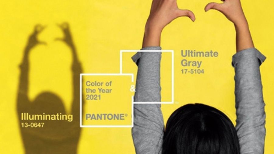
There’s no denying it: Pantone’s colors for 2021 do express something of our age. For the first time in its history the color company chose not one but two pigments for its Pantone Color of the Year 2021: PANTONE 17-5104 Ultimate Gray, and 3-0647 Illuminating, a lemon yellow.
“Practical and rock solid but at the same time warming and optimistic, the union of PANTONE 17-5104 Ultimate Gray + PANTONE 13-0647 Illuminating is one of strength and positivity,” explained the company. “It is a story of color that encapsulates deeper feelings of thoughtfulness with the promise of something sunny and friendly.”
That certainly brings to mind our hopes for next year, but it also sounds uncannily like the thinking behind the work of a couple of earlier colour pioneers.
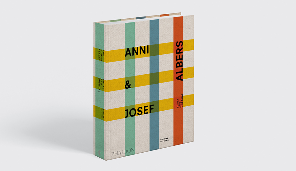
Our new book Anni & Josef Albers details the life and work of these two remarkable artists and educators. It captures much of their brilliance and artistic ingenuity, as well as the strength of their relationship and the undeniable zeal for life, which the couple managed to maintain, despite adversities.
The book also examines both the many pieces of art and design the couple produced, and also the thoughts and ideas they express and passed on to their students, at the Bauhaus in Germany, and Black Mountain College and Yale in the US, among other institutions.
Many of those lessons focussed on color, as author Nicholas Fox Weber explains. Describing Josef Albers’ first few years at Black Mountain College in North Carolina, Fox Weber writes that “Josef taught mostly by demonstrating what could be done with folded paper, by insisting on competent drawing—students were to write their names forward, then mirrored, then upside down, then with an upside-down version of the mirrored rendition, always with steady hands and complete accuracy—and presenting colors in relation to one another and graduated in scales.”
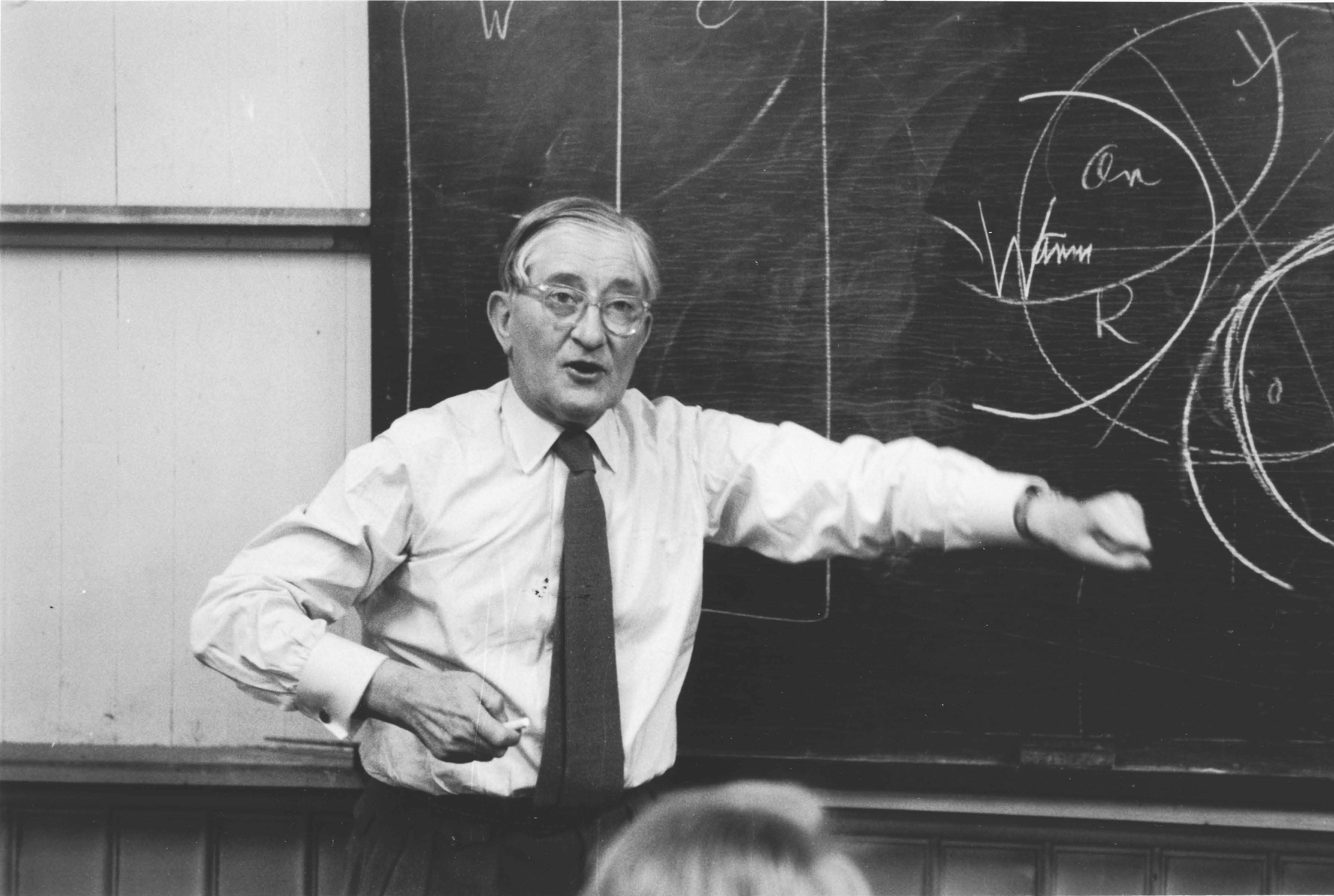
That focus on colors informed one of Josef’s most famous books –Interaction of Color, which Yale University Press published in 1963 – and influenced one of his most famous pupils: Robert Rauschenberg.
“Rauschenberg was keenly aware of Josef ’s insistent nonjudgmental attitude concerning color,” writes Fox Weber, before going to quote that famous pupil: “‘When Albers showed me that one color was as good as another and that you were just expressing a personal preference if you thought a certain color would be better, I found that I couldn’t decide to use one color instead of another, because I really wasn’t interested in taste’.”
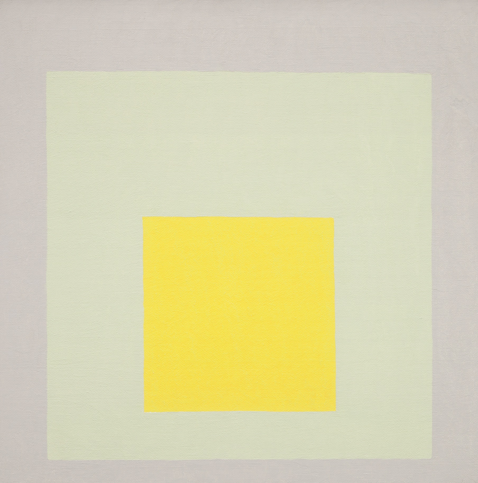
Indeed Josef’s most famous artistic series, his Homage to the Square, can be seen as an exercise in, as Fox Weber puts it, “ color performance. A red in the middle square might mysteriously, and illusorily, appear to-ward the outer edge of the gray second square, while the yellow from the outermost square might seem to hover near the inner border of that gray.”
So how does Pantone's gray and yellow combination 2021 fare within Albers’ 20th century work? It actually features quite prominently. We reproduce fifteen Homage to the Square works working with similar colors, across two pages in our new book, of which Impact (top) is just one.
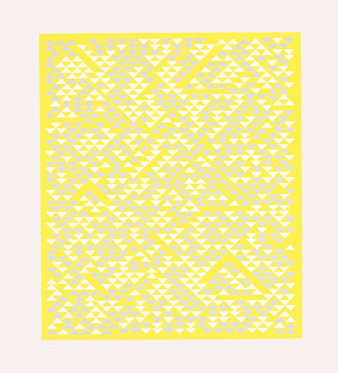
Anni’s works also displayed an appreciation for chromatic play - “ Like Josef, Anni changed color alone to create many illusory differences,” notes Fox Weber – as well as a preference for the gray and lemon combination that Pantone has tipped for next year. Her works, like his, show just how the couple remained remarkably ahead of their times. For a better understanding of their life and work, order a copy of Anni & Josef Albers here.