How a 1950s English telephone directory inspired the incredible design of Where Chefs Eat
Designer Kobi Benezri reveals the idiosyncratic thinking behind the best-selling restaurant guide
At the start of this year Phaidon published an international restaurant guide with a difference. Rather than feature the opinions of critics and food bloggers – the sorts of people whose views normally fill such publications but who go to restaurants just to eat – the book's 2,000 culinary recommendations were chosen by 400 of the world's greatest chefs – people who know the secret of good food. Where Chefs Eat has been a runaway success – after all, who wouldn't want to know where René Redzepi likes to pick up his breakfast? But it also whetted the appetite of the design industry, which has lauded the book's idiosyncratic typography and deft handling of complex data. Here we talk to the book's designer, regular Phaidon collaborator Kobi Benezri, about house styles, 1950s advertising and graphic designers as editors.
Does your studio have a signature style? You won't see a mantra printed on the studio's doormat as you come in – I think that not letting principles govern your work provokes idiosyncratic thinking. I try not to marry myself to terms like 'functional', and I'm more interested in the poetic and the objective. There's a difference between having style and having a style. The former is personal and it defines its originator, while a style is more of an outfit – it can be taught and copied, and it could be changed.
{media1}
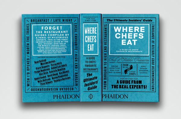
When a new commission lands in the studio – Where Chefs Eat, for example – how do you begin? I take commissions that I like, so when they come in it means the process has already begun and there's already been good conversation about it. I don't like to refer to my work as problem solving, and I prefer offering my clients a design narrative that develops the process. With Where Chefs Eat, the brief called for a text-based guidebook with very little design interpretation beyond a utilitarian cover and some infographic icons at the bottom of the listings. I received a list of sales quotes to help me understand the book and having read them I thought 'Alright, I'll buy this book, why not let everyone else know what you just told me?' So I referred to an old local English phone directory I had at home called the Kelly's directory, in which the front cover, spine and back cover are all covered with paid advertising — purely typographic — showcased with such a naiveness that could only exist in the 1950s. I have always adored how pure this type of commercialism was, so in that same method, I went ahead and used the lines I received in the design brief and covered the book's covers, spine and page edges with typography. The design validated those slogans and titles, and in this instance, the message(s) became the medium.
{media2}
In Speaking of Art, (which Benezri also worked on) a collection of transcribed interviews from William Furlong's 'Audio Arts' magazine in which the magazine's subscribers received an audio tape with the latest 'issue' by mail, the book had a fixed structure that could not be altered or edited: interviews that had already taken place and had been recorded and published before in different forms. I suggested to run the interviews as a continuous strip, and split the collection into two. I gave it a 'Side A' that ends in the middle of the book, forcing you to turn the book upside down and continue reading 'Side B' from the back cover which is identical to the front cover, only flipped.
{media3}
How closely do you work with the editors at Phaidon? And how much is editing part of your job? I work very closely with editors, and the dialogue is very important for the project as an entity. I think a graphic designer has to think like an editor. The two trades are quite similar. The relationship is crucial – if content is bad, the design won't lift it up. A design concept should emphasise an editorial approach, and in some cases it could direct ones that were missed.
You often design bespoke typefaces for the books you work on. Why is this important? I do a lot of editorial design, hence I play a lot in the boundaries between the macro and the micro of typography. For that reason I find it important to be able to create my own tools. A typeface is a form of communication and expression, but it is also your wrench and screwdriver within a greater context. I am not religious about it and I do not solely use my own custom fonts for every project, but the possibility to tailor something every now and then definitely helps.
What are you working on now, and what have you got lined up in the future? I'm working on a book with the photographer Stephen Shore, a book with René Redzepi, and a book with the artist Paul Chan. I'm also working on the Black weight of Lettera-Txt, and I'm about to release my first app, an educational game for children (and grownups).