The Beano as reworked by Hemingway
Red or Dead founder Wayne and wife Geraldine rework brand guidelines for classic British comic
Since selling their fashion label Red Or Dead, Wayne and Geraldine Hemingway's design work has taken them in some surprising directions, from rethinking housing estates to updating uniforms for McDonald's. However, there's also a strong vintage theme to much of their work - the recent repositioning of a Margate fun fair for instance, and designing new pieces for UK mid-century modern furniture manufacturer, G Plan. So for the couple's London studio, Hemingway Design to get its hands on The Beano brand seems entirely fitting.
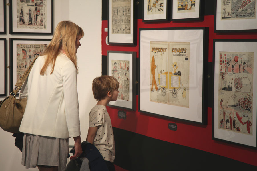
The children's comic, which is home to characters including Dennis the Menace and Gnasher, The Bash Street Kids, Minnie the Minx, and Roger the Dodger, is 75-years-old next month, and its owners publishing house DC Thompson, have seized on this anniversary as an opportunity to exploit its image banks.
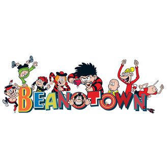
Hemingway Design has come up with some brand guidelines for an expanded array of licensed Beano products, and has designed a temporary museum. Called Beanotown, the show is part of the Festival of Neighbourhood at London's South Bank Centre until September.
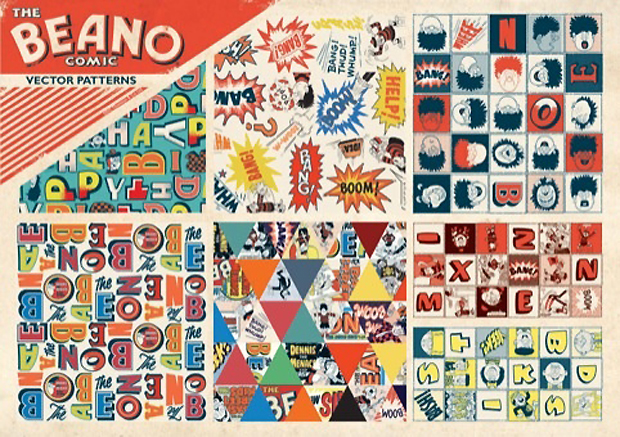
The new guidelines appear to focus on the truly valuable parts of the comic's visual heritage. "'DC Thompson had always looked at licensing from a character point of view, but we looked at the graphics, the typography and the stories behind the comics," says Wayne Hemingway.
He describes the publisher's archive in Dundee as a "treasure chest" full of "hand-drawn fonts and original art" and likens some of the sound-effect artwork - Boom!, Honk!, Biff! Yeek! - to what would happen in Pop Art a decade later.
"From a designer's point of view there's so much joy in the artwork, fonts and noises. For babies' spoons, we've applied the graphics of appropriate sound effects for instance," Hemingway adds.
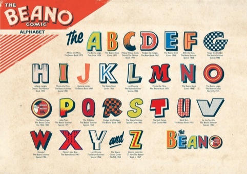
The studio came up with the strapline "Everybody we know loves the Beano", which will be applied to labelling and such like. The designers have also drawn up an alphabet from the comic's old artwork. The A came from the word 'Beano' on the cover of the first issue in July 1938, and the D featured in 'Roger the Dodger' in the 1967 Beano Book.
For anyone keen to get the look, licensed products on sale at Beanotown include t-shirts, wrapping paper, greetings cards, party tableware, bed linen and even wallpaper. Find out more about the project here.
To learn more about the development of comics over the past 100 years, take a look at our book, Comics, Comix and Graphic Novels. For further insight into visual design throughout the ages, please take a look at our Archive of Graphic Design, featuring 500 designs drawn from the past 600 years. For the last word on brnading check out Michael Johnson's Problem Solved and for more on the popular press's influence on contemporary art, take a look at our Pop Art book.