Andy Warhol versus the Dow Jones
Since the turn of the century, Warhol's Flowers series has faired better than 30 great American companies
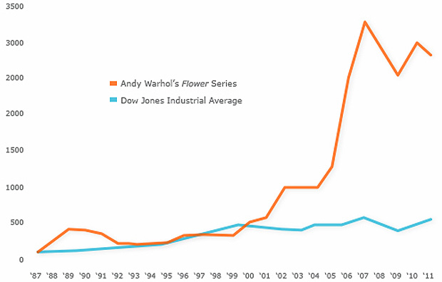
Artnet, the art market analytics service, mailed out a fairly compelling chart towards the end of last week. It tracks the performance of Andy Warhol's Flower series against the Dow Jones Industrial Average. Perhaps it's slightly disingenuous to begin the chart in the year Andy died; surely news of his passing inflated his prices? Also, Warhol isn't just any old contemporary artist; as The Economist notes, Andy accounted for 17% of all contemporary auction sales in 2010.
Nevertheless, the red and blue lines make for fairly eye-watering viewing. If you've a million to spare - a 1978 edition of Flowers fetched $1.3m last July - Warhol appears to be a better bet than Boeing stock. Then again, past performance does not necessarily predict future results, as they say in finance. To put it another way, why not take a look at our Andy Warhol Catalogue Raisonné, a multivolume series that draws together all the artist's works, and offers them to you at a fraction of the price. A safe bet, in our opinion.