One Apple 'homage' too far?
Swiss Federal Railway service SBB, takes offence to new look of Apple's clock app for iPad in iOS 6
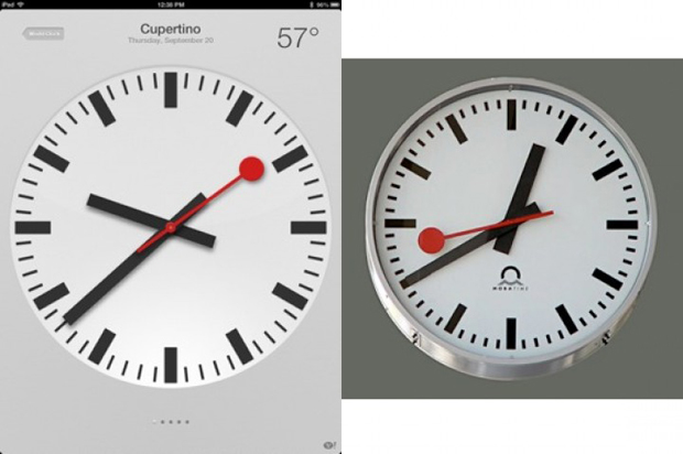
According to a report in the Swiss newspaper Tages-Anzeiger the Swiss Federal Railway service SBB, has taken offence to the new look of Apple's clock app on the iPad that came alongside iOS 6. An SBB spokesman says it owns the trademark to the classic 1944 design created by then-SBB employee Hans Hilfiker.
The design is used on station clocks throughout the Swiss railway system and, more recently, has been successfully licensed to Swiss watch manufacturer Mondaine. An SBB spokesman told Tages-Anzeiger that while he was pleased Apple was using the design he noted that the company was not authorised to do so and said a legal complaint seeking financial and legal redress was being drafted as a result.
Apple is no stranger to defending the look and feel of its own designs, including clocks. According to technology website Cnet.com in 2009, Apple sent a letter of rejection to popular app developer Tapbots - the makers of Tweetbot and other iOS apps - saying the clock icon the company used in its pocket converter application looked too much like the icon used in Apple's own telephone app. Tapbots changed its design as a result.
More recently of course, Apple's defence of its own designs has extended to the look and feel of its smartphones and tablets. The thrust of its billion dollar lawsuit against Samsung hinged on what it claimed were similarities - not just in hardware, but in the look and design of its applications and iconography as well.