Pentagram's monotone MIT makeover
Pentagram partner Michael Beirut gives MIT Media Lab an all-encompassing new look
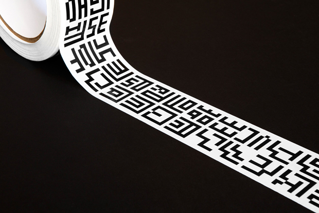
The MIT Media Lab has an ingenious but simple new identity created by Pentagram partner Michael Bierut. It employs the 7x7 grid of its successor, which houses the organisation’s initials in pixel form.
This straightforward marque is a thoughtful solution to the organisation’s many facets. MIT Media Lab’s previous logo was created just three years ago for its 25th anniversary. That one comprised a multitude of multi-coloured variations (40,000 permutations, in fact, generated by a custom-made algorithm), which made life confusing for the lab.
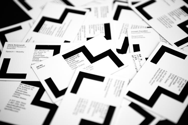
Beirut, whose previous clients include Saks Fifth Avenue, Benetton, Motorola and the Museum of Sex, was tasked with coming up with a more stable alternative that treated the Media Lab as an umbrella organisation for 23 different interests and departments.
He took his inspiration from the logo of MIT’s publishing arm, MIT Press, designed by Muriel Cooper way back in 1962. It comprises a series of strong black vertical lines. “There was something about Cooper’s logo for MIT Press that contained much of the simplicity and irreducibility that had eluded the Media Lab in its quest for an identity over the years,” Bierut says.
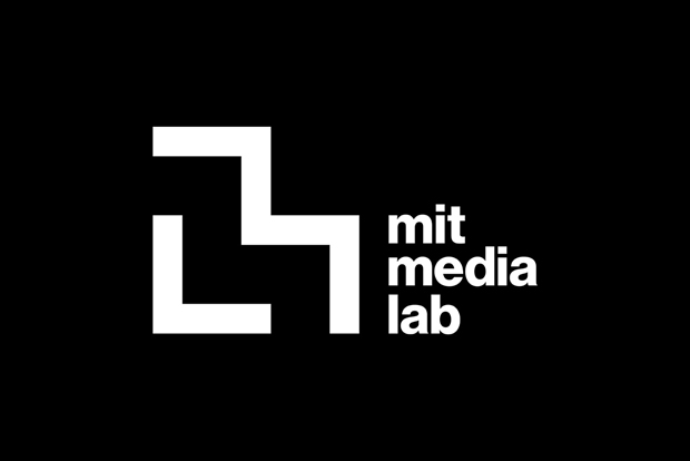
Borrowing from this graphic, he configured a pixel-style typeface that would be legible, so that each off-shoot could be represented by its initials.
So the sub-brand Media Matter is has two two zig-zagging Ms, one lying inside the other. While some of the marques are very obvious, others are pretty obscure. But nothing is left in doubt, as each one has its full name in clear lowercase next to it.

The whole thing is executed in black and white, which would have appealed to Bierut’s previous employer, the late great Massimo Vignelli (he only ever wore black). If you'd like more insight into graphic design from the days of the Gutenberg press right up until the present day, check out The Phaidon Archive of Graphic Design here.