Moleskine gets a makeover
Everyone's favourite notebook gets a new look from Milan-based graphic designers Achilli Ghizzardi Associati
There’s nothing riskier than messing with the look of a long-standing, much-loved brand. Think of all those hardened loyalists you might alienate! But sometimes, companies convince themselves it’s worth making that leap, and usually it has something to do with strategy.
Moleskine may be best-known for those fabulous ‘strapped’ notebooks, that we associate not just with contemporary architects and designers, but with Oscar Wilde, Pablo Picasso and Ernest Hemingway.
However, it has a host of other products, from journals, bags, pens, and cases to apps and print-on-demand services. The Italian business thought it was high time these other items got a fair billing, and to that end it asked Milan-based graphic designers Achilli Ghizzardi Associati to come up with an appropriately inclusive marque.
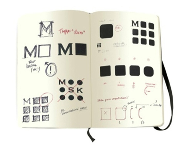
Their solution is constructed around the themes of flexibility, organisation and open space where creative ideas can take off. It’s a monogram of nine squares in a grid pattern. The first – top left – square always houses the ‘M’, and the others can carry any image or graphic relevant to the brand, on any background. As Moleskine says, “the intention was to create a fluid visual icon that communicates its multi-faceted and open nature while unifying its many objects, types of users and brand values.”
It makes us think of a paired-down take on Javier Mariscal’s Bar-Cel-Ona campaign. That, too, was a nine-letter proper noun, broken down into three rows.
Achilli Ghizzardi has made sure that its squares have nicely rounded corners, in keeping with the notebooks, and in their redrawing of the ‘M’ they have given it some apt curves too. This gives the brand “a proprietary font for the first time in the company’s history”, according to Moleskine.
The new graphics will no doubt take centre stage at Moleskine’s branded stores, there's one in the Time Warner Centre in New York and another in London at Heathrow Terminal 4. The company refers to them as Moleskine Places: “The store design mirrors the elegance and simplicity of the Moleskine notebook: the classic black rectangle is reimagined as an open platform for creativity in a physical space. A map covers the floor, symbolizing the mobile identity of contemporary nomads.”
In graphic terms, we thing it makes sense and it's been sensitively enough done that it’s unlikely to offend the die-hards. Let us know what you think though.