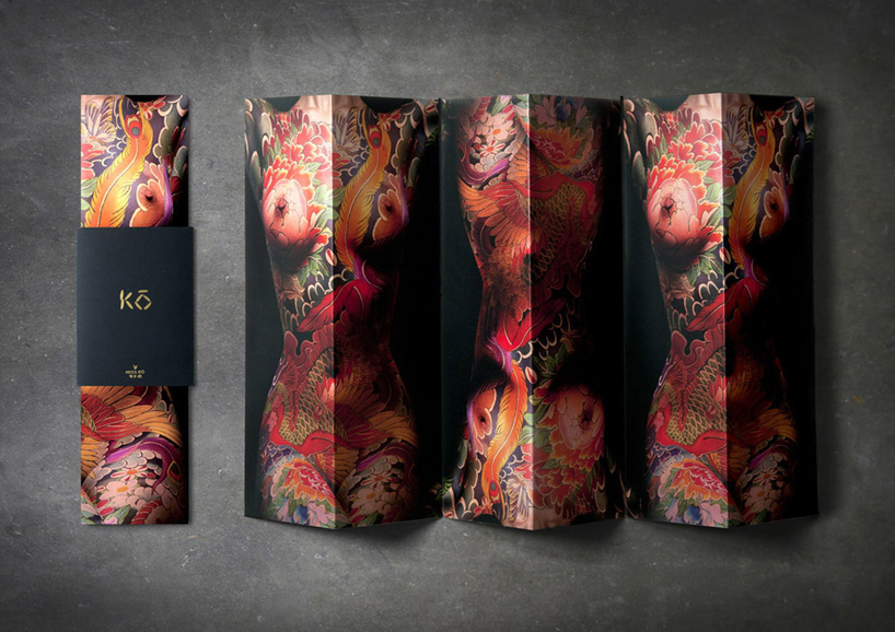
Graphics firm Gregory Bonner Hale commissions full body tattoo artwork for Paris restaurant identity
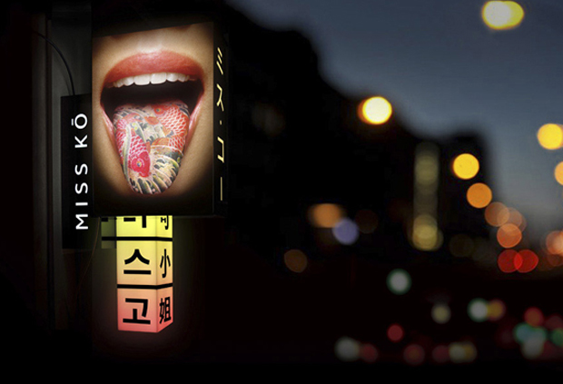
Japanese body artist Horikitsune lends a hand (and a few other body parts) to Philippe Starck restaurant Miss Kō
On the (admittedly few) occasions when we think of body graphics, the first name that springs to mind is Stefan Sagmeister. The German-born New Yorker made a splash back in 1999, when a studio intern sliced the details of an AIGA Detroit lecture into Sagmeister's torso. "Yes, it did hurt - real bad," he said at the time. Now, an Asian fusion restaurant in Paris, with interiors by Philippe Starck, has gone one better. For the identity of Miss Kō, multi-award-winning London graphics firm Gregory Bonner Hale commissioned a full-body tattoo.
Their idea was to create a physical manifestation for the Miss Kō personality. "A young, sexy but eternally mysterious symbol of Asia, and the embodiment of its traditions and its strangeness," is how the designers describe her.
This naked character, with her head forever in shadow, sports a Yakuza-style full body suit tattoo of colourful, intricate flora and fauna. The artwork was by Horikitsune (Alex Kofuu Reinke), "the only European to have trained as an apprentice in the traditional Japanese art of Irezumi (the Japanese word for traditional body art)" according to GBH. It's clear that the images of the fabled Miss Kō's body are not inked using genuine tattoo techniques and are, instead, mocked up with body paint and digitally manipulated.
The cropped shots of Miss Kō - by celebrity and fashion photographer Uli Weber - turn up on the restaurant staff's business cards, the cocktail menu, and food and drinks menus. "The repeated disembodied tattooed body-parts are both strange and beautiful, almost symbolic of the Asian relationship to food and to the animal kingdom," the designers add.
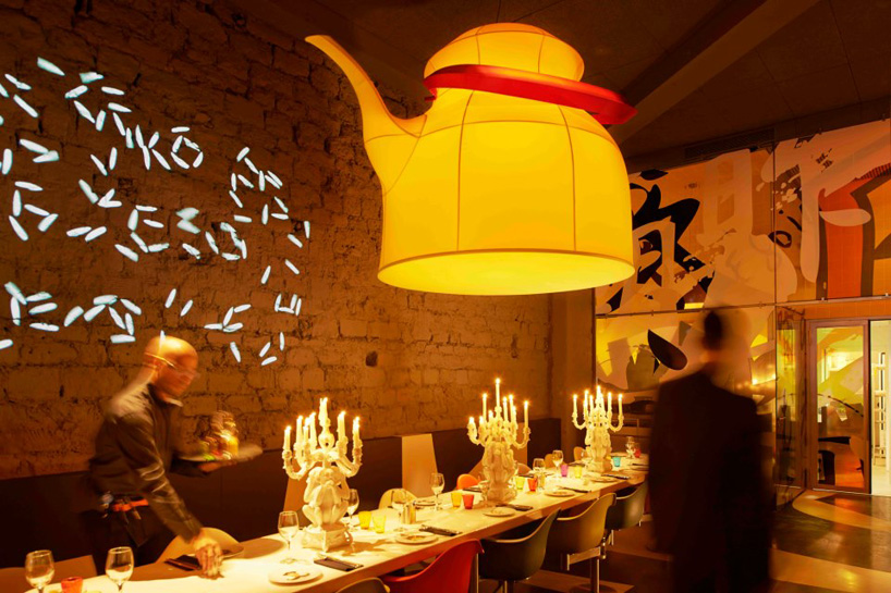
Perhaps so, but actually we're keener on the restaurant's logotype, which has much less chance of offending anyone. It's fittingly fashioned out of nine grains of rice. The designers have had fun with this, creating an animation of dancing grains, which is projected onto the venue's floor. Diners look on as once in a while these grains choreograph themselves into the restaurant's marque.

For more, visit the restaurant's site. To learn more about a myriad of graphic design techniques, from all over the world, consider our Archive of Graphic Design, which features over 500 graphic designs, from the fifteenth century up until the present day.