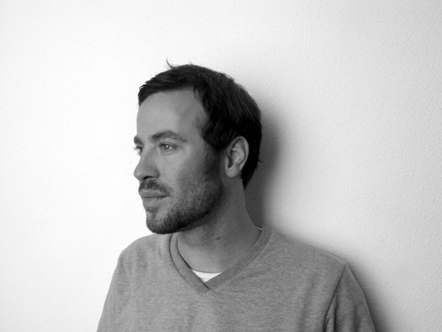
Mirko Borsche talks graphic design
We catch up with the Munich-based designer and creative director of Die Zeit in Germany
The Bavarian graphic designer Mirko Borsche likes to have fun. His posters are filled with poppy illustrations and playful photo campaigns. His editorial work is always experimental and often challenging. And his typefaces are hilarious (Jonathan), elegant (Muenchen) and downright brilliant (Sumatra) in equal measure. Since opening his own studio in 2007 following successful stints at the head of numerous magazines, Borsche has done pretty much everything you can in the graphic design world, and always with a smile on his face. Here he talks about signature styles, editorial relationships and play as a powerful tool.
Could you describe your approach? Does the studio have a signature style? All projects begin with an idea. Or, more accurately, we work on creating a collection of ideas and filter those down until we settle on the most appropriate or strongest. Our projects have at the core a central idea. I believe it's very important to reduce elements and keep the idea concise; it's quite easy to lose the message you're trying to convey in decoration or over-design. We never impose a style on a job; the subject and content of a job always informs the style. If a certain style gives the wrong message then the style is wrong for the project. It wouldn't makes sense to have a signature style.
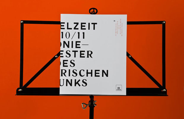
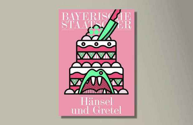
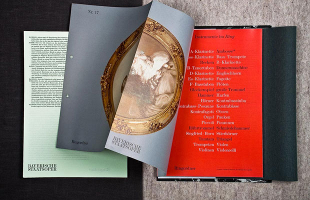
When a new commission lands in the studio – the Bayerische Staatsoper poster series, for example – how do you begin? The usual starting point is a brief of some description. This could be more traditional in the sense of the word, such as a document, or as informal as talking over lunch with the client. The first step is always to be briefed: What is the project about? Who is the audience? What does it need to say? Only with that information can you start working on ideas and sketches that work towards answering the brief. Unless you understand the requirements of a project, you won't be able to make intelligent or effective work. In the case of the Staatsoper posters, we'd already established a visual language, so the process was more about deciding on a suitable motif for this specific production, whilst still working within an established framework. At the moment we're working with a team of two illustrators for all the opera posters. This keeps the posters stylistically coherent from production to production through the year. Again, as with all projects, the subject informs the output.
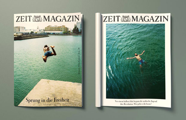
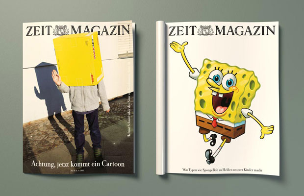
Zeit Magazin is one of your most high profile projects, and much of your work is editorial. How closely do you work with editors and how much editorial control do you have? It's a very close relationship. The editorial control in terms of the text content of articles lies with the Editor-in-Chief. I'm the creative director, so the overall creative output is my responsibility. I have input over the illustrations and photographs accompanying a piece – a lot of my work is organising photoshoots and briefing illustrators so I get the results I'm after. There's a lot of back and forth between the Editor-in-Chief, the photographer, the illustrator and me. So in that sense it's a collaboration. Most of my work with Zeit Magazin is making sure the magazine stays true to the visual language that I've created for it. In short, I make sure Zeit Magazin looks like Zeit Magazin, which is important because the readers have come to expect a certain aesthetic from the magazine; it would be confusing if it suddenly deviated from that aesthetic. It's also important for the audience to be able to visually distinguish between a copy of Zeit Magazin and another publication. This also fits to all the other magazines we are doing – Tush, The Germans, Horst, Max Joseph, Weltwoche etc.
This is an unavoidable question given your association with print: how will the magazine live on in paper form? I think print will exist for a long time yet. There's still nothing that quite compares to physically holding information in your hand. With all the digital formats now available, it's possible that magazines will become more disposable, with the more expensive production techniques being relegated to only books. But they won't disappear entirely.
Do you approach print projects differently to those that use other mediums? Not really. The idea is still central regardless of medium. Obviously there are different technologies to consider and these come with their own set of problems to consider. Something online is going to be seen in a different way to a poster, so you have to design accordingly with that in mind – things like scale, context and location are important to think about... But the fundamental approach is always the same.
How important is fun to you and your studio? Much of your work seems full of it? Very important! I find that if you don't find enjoyment in what you do, the quality ultimately suffers. As well as increasing morale, I also find having fun really helps with keeping the work output fresh and interesting. If everyone works like a robot, churning out design, the end results get very stale and start to look and feel like everything else. Play is actually a very powerful tool. Children use play to learn and grow and we use it a lot in our projects. I also think it's important to take risks with projects. The key is to see the fun in trying something experimental and not be afraid of failing. Nowadays there's a danger, especially in the corporate world, of being paralysed by the fear of failure.
What are you working on now, and what have you got lined up in the future? Amongst other things, we're working on this year's programme book for the Staatsoper, as well as the booklets for the individual productions. We've just finished work on the third issue of a new political and cultural magazine called The Germans, and we've also recently installed a carpet sculpture for a textile exhibition. We still have recurring projects coming up, such as Superpaper – a free zine-style newspaper distributed around Munich containing information on up-and-coming local events and showcasing new artists. Check out more great graphic design in the recently published Phaidon Archive of Graphic Design.