What do you think of Spotify's new look?
It's goodbye to the green as designers Collins give music streaming service a great new 60's inspired identity
Spotify, the world’s biggest music streaming service, has a new look - the first since the company's inception in 2008. Back then, the black, white and green ‘sound wave’ icon and the Proxima Nova font did the trick - after all the idea of streaming entire albums easily was what you signed up for. Since then, however, the business has expanded to such an extent that the original look was starting to look decidedly retro - and not in a good way.

So, in April 2014, Spotify appointed the New York design firm Collins to create a look that was worthy of its newfound position, and would appeal to a core audience of those born between the early 1980s and early 2000s. “The big shift in helping the company go from looking like a tech company to more of an entertainment brand, was giving them the ability to communicate in much more diverse ways,” says Leland Maschmeyer, executive creative director and founding partner at Collins.
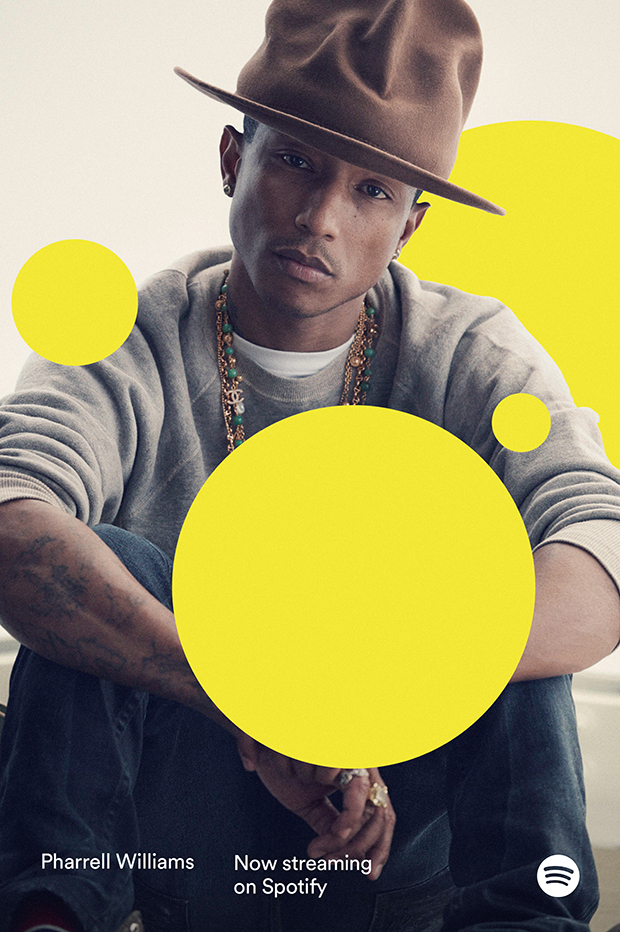
Key to the new look is a series of shapes which Collins say are inspired by a listener’s reaction to a good tune. “When a song profoundly resonates with you, what happens?” ask the team at Collins, “You cry. You cheer. You scream. You laugh. Or, as we put it, you burst with emotion.”
Hence the ‘bursting’ shapes (loosely based on the ‘play’, ‘pause’ and ‘record’ button icons) that can be positioned behind or in front of an image or text. Meanwhile the previous rather dour green has been livened up here and there. Some of the treatments, including the Pharrell Williams image, above, bring to mind John Baldessari's classic manipulated photographs, wherein the artist obscures subject's faces with colourful circular stickers.
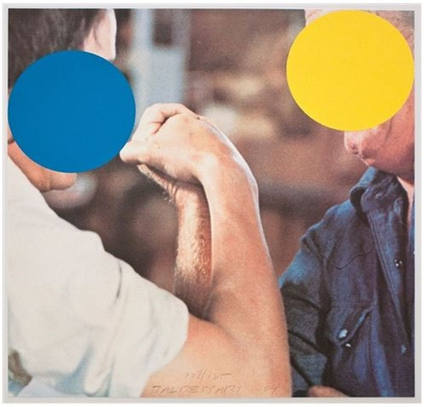
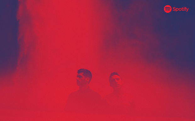
Collins do not make direct allusions to this source of inspiration, but they have revealed others. The agency says it came up with the deceptively simple treatment for the images of artists that it uses: a duotone look reminiscent of promotional material from the 1960s.
"That aesthetic could be applied to lots of different types of photography," Maschmeyer says. " So even though the pictures were shot in different styles, and by different photographers, when you put them through that filter, they all hang together.” He believes that the system is flexible enough “to go anywhere Spotify goes”. And that obviously covers a lot more ground today than it did in 2008.

For further insight into great graphic design, from the earliest moveable type to the Internet age, take a look at a copy of the Phaidon Archive of Graphic Design.
Meanwhile, you can listen to Spotify playlists drawn up by some great contemporary artists, via our on-going Muse Music series. Go here for selections from John Pawson, Antony Micallef, George Condo, Martin Boyce, Simon Fujiwara, Karla Black, Mark Titchner, Wilhelm Sasnal, Elizabeth Peyton, Chris Johanson, Edmund de Waal, Samuel Wilkinson, Roger Hiorns, Alex Hartley, Brian Griffiths, Cally Spooner, Jockum Nordström, Dexter Dalwood, Edward Barber, George Shaw, Michele Howarth Rashman, Piers Secunda, Haroon Mirza, United Visual Artists, and Nathaniel Mellors.
