Rolf Müller's tidal shift
A look back at the moment a young German graduate changed the course of graphic design
Every summer in late June, thousands of sailboats descend on Kiel, Germany, for the city's annual sailing event. Kieler Woche has been celebrated since the turn of the twentieth century (it officially began in 1882, when 20 sailing yachts participated in a race from nearby Düsternbrook), and since 1948, like many large-scale sporting events, has incorporated a poster competition. Past winners, whose works now act as a chronicle of contemporaneous graphic design styles and trends, include industry stalwarts Anton Stankowski, Christof Gassner and Wim Crouwel, but it was Rolf Müller's 1972 effort that changed the course of graphic design for good.
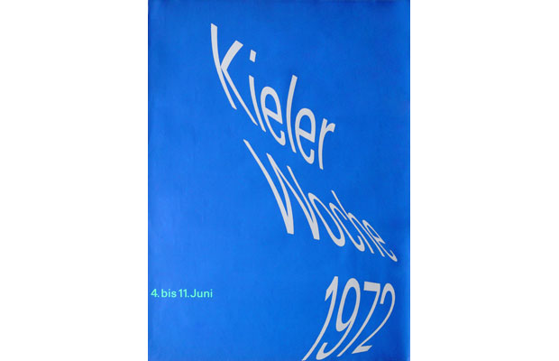
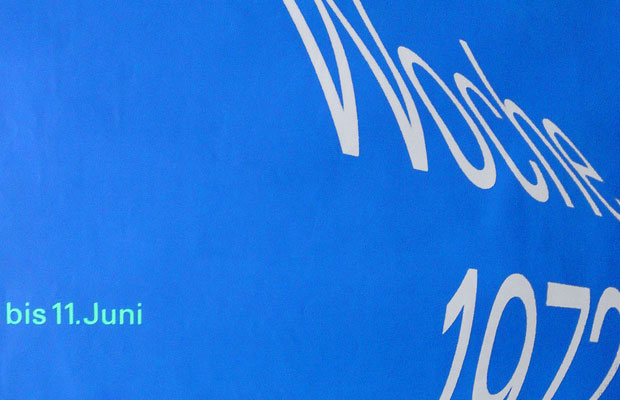
"Early posters of the 1950s tended to involve pictorial images of boats and sails with varying degrees of abstraction," reads the Kieler Woche entry in The Phaidon Archive of Graphic Design. "By the 1960s, the style had become even more abstract, with water and sails given geometric interpretations." Müller decided to take that abstraction one step further, completely removing imagery and instead using "typography alone to express the visual character of the event."
Müller's poster is a triumph in graphic communication, its curving headline typography evoking a sail billowing in the wind as effectively as any figurative image, and its supporting text – the date of the event – set simply in a green sans-serif, as if to emphasise the sailboats' ties to the land.
The German typographer, who, rather impressively, had only recently graduated from college before coming up with the design, and who later worked in collaboration with industry luminaries Josef Müller-Brockmann and Otl Aicher, wasn't the first to experiment with type as image. In 1962, George Tscherny had used undulating type to evoke the sculpture of José de Rivera for an exhibition catalogue cover, and three years later Steff Geissbuhler used a "reflective mylar cone to create the illusion of type spiraling down a tunnel in a Geigy brochure."
But Müller's blue and white design took the idea to a whole new level. In the four decades since his brainwave, myriad designers (Vince Frost included) have eschewed figurative photography and instead created imagery with type. Without Müller's initial inventiveness, would they have ever made that leap?
Read more about the designer Rolf Müller in The Phaidon Archive of Graphic Design.