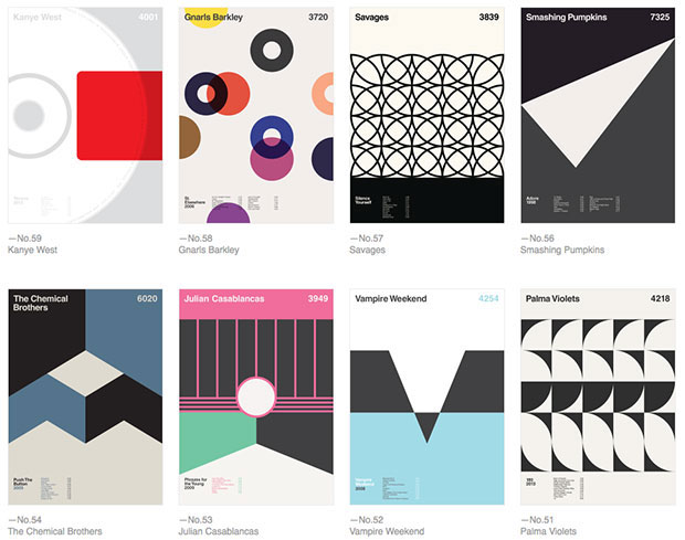
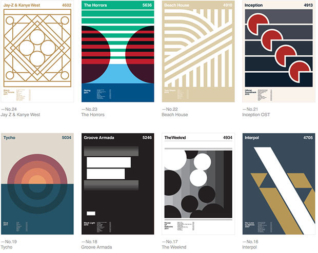
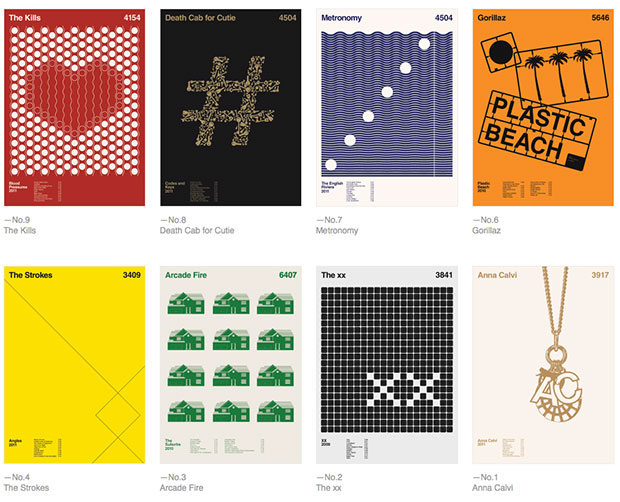
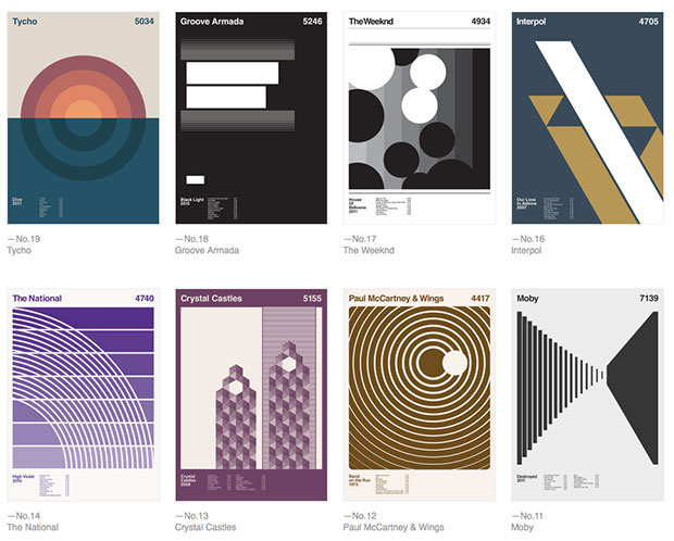
The Anatomy of an Album
Graphic designer Duane Dalton's pet project sees him reducing over 75 albums to their core elements
By day London-based graphic designer Duane Dalton creates strategic and visual communication for brands at Sea Design. By night however, he deconstructs album imagery into its purist form by discarding what he considers to be unnecessary information in a graphic design series he calls Album Anatomy.
Album Anatomy is created via a strict grid formation that displays basic details – album title, track listing, length - but discards extraneous, unnecessary information, leaving a central void on which Dalton can convey his emotional response to an album. This can be influenced by the album’s original cover art, a standout track or the overall flavour of the music. The project is an ongoing one with the albums in it spanning the forty years from 1974 to the present day.
“Album Anatomy came about when I was studying graphic design,” he says. “I discovered the work of Ross Gunter and his Bridging The Gap poster series, used to promote nightclub events. I loved the forms being used and the room for variety and experimentation. I thought I’d love to do something like that, so I combined my passion for music and graphic design. The act of looking and reducing forms is still the main premise of the Album Anatomy project, in order to try and convey the overall visuals and sounds associated with an album into a simple and identifiable graphic."
Dalton says that one of the main stipulations he sets himself in choosing an album is that he must have listened to the given album all the way through and, in most cases, several times. Secondly, does the album mean something to him? “A lot of the albums I have done have connected with me on a personal level and sometimes in a nostalgic way too. Only then does the album artwork become a factor, and this imagery tends to become the main focal point during the design process.”
There is however, one album he’ll never touch, Joy Division’s Unknown Pleasures whose cover, designed by Peter Saville, is based on a comparative path demonstration of the frequency of a signal from a pulsar.
"That’s one that I will never do. I will admit I have attempted to create an Album Anatomy of it, but I stopped. In my opinion, it's already highly minimal and just too iconic. It's quite perfect really.”
There are plenty of other examples of iconic sleeve design in our book in a box The Phaidon Archive of Graphic Design which features 500 graphic designs including newspapers, magazines, posters, advertisements, typefaces, logos, corporate design, record covers and moving graphics from around the world, which have set a benchmark for excellence and innovation. Check it out in the store.