Hershey’s courts controversy with redesign
Candy company's new logo triggers Airbnb-style adverse reaction
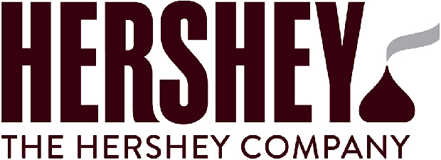
While the new logo for candy company Hershey would appear to be more of a tweak than a revolution, it's nevertheless been met with some very strong reactions. The iconic brand has ‘merely’ changed Hershey’s to Hershey in a slightly different typeface, and rewritten its existing rather self-explanatory strapline ‘The Hershey Company’ in capitals.
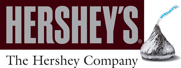
But there has been much debate (most of it critical) around the changes to the ‘Kisses’ symbol which sits to the right of the name. Up until now, this image of the little tear-drop chocolate appeared in its foil wrapper, with the ribbon to open it waving out of the top.
Now, the Kisses is unwrapped, and is represented as a graphic symbol in Hershey’s trademark chocolate brown. The ribbon is a grey brush stroke.
Commentators have claimed - rather rudely one might say - that the new Kisses resembles a steaming turd. Others claim however, that it is in keeping with the rest of the marque.
Usually in these situations, commentators blame the company for either not appointing an external designer and mistakenly allowing in-house designers to get their hands on it, or on appointing the wrong external designer. But not in this case.
This was a joint effort by Hershey’s in-house design team, headed up by Ron Burrage, and the creative agency goDutch in Cincinnati. The typeface designers, Alexander Design Associates in New York are not in the line of fire. And rightly so, as their solution is clear and functional and in keeping with the brand’s heritage.
It is unlikely The Hershey Company were expecting such a furore. The new look was introduced internally this spring. Often, a disgruntled employee will leak an unpopular redesign. Perhaps in this case Hershey’s staff didn’t pick up on the Kisses’ potential for embarrassment. It has become fashionable to slag off logos. Airbnb's recently introduced Bêlo logo was described variously as both a penis and a vagina.
The company's CTO Nathan Blecharczyk had a wry last laugh saying, "Go ahead, laugh all you want guys. We wouldn't want to design a logo that caters to the lowest common denominator."
Incidentally, if you're interested in some of the logos that have gone down in history and stood the test of time check out the Phaidon Archive of Graphic Design. It features 500 graphic designs including newspapers, magazines, posters, advertisements, typefaces, logos, corporate design, record covers and moving graphics from around the world, which have set a benchmark for excellence and yes, some controversy too. Illustrated with up to six images per entry, including rarely seen historical and contextual material, it's the ultimate reference guide for the design professional and enthusiast alike. Buy it here.