Neville Brody creates typography for new England kit
Will it be a future design classic that ends up in the next edition of the Archive of Graphic Design?
While the unveiling of England’s World Cup football kit has been met with some press censure over the shirt’s price tag (an eye-watering £90 - $150), typography fans might at least take some comfort to know that they could be investing in a future design classic.
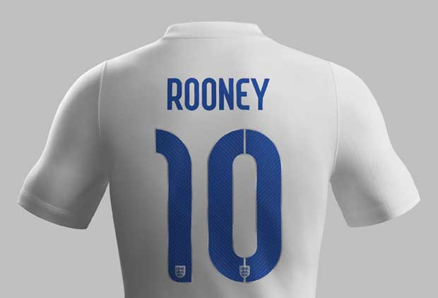
The curved typeface for the names and numbers that appear on the two kits that the team will sport in Brazil this summer has been designed by Neville Brody.
The celebrated British graphic designer is used to high profile commissions. His clients have ranged from Apple and Dom Pérignon to Sony PlayStation, Bentley, and Kenzo. Many years ago he was the hugely influential art director of hugely influential magazine UK style magazine, The Face.
Brody says he took as inspiration the intersection between flair and workmanlike reliability, and the all-white strip worn by England at the 1970 World Cup, hosted by Mexico.
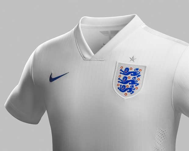
Martin Lotti, football global creative director of Nike, which made the kit, points to yet another source of inspiration: the armour of English knights.
“Small touches emphasise the idea of innovation, invention and surprise, built around a more geometric structure,” he says, “The industrialised suggestion of a stencil was simultaneously based on a pinstripe motif, combining style with no-frills efficiency.”
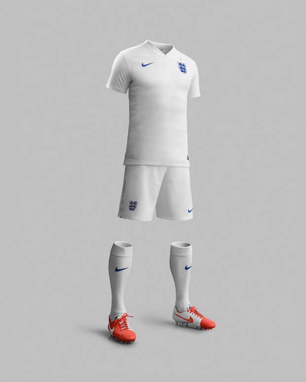
The new home kit will get its first outing at Wembley Stadium on May 30 when the national team takes on Peru in a friendly. Meanwhile, this year’s World Cup hosts Brazil also have a Nike kit to look out for. Theirs is designed by local artist and illustrator Bruno Big.
If you're interested in knowing more about the development of football fashion, Colin McDowell writes eloquently about it in a section of his book The Anatomy of Fashion. He's particularly good on how football shorts, for instance have tracked changing social attitudes. Here's a brief excerpt.
"Sportswear has its own fashions and, to a large extent, must observe the social norms governing dress at a particular moment. The story of football shorts for instance, track changing social attitudes. The first players wore three quarter length trousers that overhung or were tucked into long stockings. By the early 1900s the shorts were knee length, again with long socks, but sometimes exposed part of the players' legs. Shorts then grew shorter, but only slowly (hence the impression of so many knobbly knees given by films of the 1950s).
"In the 70s and early 80s however, they made a sudden rise to expose most of the thighs; they also became revealingly tight. Such a development served no practical purpose - the speeds at which soccer is played do not require aerodynamic adjustments - instead, they reflected the triumph within society of the ideal of the young, athletic male body." Check out The Anatomy of Fashion in the online store and read an interview with its author, celebrated fashion writer Colin McDowell MBE.