Discover a world of contrasts in our new book, Map
By pairing apparently unrelated cartographic works together our new overview reveals some telling similarities
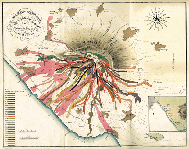
Map: Exploring The World is an astonishing collection, featuring 300 examples of cartography from ancient to modern digital times. One of the great devices of the book is to pair off particular maps to provide often ironic contrasts between past and present methods. One grimly colourful example of this is the geologist John Auldjo’s A Map Of Vesuvius (above), which he drew up in 1832.
Using a variety of vivid and evocative colours, from rich pinks to violent reds, it shows with wormlike illustrations the direction and extension of lava flows from 27 eruptions of Mount Vesuvius over the previous 200 years, starting in 1631. Auldjo collected and dated rock samples on which to base his findings; he also took advantage of new developments in graphics and colour printing to convey his findings. Although scrupulously accurate, the results make up in their lack of legibility with their lurid, impressionistic demonstration of the volcano’s frequent activity. Maps like this helped make geology a graspable concept in the eyes of the public.
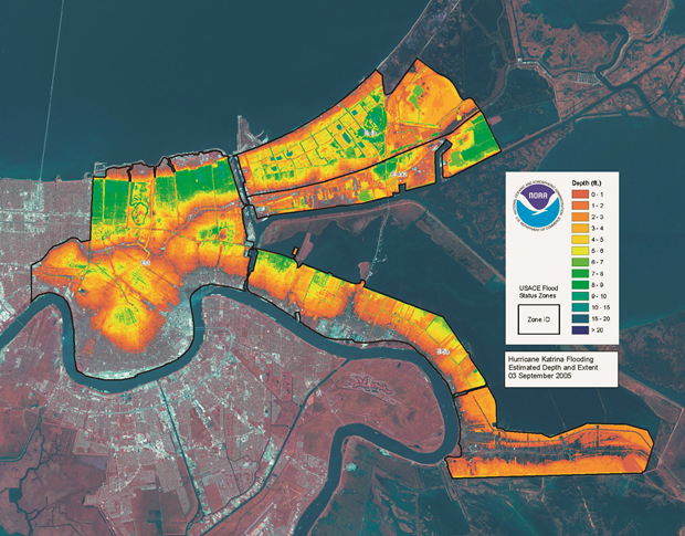
On the opposite page we find Hurricane Katrina Flooding Estimated Depths and Extent, prepared by the National Oceanic and Atmospheric Administration (NOAA) and the Federal Emergency Management Agency (FEMA). Using enhanced satellite imagery and colour coding, this map conveys with searing exactness the dreadful consequences of the natural disaster that befell New Orleans when its levees broke in 2005. The parts of the city deepest under water are indicated with grimly glowing yellows and greens, neutral indicators which nonetheless are scaldingly effective in delineating the impact of the tragedy. The map indicates flood levels a week after the storm struck – it shows that even then, parts of the coast were still ten feet under water.
Almost two hundred years apart, both of these maps provide in their very different ways colourful cartographic illustrations of the volatile cruelty of Mother Earth.
We hope you have enjoyed this insight in to our new book Map. You can find out more about the title here, and pre-order your copy here.