Herman Miller's logo took an hour to make and is 73-years-old!
Here’s how George Nelson and Irving Harper came up with an elegant solution to a knotty visual challenge
After the war the Michigan furniture maker Herman Miller was perfectly placed to kit out the modern homes and offices of the USA, even if it wasn’t quite ready to convince the American people of the absolute suitability of its products.
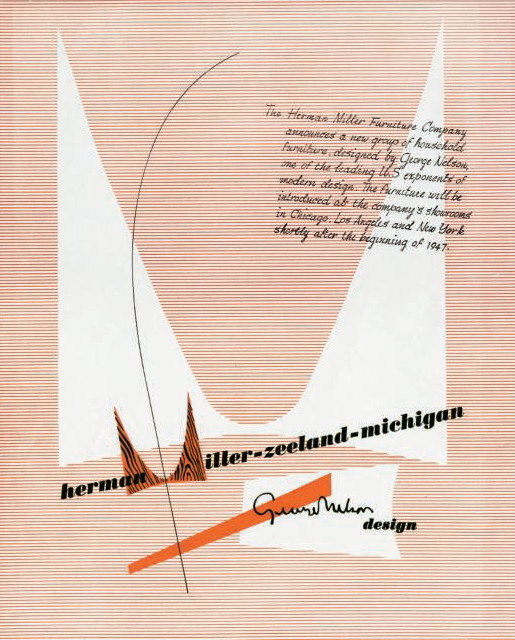
“At the end of 1946, Herman Miller’s director of Design George Nelson faced two important deadlines,” explains our book Herman Miller: A Way of Living. “As the new director of design for Herman Miller, he needed to complete the design and production of his first furniture collection for the company. Next, he had to produce an ad for the collection before its January 1947 launch in the firm’s Chicago showroom. But Nelson had a major problem: there wasn’t product photography ready to use in the ad.
“Over the previous year and a half, Nelson and his associate Ernest Farmer had worked tirelessly to ensure the furniture collection would be finished in time. Creating assets for an advertising campaign had not been a top priority.”
Nelson turned to one of the company’s newest employees, the industrial designer Irving Harper. “Despite Harper having no formal graphic design experience, his first assignment was to create the aforementioned print ad for Nelson’s debut collection,” explains our book. “Without photography, he attempted to communicate what Herman Miller was, what the company sold, and where customers could buy it.
“While the lack of imagery posed a significant design challenge, it was also an opportunity to respond to a lingering request from Herman Miller founder D. J. De Pree to create a new trademark for the company. Nelson initially recommended Paul Rand for the job, but for unknown reasons the relationship never progressed.
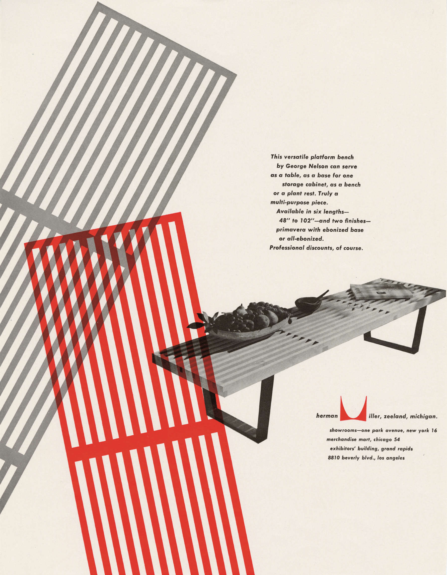
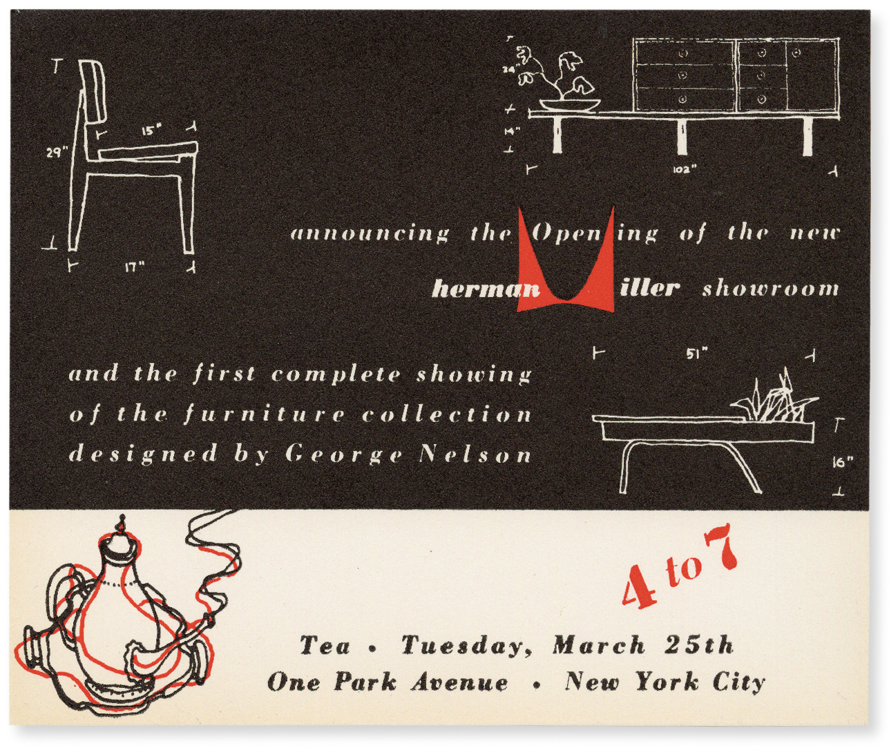
“Using a French curve, Harper rendered a stylized M and placed it within the Herman Miller name that was typeset in Bodoni Bold Italic. A larger M was silhouetted in the background of the ad, further establishing it as a singular mark. To communicate what the company made—wood furniture—Harper applied a wood-grain pattern onto the small M. Herman Miller’s previous advertising budget only allowed for black and white printing, but Nelson pressed De Pree to invest in an additional color ink, and red was selected. When asked in a later interview why he chose the color, Harper responded blithely, ‘Because I liked it.’”
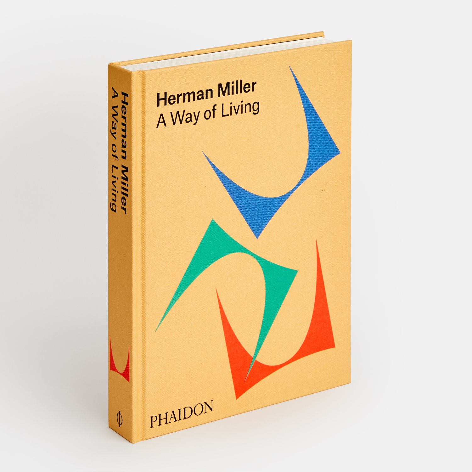
The whole design process took less than an hour, and 73 years later, that stylised M remains in use, making it one of the cheapest, and most effective visual branding exercises in history. To see just how wide a variety of products Harper’s trademark has helped sell, order a copy of Herman Miller: A Way of Living here. The trademark is on the cover, but don’t worry, there’s plenty of beautiful photography inside too.