INTERVIEW: 'The Rihanna cover image is obviously instantly iconic. You will always remember that cover and that image'
Jonathan Barnbrook and Marwan Kabour on typography, technology and not being chopped off by Instagram
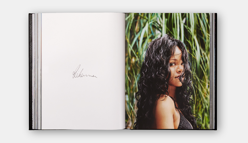
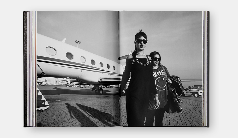
Our new book, Rihanna, is a stunning visual autobiography, revealing, via intimate photographs, the star’s life as an artist, performer, designer, and entrepreneur.
That life might be lived on private jets, stadium stages and the front rows of Fashion Weeks around the world, but the book itself was designed and laid out in the unassuming London studios of Barnbrook, one of the world’s leading independent creative design studios.
It was there that senior designer Marwan Kaabour had the huge but highly enviable task of turning these candid images into a compelling, revelatory narrative. In this interview, Marwan and the studio’s founder Jonathan Barnbrook, explain why they wanted to show the global superstar’s more vulnerable moments - as well as the starry ones.
“If you look at the book you will see that her beginnings were anything but glitz and glamour. Looking at it you really do recognise and appreciate the amount of hard work she has put in, from very early on,” says Marwan. “To see where she has arrived really is astonishing.”
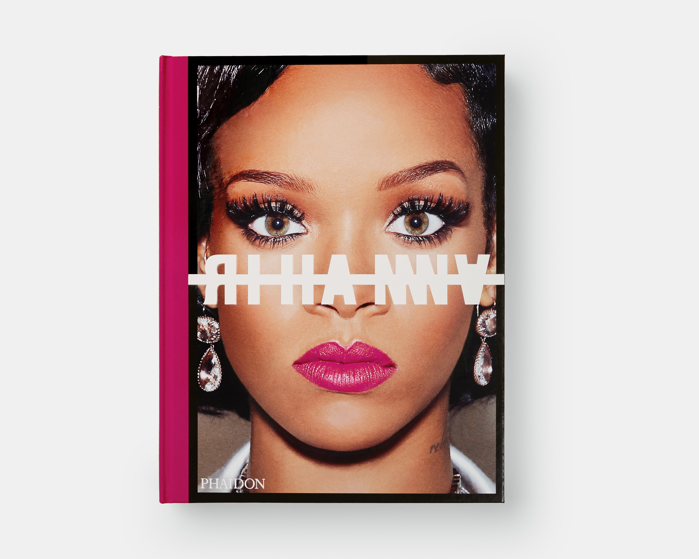
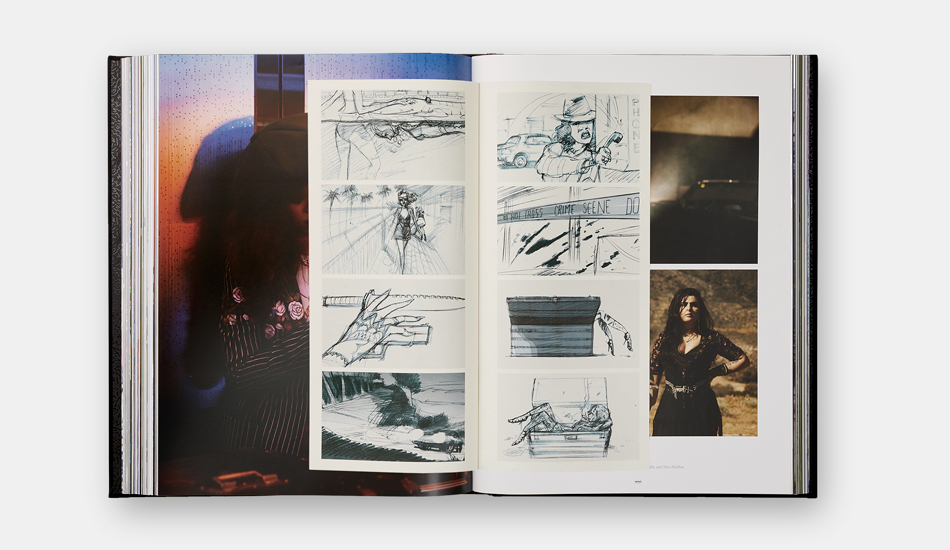
Impeccably produced, the sumptuous 504-page book contains 11 special inserts, including a removable poster, and 7 gatefolds. The cover features a stunning color photograph and wrap-around cloth binding and comes in a printed black carrying case.
Barnbrook (founded by Jonathan Barnbrook) designed the interiors, typography, and cover for the large-format Rihanna which measures: 12-5/8 x 16-1/2 inches, and includes more than 1,000 photographs, many published for the first time. The studio’s contribution to design was recognized with a retrospective at the Design Museum in London in 2007 and a Grammy Award in 2016 for David Bowie’s Blackstar record cover artwork.
Here is the third and final part of our three part interview with Jonathan and Marwan at Barnbrook.
We suspect we know the answer to this one but did you look to other photography books for inspiration?
M: “I wouldn’t say so. I would say Rihanna has so much that is in her universe to look at that it was enough for us to use as our starting point rather than shift our focus somewhere else! The huge pool of material was very much the inspiration. But maybe we did look at books that had something to say beyond the first level. Looking at books that provided an alternate way of looking or reading; books that had tip-ins and inserts and fold outs. We were looking at them as ways of expressing the narrative more than for aesthetic inspiration.”
Did you have an idea of where the design might possibly go before seeing the incredible amount of imagery that makes up the book?
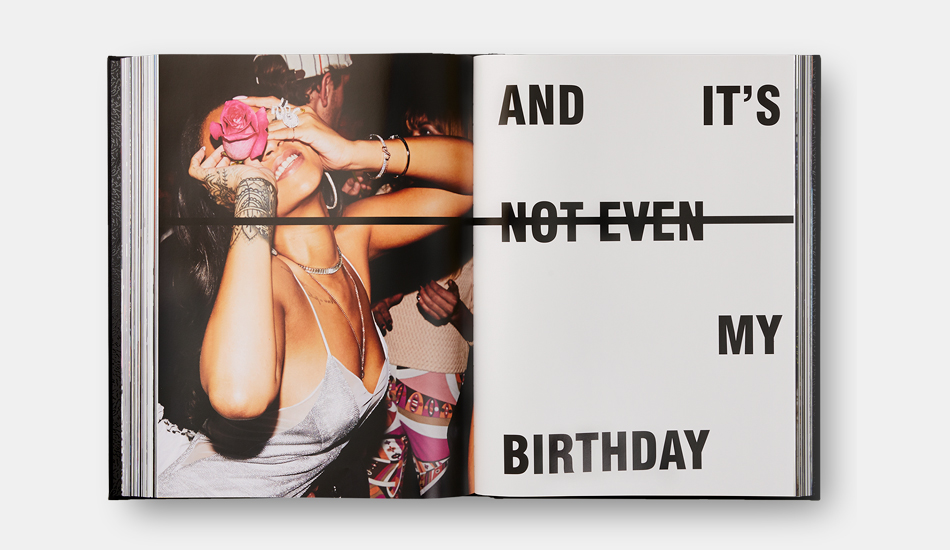
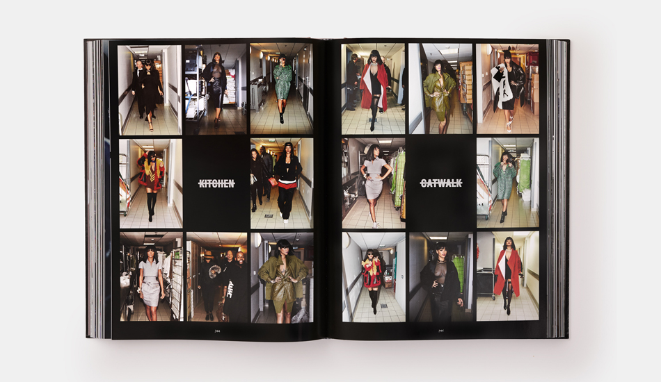
M: “I wouldn’t say so. In the beginning we just had a hard drive with a ton of images and our aim was to create a sense of narrative and then the text at some point seemed like a very natural companion to the images. We quickly realised we needed not just timid caption-style typography at the bottom of a page, we needed something that is much more vocal - like she is. That’s when the idea of having a typographical element that is very much at the forefront of the design began to lead us to where we are now.”
J: “Something that’s fundamental to the typography of this studio actually is this idea of making a mark on paper but also negating it as well. It’s the same thing with a personality. Whether it’s Rihanna or somebody else, it’s all about that person. So you’re making this bold statement but you’re taking something away as well. You have to have something to link all the pages, about the idea of shock and the negation of personality as well.
“Whether it’s an album cover or whether it’s a book there has to be a central theme to link everything together. I hate calling designs like this a branding project but it has to work conceptually first.”
The book features different paper stocks, tip ins, fold outs – so many cool devices - how did you decide on the correct ratio?
M: “It should be the right amount for it to remain an exciting and layered and complex object without it becoming too disruptive. We didn’t want to interrupt you every other page. In the end it was just a case of exhausting all the different options and going through them until we decided on the right amount. It was very much a dialogue.”
Books now have to work on social media as well as on a bookstore table – how did that affect the cover art for this book?
J: “I think the typography was certainly a response to that. It had to be quite robust and strong to go through all these different viewing platforms. Current technology means that things have to work in different kinds of media – from the lowest common denominator to the highest. For record covers and books now, we look at the cover quite small to see how it might work. Because a lot of people just see the end product at postage stamp size – they don’t see the real thing. They don’t go into a record shop or a book shop.”
M: “And the Rihanna cover image is obviously instantly iconic. You will always remember that cover and that image with the text together.”
J: "And Instagram can’t chop off the cover typography because it’s right in the middle!”
In addition to the large-format edition of Rihanna ($150 USD), Phaidon and Rihanna have collaborated with The Haas Brothers on two limited editions. Twin brothers, Nikolai and Simon, founded the Haas Brothers in Austin, Texas. Their work explores aesthetic themes related to nature, science fiction, sexuality, and psychedelia. Their first solo museum exhibition was held at the Bass Museum of Art in Miami, Florida and their pieces are held in the collections of the Metropolitan Museum of Art, LACMA, and RISD Museum.
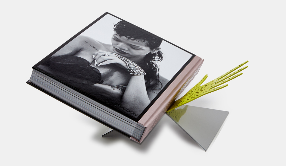
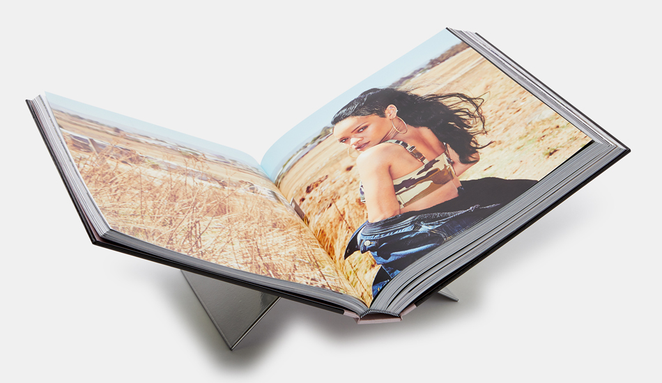
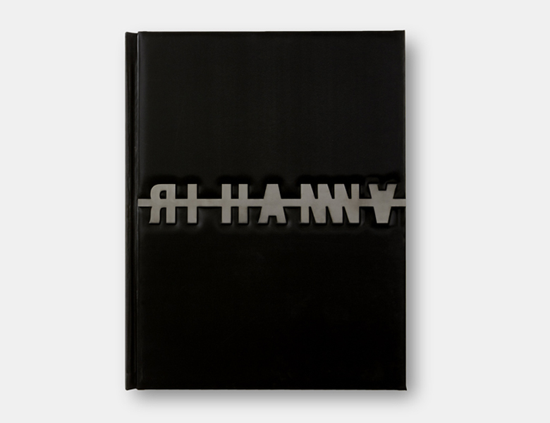
The Rihanna: Fenty x Phaidon edition featuring "This Sh*t Is Heavy" ($175 USD) version includes a copy of the book with a unique cover by Barnbrook that features two black and white photographs and a cloth binding, as well as a Haas Brothers designed, steel tabletop bookstand inspired by Rihanna’s hands and finished in matte, powder-coated green and mirrored silver chrome. It's available here.
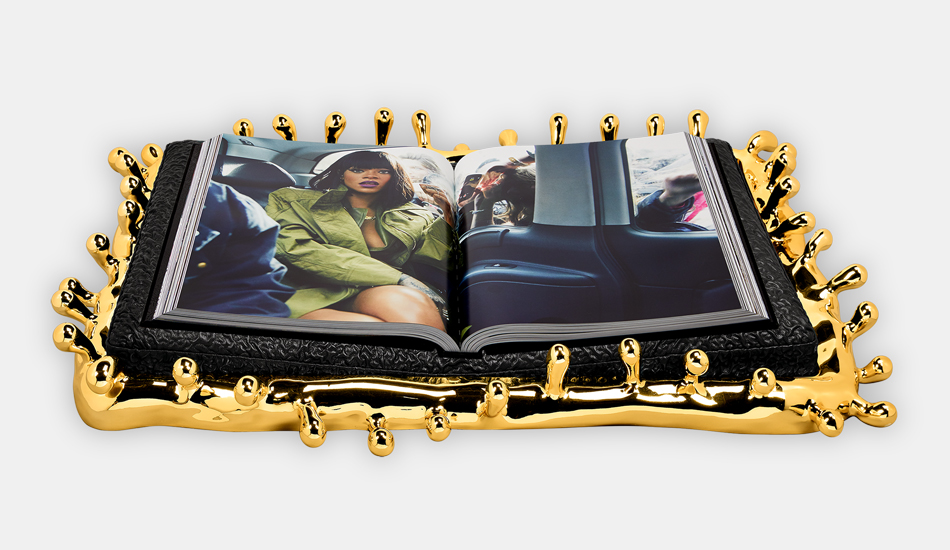
A third and very limited edition of the book, Rihanna: Luxury Supreme featuring "Drippy + The Brain" edition ($5,500) is signed and numbered by Rihanna and The Haas Brothers. The book for this edition is bound in a custom-made black fabric with an inset, matte black, laser-cut steel logo inset into the front cover and completed with a cast-resin tabletop bookstand covered with a bespoke black vermiculated fabric. The book and stand together weigh 126 pounds. It's available here.