Phaidon Introductions: Michael Bracewell on Harland Miller
The critic and curator sees pop art, abstract expressionist influences and much more in the artist’s pictures
Is Harland Miller a hard artist to ‘read’? Certainly, some of the texts on his canvases can be seen and understood in seconds. Yet, as the critic, curator and cultural commentator Michael Bracewell explains in his introduction to our new Harland Miller book, Harland Miller: In Shadows I Boogie, these titles are really just the beginning of a much deeper journey.
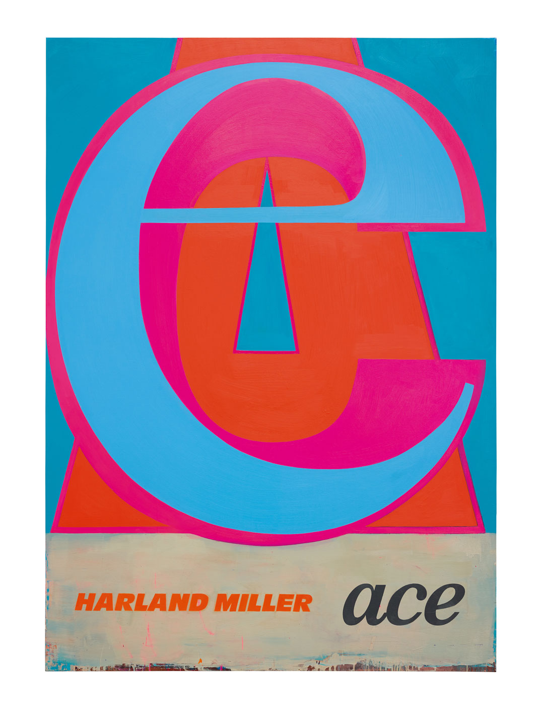
“Harland Miller is known as the creator of figurative paintings and works on paper, many of which depict the iconic designs of Penguin paperback books and bear the artist’s name as author, with the fictitious title of each being wittily deadpan, punkish and aphoristic,” writes Bracewell in his guest essay, Delicious Around the Edges: Formalism and Surface in The Paintings of Harland Miller.
“Miller began making paintings according to this template during the 1990s, establishing a visual language that was confrontational, compelling and could draw the viewer into an immediate, entertaining and quick-fire relationship with each work. Coolly fatalistic titles such as Death – What’s In It For Me? or Armageddon – Is It Too Much to Ask? may appear to define the temper of Miller’s vision as an artist, but on closer consideration are revealed as more complex pictorial and formalistic devices.
“The ‘punchline’ aspect of Miller’s art can be seen as a mask or alibi for his sustained enquiry into the capacities and processes of painting as a medium. The literary wit of his subject (the comedy of each book title) thus performs the function of the ‘Socratic lure’: a means, through a device of rhetoric not dissimilar to charm, of drawing an interlocutor first into engagement and then agreement with the actual concerns and arguments being advanced.
“Miller makes works primarily in oil on canvas and watercolour and pencil on paper. An early painting in oil, Bridlington – Ninety Three Million Miles from the Sun (2002), can be seen to introduce the formalistic and plastic values that have remained central to Miller’s work, developing in complexity and depth – likewise in feeling and psychology – from one series of paintings to the next. Bridlington… measures more than two metres (six feet seven inches) in height. The scale of the work is imposing, rendering the dimensions of a paperback book monumental and confrontational.
This opens the picture plane for Miller, allowing space for the layers of painting, staining, dripping and overpainting to appear simultaneously graphic, as regards their representational role, and expansively and intuitively abstract. Replicating the livery of an early Pelican paperback (an imprint of Penguin specializing in educational books, primarily history, social sciences and psychology), this painting first confronts the viewer with louring, dulled and dirtied shades of blue and white, and with the imprint’s distinctive sans-serif typography. Bridlington is a coastal town in Miller’s native Yorkshire, and these dulled hues propose all the drear flatness, relentlessly bad weather and melancholy often ascribed to run-down or out-of-season British seaside resorts.
“The rain-swept ‘shabbiness’ evoked by the painting technique thus seems to pass as much comment on the named place as does its title. Studied more closely, the painting is revealed to be densely worked and layered, animated by drips and stains of paint and sudden passages of muddy ochre or darkened, murky blue.
The effect is brooding and psychological – Rothko-like yet stormy. The top half of the painting – in which the ceremonially encircled ‘Pelican Books’ banner can be partially discerned, as though through dense smog – presents a stormy band of dirty blue. This blue is, in turn, comprised of several layers of overpainting, in places abbreviated or gesturally ‘abandoned’, leaving the rough edges of the brushstroke at the point where the brush is lifted from the canvas. A crimson-tinged brown – mean and dour – exists beneath the blue, serving as the tonal backdrop of the entire painting, sustaining its abject mood.
“The graphic devices of the book cover are equally complex in terms of gesture, overpainting, density and surface values. The horizontal brushstrokes comprising the basis of the dirty white band that bears the book title are roughly compressed on the left and unfinished on the right. Rivulets and drips of paint descend across the centre of the band, with a yellowish-brown stain just off-centre in the middle of its lower half. Beneath this, the staining intensifies to the left, and the varying densities of colour – blue, dark blue, damp-tarpaulin brown – appear to descend like a stormy sky over the ascending pelican that is the imprint’s logo. The lower edge of the painting is dominated by further drips and smears of paint, with both the horizontal and vertical brushstrokes seeming aggressive and abbreviated.
Ultimately, the representational central area of the painting, pictorially, becomes utterly subordinate to the moody abstract expressionism from which it seems to sulkily emerge. Such complexity of layering and underpainting of broad, abbreviated, gestural brushstrokes, creating variances in light and dark, ‘heavy’ and ‘thinned’ tones, is intrinsic to Miller’s painting style. Throughout, the graphic devices of the book covers seem merely the vehicles for this expressiveness. Ironically, it is the constancy of Miller’s subject matter – its apparent repetitiveness as a format – that provides him with a vehicle to make successive, deeply felt and intuitive explorations of the painting process itself, the sensibilities of which are each distinct, profoundly and emotionally animated.
“In one regard, the art of Harland Miller conforms to the tradition of Romantic irony, a concept introduced by the German writer and philosopher Friedrich Schlegel (1772–1829). In it an artwork possesses the dual nature of being at once in earnest and in jest – indeed its artistic resolution derives the precise balance of these two qualities. In Miller’s case, there is the additional irony that his intense artistic engagement with formalism, surface and materiality embraces the totality of each work – including the graphic devices of lettering, livery and design that comprise the slogan-titles that first arrest the viewer’s gaze.
The book cover subjects of Miller’s paintings possess the power to beguile and seduce that is common to Romantic art. Coolly slick, their fictitious titles and Miller’s name as author define a classically modern Romantic position, proposing heroic and mock-heroic attitudes of ironic self-deprecation, as stooge of abject fatalism. Their pictorial sensibility – as paintings of words, as opposed to simply painted words – is a hybrid of figurative Pop cool (the depersonalized depiction of mass-produced products epitomized by Andy Warhol’s early work) with the psychologically attuned sensibility of Abstract Expressionism (such as that pioneered by Robert Rauschenberg during the 1950s) and Geometric Abstraction (defined by Frank Stella’s works of the early 1960s).
"What on initial viewing might appear fast and pointedly flippant is revealed on closer scrutiny to be academic, formalist and impersonal, rather than aphoristic or declamatory – concerned above all with surface, texture, colour, form and materiality – the very stuff of paint, its malleability and nature. The ‘subjects’ of Harland Miller’s paintings might thus be viewed and experienced as objects: sensory rather than intellectual, agents of plastic values, at once autonomous and particular to Miller’s vision, and responsive to a historical lineage of artistic enquiry into painting, especially the formalist qualities of the medium. Miller’s residence in the United States during the 1980s and early 1990s, and his consequent first-hand experience of American painting in museums and galleries – Abstract Expressionism, Pop, Post-Painterly Abstraction and Colour Field – would have informed his developing ideas. The confluence of impersonality and engagement with surface in relation to subject that is common to many of the American artists working in these styles is of particular relevance to Miller’s art.
The idiomatic ‘Britishness’ of Miller’s literary vision – the ‘kitchen sink-realism’ resignation and dour pugnacity of many of his ‘titles’, laden with sharp vernacular, local and colloquial references – is thus formalistically depersonalized by the painting process and given new artistic purpose in a painterly visual language, rich and diverse, that is inherently American. Similarly, the book cover designs on which many of Miller’s paintings are based bring with them a sense of cultural-historical time travel, thanks to their references to the period between the mid-1950s and late 1970s during which these series of books were in commercial circulation as new books. At one level, they evoke – with their own strange poetry, skewed by mordant wit – a vanished world and the nostalgia attendant on the contemplation of old books. The seductive poetics of archaic modernism, therefore, further nuance Miller’s pictorial language.
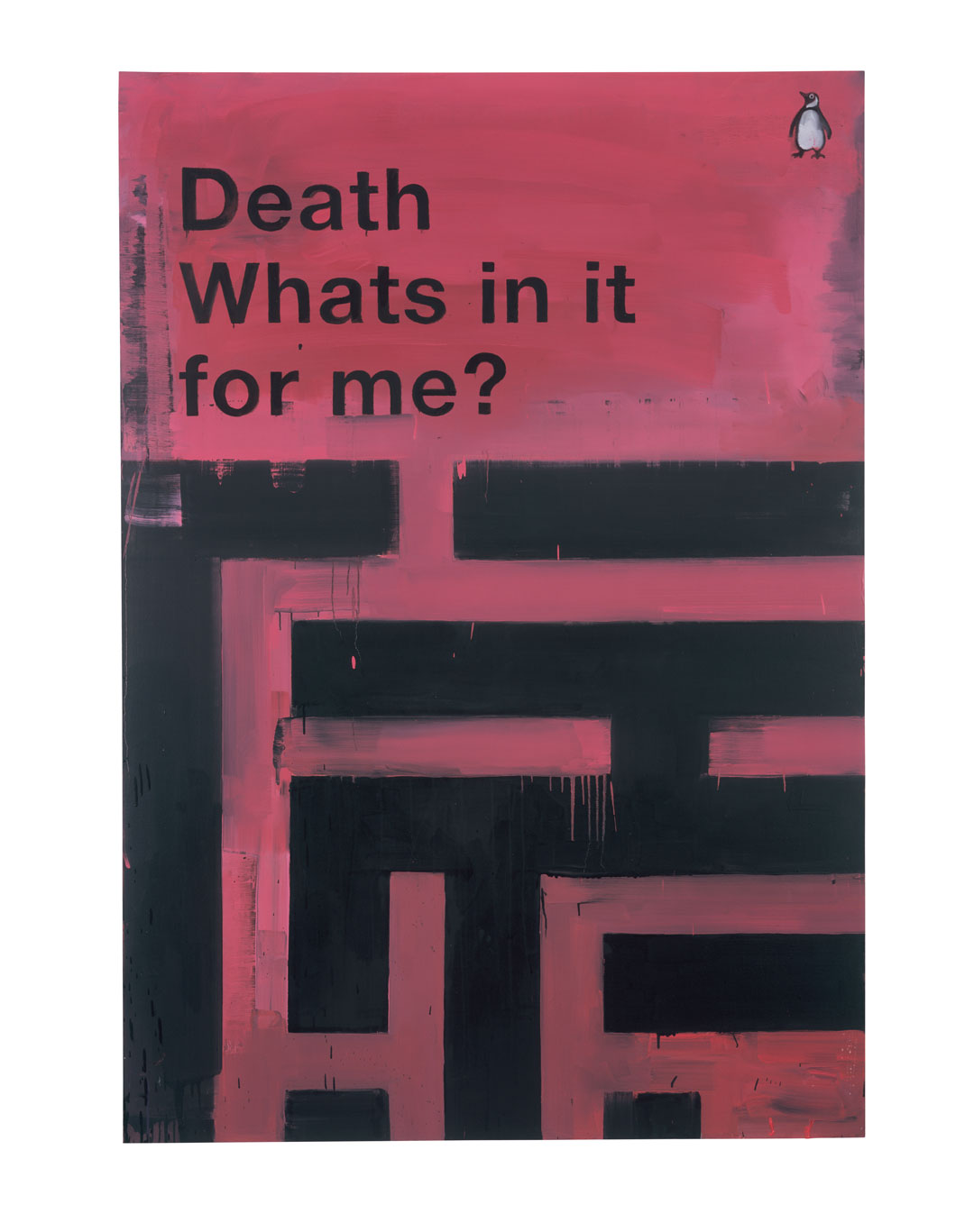
“Death – What’s In It For Me? (2011) exemplifies these variations. In portrait format and large scale, this work depicts a brick-red book jacket on a ‘dirtied’ white background. The first word of the title – ‘Death’ – is painted in bold, black, sans-serif capital letters, declamatory within a frame of four concentric, alternating off-white and brick-red lines, the colours of which reverse at the top left and bottom right corner of the frame. The style of the ‘frame’ is reminiscent of Frank Stella’s geometric minimalism of the early 1960s – all symbolism, ‘meaning’ and illusionistic effect withdrawn, leaving only flatness, form and colour. The subtitle to Miller’s painting – ‘What’s In It For Me?’ – and the Penguin logo seem graphically and pictorially to add a more personalized element, but these too are coldly rendered.
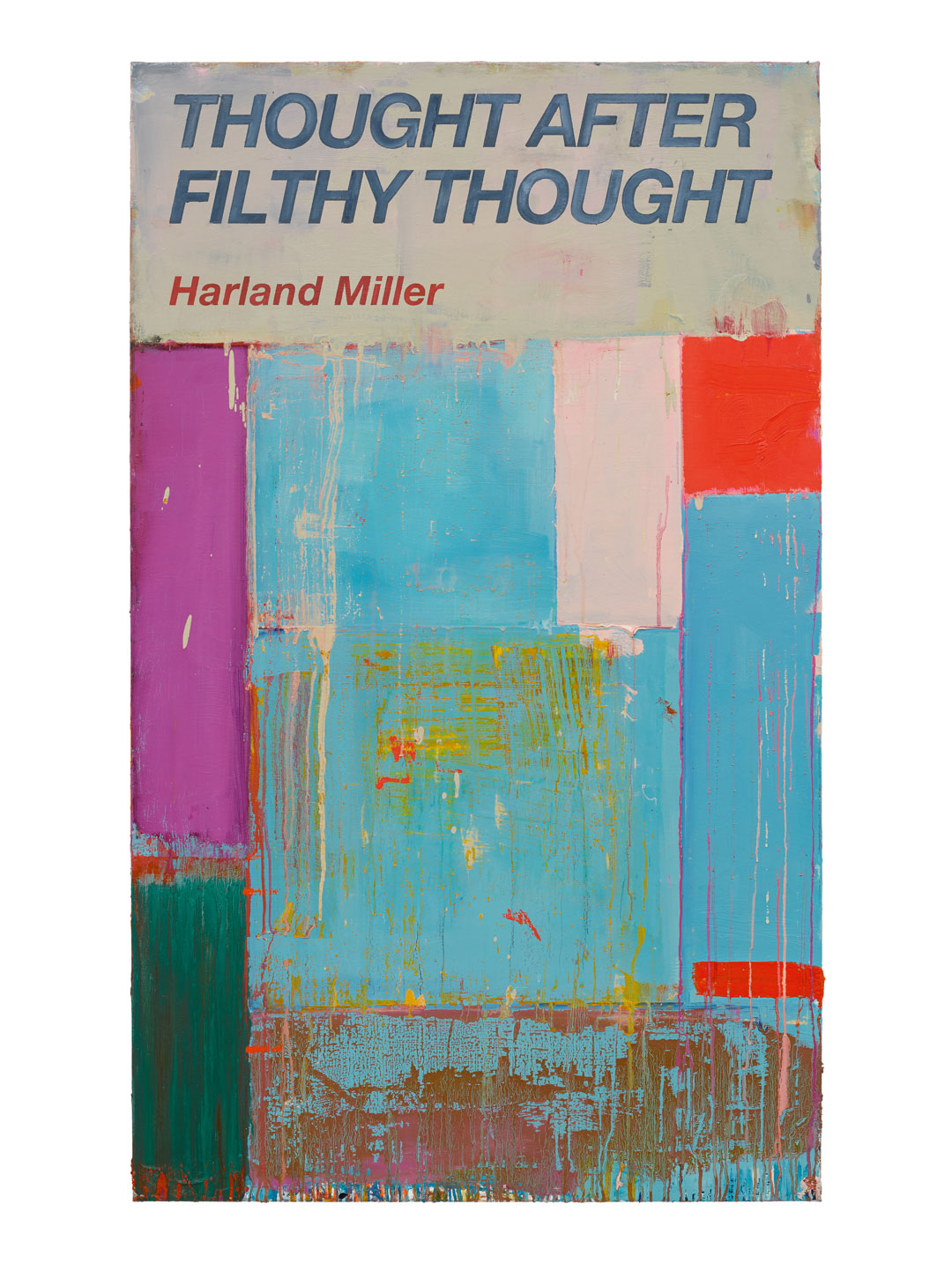
“The fiery orange-red and dirty-bandage white, emblazoned with black lettering in the upper half, appear time-stained and tonally battered – trailing pale brownish rivulets of paint from the lower edge of the book cover, semi-obscured by crudely cloud-like passage of white. What is asserted, formalistically, is the idea of the subject, pictorially, being less a representation than a venue for the processes of painting.
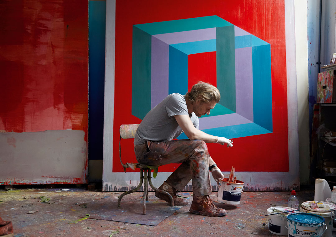
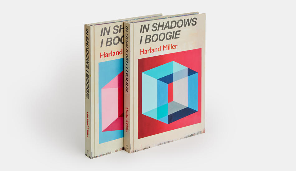
"Other paintings... In Shadows I Boogie for example, or Immediate Relief… Coming Soon are alternately dominated by painterly excursions into densely worked abstraction, abutting squares and oblongs of heavily scraped and overpainted pale or muddied colours, such as Thought after Filthy Thought, and vibrantly Pop-synthetic, three-dimensional geometric forms, reminiscent of architectural modules. While the cultural commentary, literary wit and sociological insight of Miller’s artistic vision has been long acknowledged, these attributes seem better considered as agents of a more complex, formalistic and psychological project, exploring the processes of painting and the materiality of paint itself.” To take that exploration further, order a copy of Harland Miller: In Shadows I Boogie here.