Why Harland Miller's paperbacks are like Andy's soup cans
The artist has consumed and appropriated Penguin's paperbacks - just like Andy did with Campbell's cans
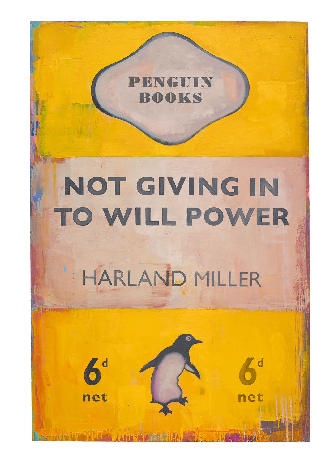
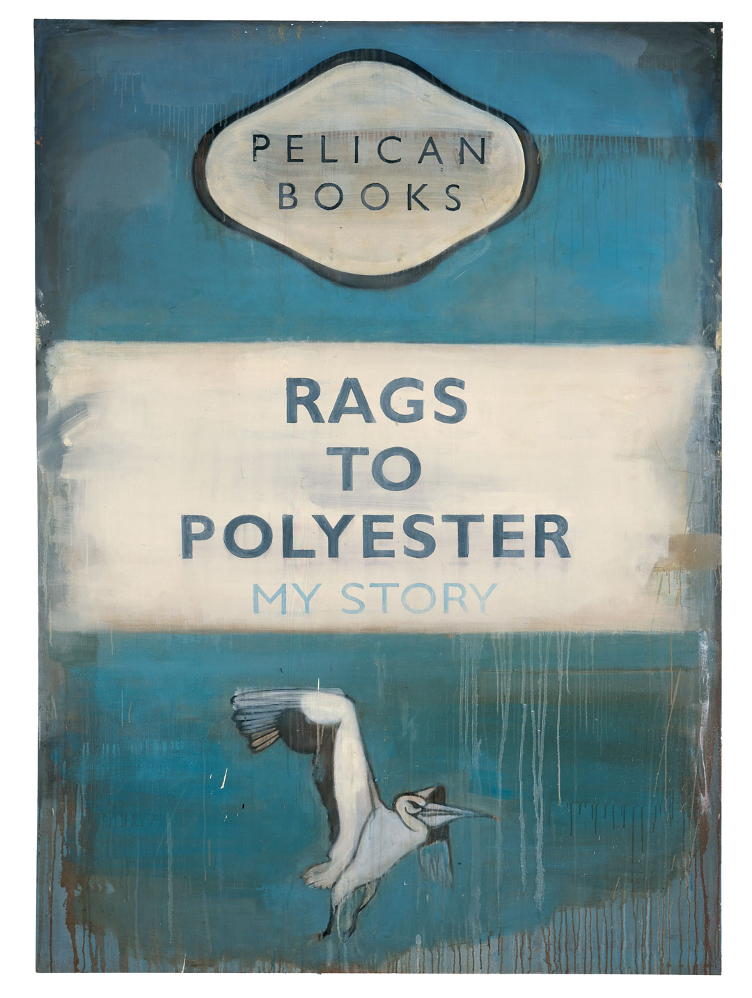
The British artist Harland Miller was living in Paris in the early 1990s when he first fell in love with Penguin paperback book covers. “I found a box of books outside a French secondhand bookshop in Notre Dame,” the artist says in his new book, Harland Miller: In Shadows I Boogie. Miller noticed how the design of those Penguin classics threw the focus onto the title of the book, exactly what he wanted to do in his art.
Miller had already been experimenting with text and wordplay in his paintings, and appreciated the simple, mid-century British designs because they emphasized the letters on the page. However, he would not have been unaware of the fondness those paperback designs enjoyed within the reading public’s collective memory.
“The brand image was established through this series of books and has become, in the public imagination, a British design icon as immediately identifiable as Harry Beck’s London Underground map, the Routemaster bus, Giles Gilbert Scott’s red telephone box or the Mini motorcar of Alec Issigonis,” writes Catherine Ince, Senior Curator at the Victoria and Albert Museum, in our new book.
While in Paris, Miller both appropriated the covers, and also devoured the books, somewhat like an earlier artist – who claimed he ate his favourite brand of canned soup every day for twenty years.
“I suppose it was a bit like Andy Warhol’s Campbell’s soup cans being about what he ate for dinner every day,” Miller says, “these Penguins were what I ended up reading every day, because I was living in Paris and I’d bought a bunch of them second-hand.”
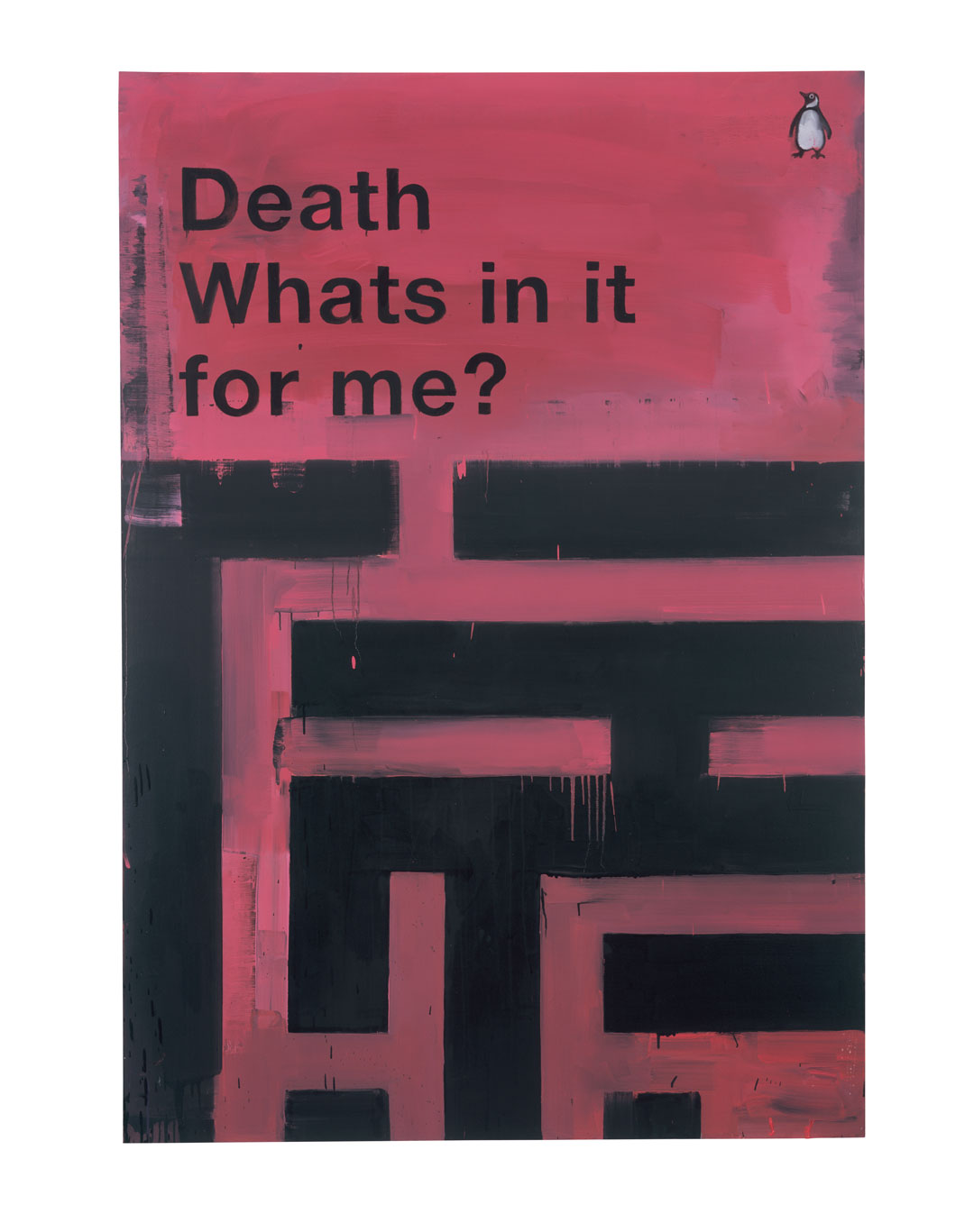
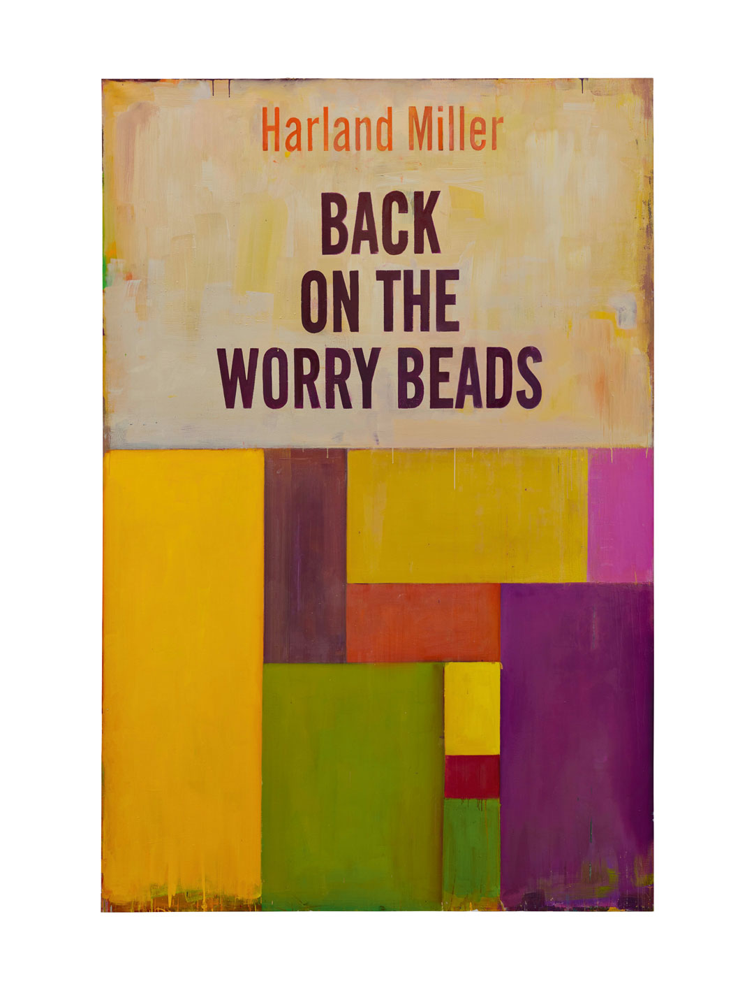
However, Miller, unlike Warhol, didn’t just stick to one original, book design. Instead, he explored Penguin’s wider back catalogue, drawing on the later, post-war versions, produced by better-known graphic designers, such as Jan Tschichold and Germano Facetti.
This all-encompassing appreciation for a publisher’s output leads Ince to draw comparisons with another British artist. “Miller’s respect for the Penguin brand can be compared to Richard Hamilton’s similar study of the constructed identity of [German consumer electronics firm] Braun products,” she writes. “Like Miller, Hamilton drew on the world around him and explored the varying forms of popular and consumer culture of the day across disciplinary boundaries.”
And there are American mid-century inspirations in Miller’s work too. “Miller cites Ed Ruscha as an influence,” she writes. “The American artist’s exploration of the material culture of popular, mass-produced products or American post-war design subjects was rooted in his training and experience in commercial art practice.Works such as Annie (1962) or Actual Size (1962, p.40) are painterly renderings of American products where the word is emphasized for impact.”
But while Ruscha and Hamilton’s work throws emphasis on the bright new commercial opportunities of the post-war world, Miller’s art, created half a century later, seems to hark back to a more egalitarian age.
After all, Penguin books were cheap; initially just sixpence and, as Ince notes, “Penguin became synonymous with the socially democratic ambitions of the era and revolutionized access to high-quality writing, making it affordable and available to everyone.”
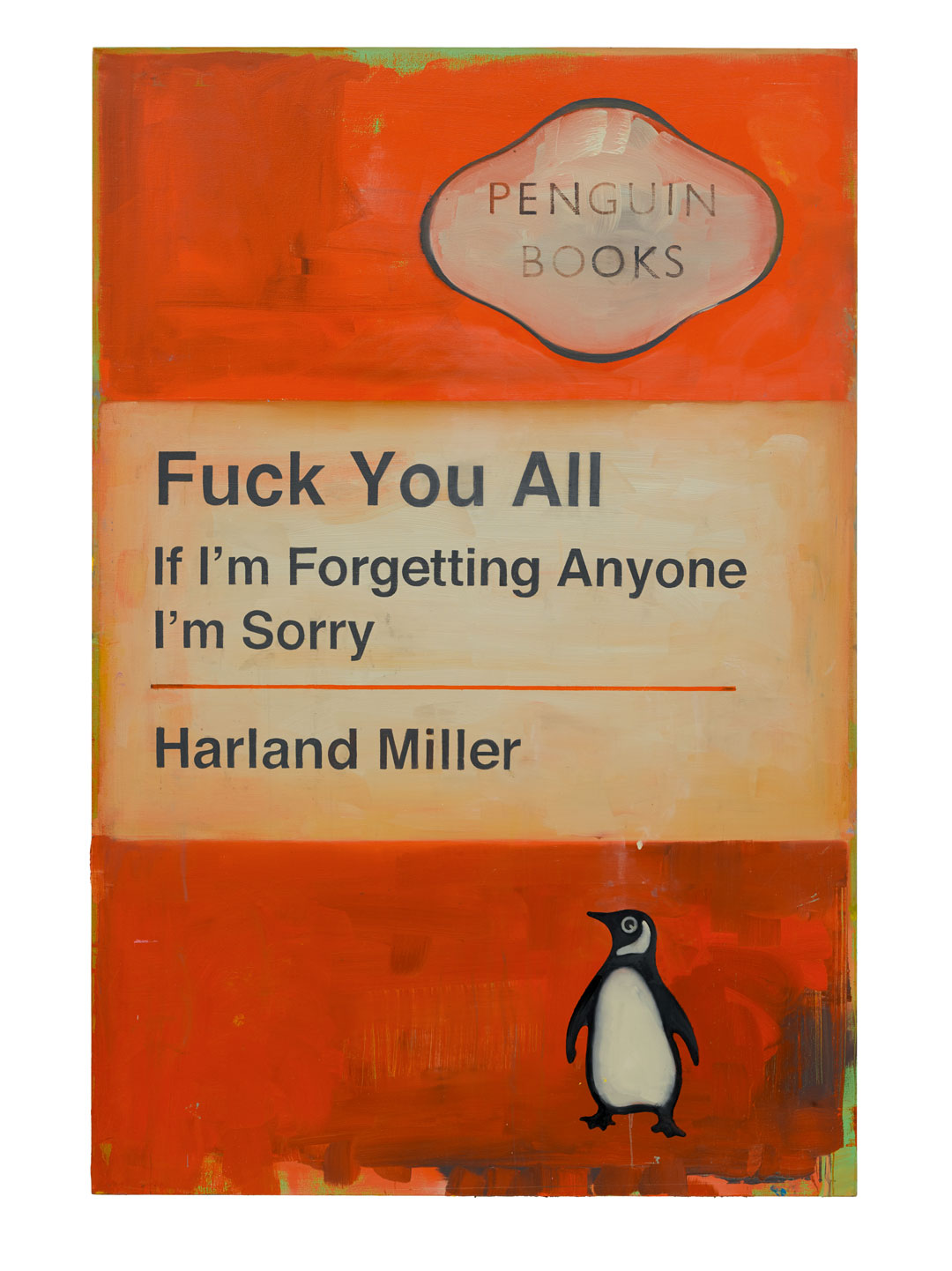
That spirit may have passed, but Penguin remains progressive enough to allow the artist to have fun with its covers. “After a lengthy exchange and a meeting at Penguin headquarters in London, the company decided to embrace Miller’s conceptual project,” writes Ince, “eventually commissioning him to make work for the company and giving him access to their archives.
The publishers may have regonised that, as with Warhol’s soup cans, a little art-world notoriety can be good for sales, although it isn’t hard to detect some British magnanimity, open-mindedness and sense of fair play in the words of John Makinson, chairman of Penguin Random House who said that “although it’s obviously his take on the Penguin design heritage, it is amazingly true to the spirit of the Penguin cover. They’re sardonic, playful, ironic - but mostly they’re rather beautiful images.”
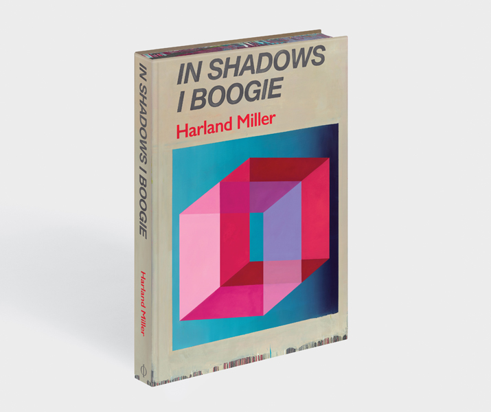
For more on the meaning and beauty in those images buy a copy of Harland Miller: In Shadows I Boogie here.