So why do people of the Twenty-First century still wear a Rolling Stones logo from the Twentieth?
Problem Solved author Michael Johnson on the enduring appeal of a look photographed by Hans Eijkelboom
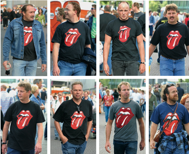
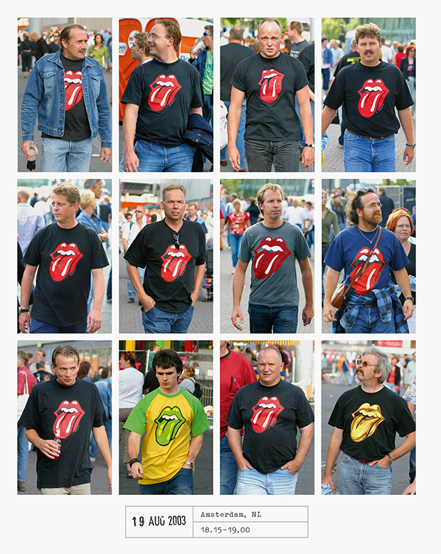
"Looking at Hans Eijkelboom’s collection of gridded up look-alikes in ‘People of the Twenty-First Century’, one set of images is particularly striking. A group of twenty-something to middle aged men proudly display an odd-looking, bulbous illustration of lips and a tongue on their t-shirts. Had you just beamed down from another galaxy, you might be wondering why so many gentlemen were all advertising the same brand of lipstick, or ice-cream, or were making a less-than-subtle, come-hither sexual advance.
It is, of course, almost impossible to decode the meaning of this infamous symbol in any traditional way. Just as a scribbled red signature has become synonymous with a white-bearded entrepreneur, and white, red and curvilinear script symbolic of a brown fizzy drink, we see these lips, think of a lead singer with a pillowy pout and hear one the world’s most famous rock bands in our heads. Even in a world which examines the sexual antics of the seventies in increasingly forensic detail, few people would look at this symbol and think of any of that – it's become the visual mnemonic that simply says 'The Rolling Stones', without resorting to any words.

John Pasche’s famous illustration bears all the hallmarks of the late sixties/early seventies design. Only a few years after Wes Wilson’s iconic typographic posters in San Francisco, there’s a hint of psychedelia in the curves. But it's also a frontrunner for the bulbous, eclectic and vernacular-retro style that would come to dominate seventies graphics, until Punk delivered a well-aimed Doc Marten up the backside of the music establishment later in the decade.
And the logo might never have happened at all. Mick Jagger phoned the Royal College of Art in 1969, looking for a young designer to design a tour poster, allegedly unhappy with the ideas proposed by their then record label, and in 1970 Pasche’s initial four-year stint designing for the band began. So, just to put that into perspective, that’s a little like Bono calling the front desk of Central Saint Martin’s next week and asking to speak to someone in the graphics department.
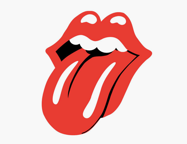
The lips themselves first saw the light on the inner sleeve of Andy Warhol’s equally iconic ‘Sticky Fingers’ album sleeve design and caused some confusion – some people still cite Warhol as the symbol’s designer. Whilst Warhol’s zipped cover might get the plaudits for cover design, Pasche’s lips swiftly became the band’s iconic logo and has been in use, and on tour, for over four decades, racking up countless merchandise sales along the way. He initially got paid £50 for the design, followed by £200 two years later (that’s roughly £1500 in today’s money.)
There's no hint of a royalty deal – just imagine what he could have earned if he had ‘done a George Lucas’ (who waived his Star Wars directing fee for a cut of the profits and the licensing rights). But in a move being emulated by several other record sleeve designers from vinyl’s golden era, Pasche was at least able to realise some of the ‘lost’ income by auctioning his original artwork for the lips for $92,500 (which was purchased by the V&A in 2008).
If Jagger's lips hadn't made such a visceral impression on Pasche that fateful day in the band's offices, it's unlikely that the design would ever have happened. Apparently Jagger had suggested using Kali, the Hindu goddess (whose tongue is also resolutely stuck out), but Pasche had the sense and chutzpah to swap the goddess for someone closer to hand. And in one simple step the weekend wardrobe of millions of ageing rockers the world over was resolved."
Keen for more words of wisdom from the creative director of innovative design agency Johnson Banks, Michael Johnson? Then read our Ten Questions interview with him here, and check out his great book Problem Solved in the store. Meanwhile learn more about the conceptual street photography of Hans Eijkelboom here. And if you want a Mick Jagger frankfurter recipe from back in the day, (and why wouldn't you?) you'll find that here . . .