Michael Bierut on reworking George Nelson
The Pentagram partner opens up on his new version of the 1977 design bible How to See
There are some designs you are just not supposed to mess with. Until recently, George Nelson’s 1977 book How to See was certainly ranked alongside Mies van der Rohe's Barcelona Chair and the Coca-Cola bottle as the kind of works too perfect to mess with.
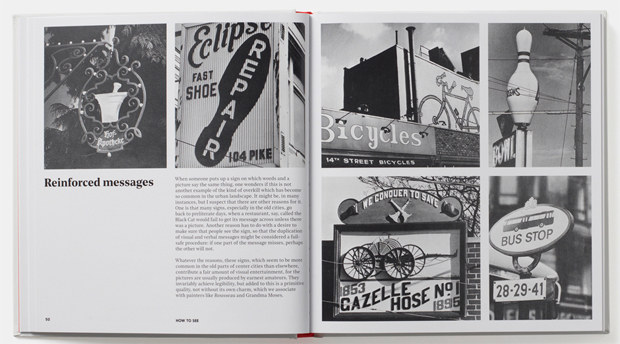
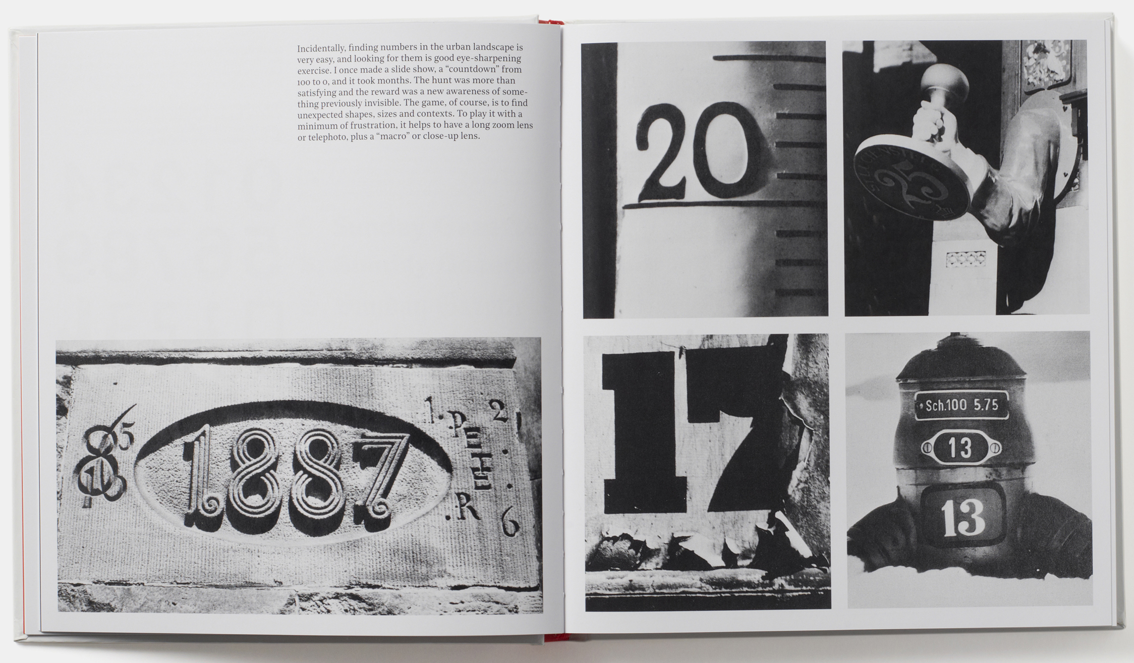
First published 40 years ago by the iconic American furniture manufacturer Herman Miller, Nelson's critically acclaimed book describes how to recognize, evaluate, and understand the objects and landscape of the man-made world so perfectly that it went on to influence generations of design professionals, students, and aficionados, including the leading graphic designer and Pentagram partner Michael Bierut.
When Phaidon asked Bierut to rework Nelson’s book for a 2017 audience he admits he was “kind of frozen in place for a moment, partly because I had so much respect for the original edition, while at the same time having so many reservations about its design.”
“The trick became creating a book that retains the direct quality, the bluntness and the forthrightness of Nelson’s original idea, but does it in a way that makes a beautiful book that could also be an object of desire to a certain degree,” explains Bierut in an interview over on Herman Miller’s site. “I’ve never done a project that had this weird combination of restoring an icon without just figuring out how to faithfully make it look exactly the way it used to.”
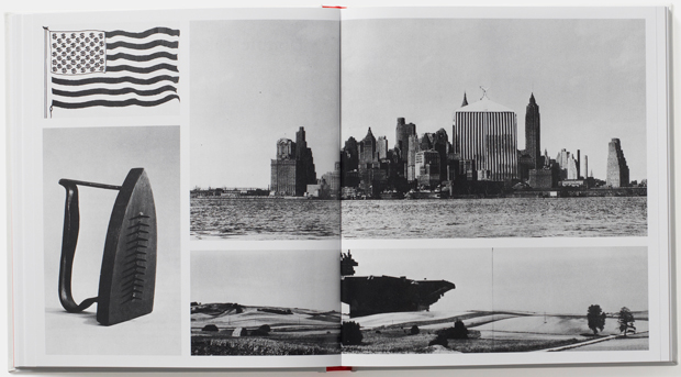
Bierut overcame this knotty design problem by resisting the urge to aestheticize the pages, “to not make it look like a fine art catalog,” he says. “Nelson clearly didn’t intend that. So we kept basically the same kind of ratio of image to words, and we kept the same simplicity of presentation of those images.”
Of course, we helped out too. “The publisher Phaidon did an amazing job of resourcing and rescanning the images," says Bierut. "And they look miraculously better than they look in the original book. It's a sensational printing job."
Yet much more of the credit goes to Bierut and his team who balanced careful considerations of beauty, utility and fidelity when updating this classic, which went right down to typographic choices.
“Another area where we did some real exploration was trying to figure out how much fidelity to have to the original typography, specifically the choice of fonts that Nelson and perhaps Chris Pullman — a teacher and mentor of mine who had worked with Nelson —had recommended for that first edition,” says Bierut.

In this way, Nelson’s four-decades old book worked its magic on the designer, forcing him to rethink all manner of aesthetic decision points.
“Not to get too meta,” says Bierut, “but this book really called on us to kind of interrogate the meaning of the visual choices that were made back in the mid 70s; we really tried to channel our predecessors. We didn’t try to make it into a book that looks like it was designed by me in 2017 - it was really trying to remaster the book while keeping the original intent clear.”
You can watch an interview with Michael below, and to experience and enjoy that remastering for yourself order a copy of the book here.