The colours that make HAY shine
Against a prevailing backdrop of Scandi neutrality, HAY has brightened our world with colourful, coherent products
When Mette Hay was a teenager, growing up in Denmark, she used to help out at her parents’ design store. The shop was called X-Akt, and it was located in the fairly remote Jutland city of Herning, about three-and-a-half-hour’s drive from Copenhagen.
Mette was sometimes tasked with the job of unpacking new deliveries from a wide range of different manufacturers, including Koziol, Magis, Authentics and Mandarina Duck. She took an interest in most of the products, yet one brand truly stood out for her: the Italian firm Alessi.
“It was their mix of colours, their broad selection of designers, all in these products designed with such humour,” she recalls in our new book on HAY, the world-renowned design firm founded quite a few years later by Mette and her life partner Rolf Hay.
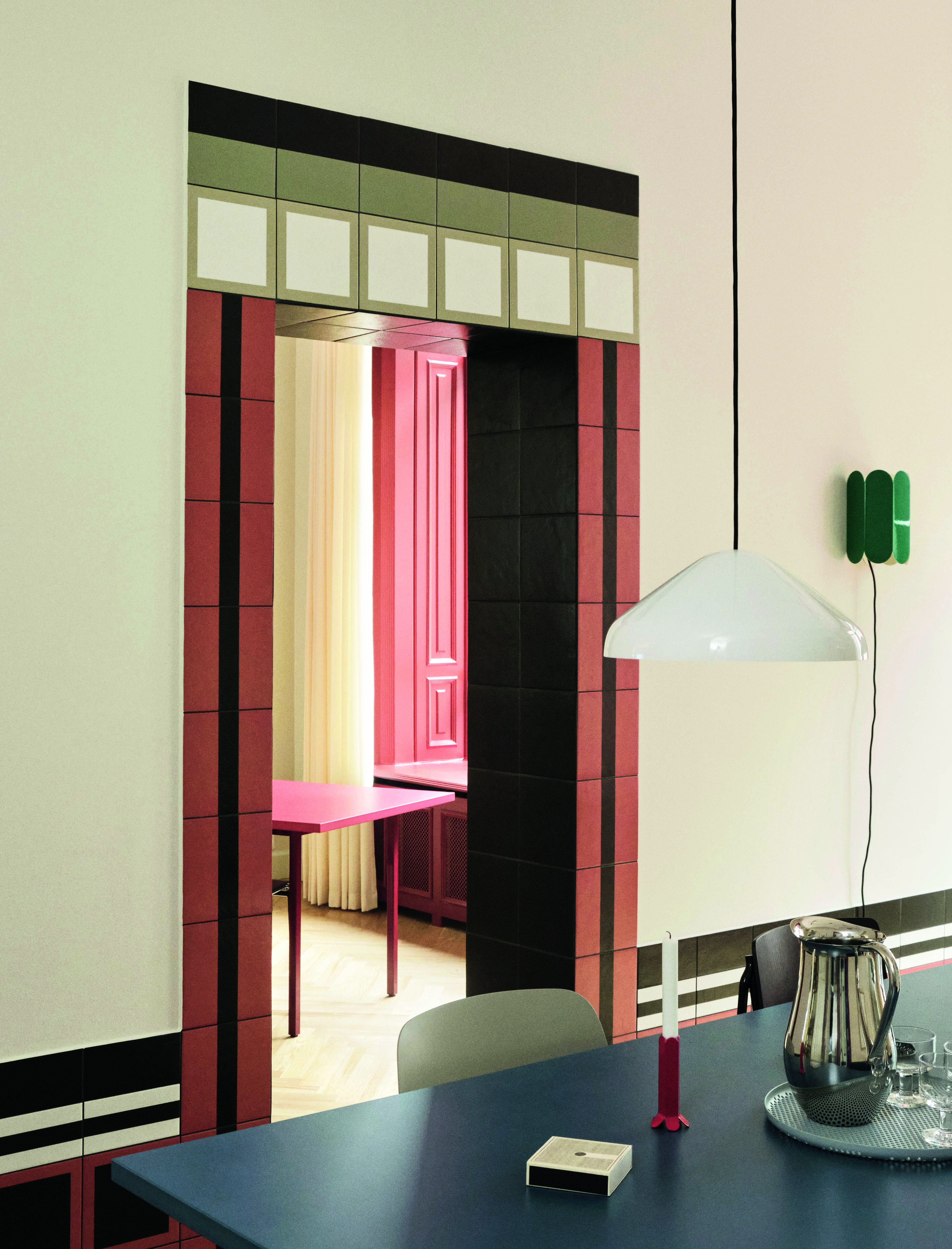
HAY House, 3 Days of Design, Copenhagen, 2021
Her interest in pigmentation wasn’t some idle teenage whimsy; Mette saw that X-Akt’s clientele also appreciated a little chromatic variation. “Colours bring customers into a shop,” she says in our new book, “maybe they enter because they’re drawn to the colour of a tea towel and, not so seldom, end up ordering a sofa.”
This embrace of colour ran contrary to the prevailing trends within Scandinavian design, which, as the British writer and design consultant, Tom Morris writes in HAY, were “well-behaved to the point of blandness.”
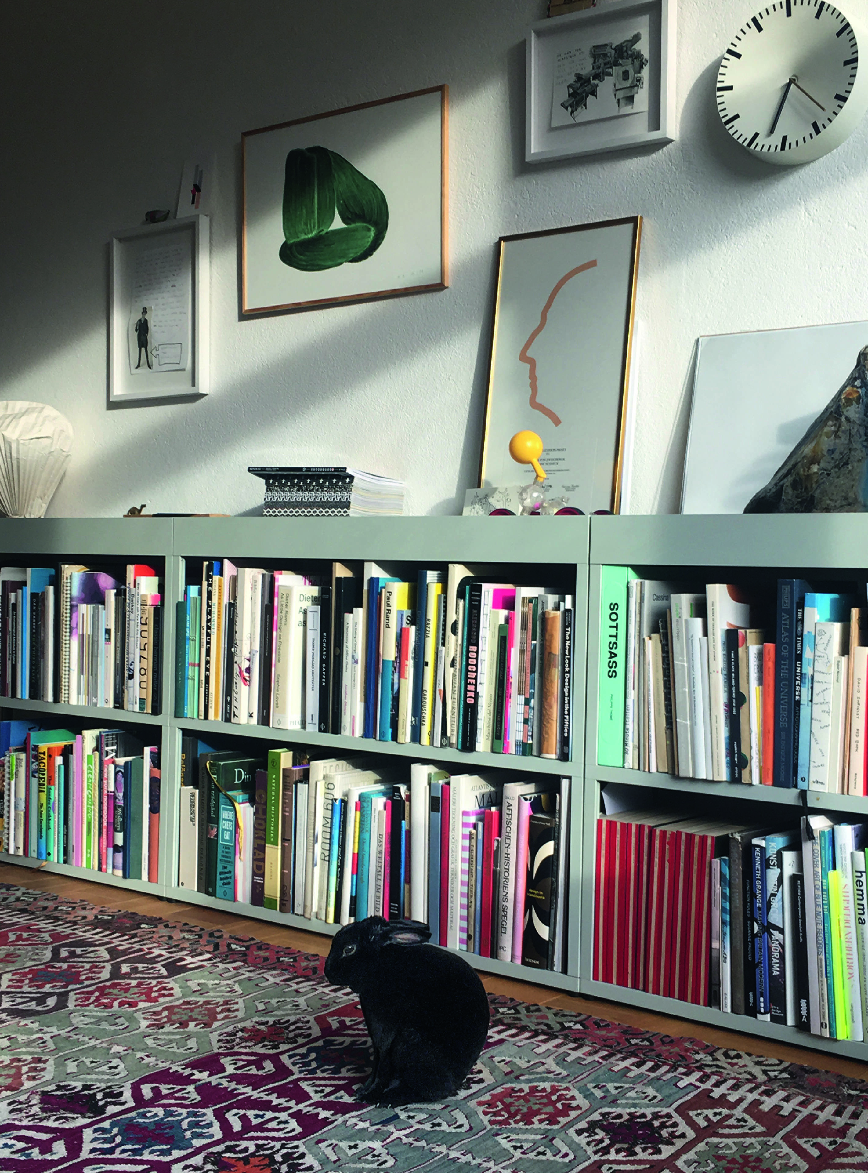
New Order Shelf in Clara von Zweigbergk and Shane Schneck's home, with their pet bunny, Skutt, 2017
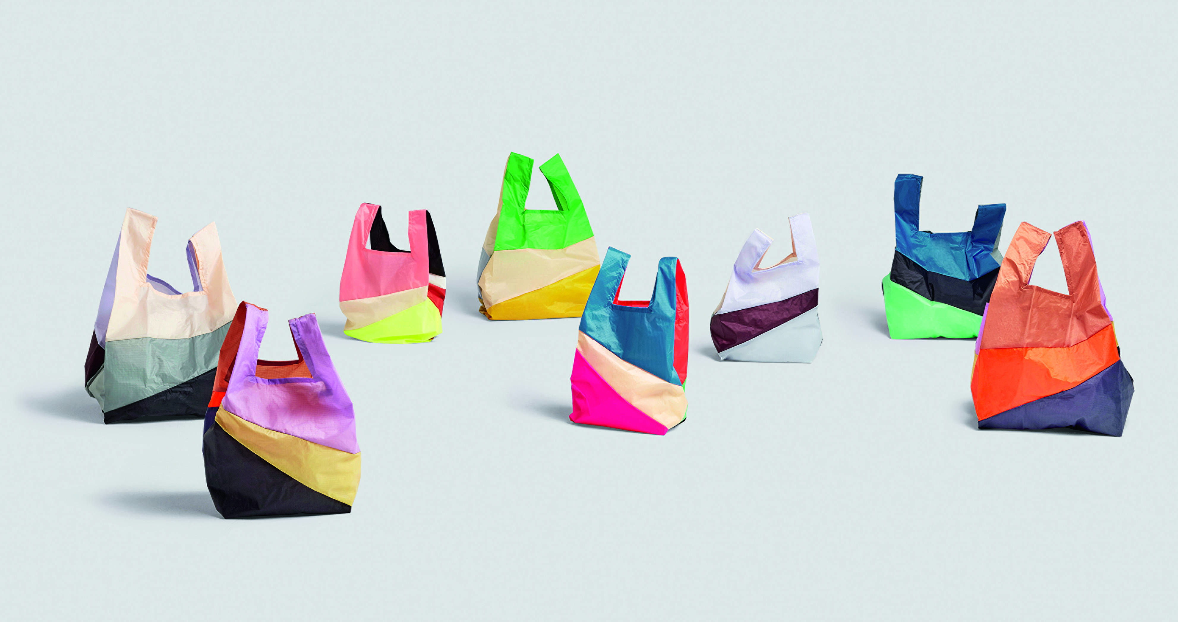
Against this background, HAY found a way to stand out. "Years later, Mette’s innate sense of colour combinations would help cement the company’s identity in the global marketplace,” writes Morris. “Whether it is the engine red of the New Order shelving system by Stefan Diez (2012), the deeply saturated marigold of Inga Sempé’s Matin Wall Lamp (2018), or the multi-coloured yarn wrapping a steel frame in Ana Kraš’s Bonbon Shade (2019), HAY’s collection of furniture and accessories has always shown an embrace of colour. And HAY’s unique chromatic sensibility – influenced by the spirit of mid-century Italian and North American design and driven by its founders’ passion and instinct – has always stood apart from the cool detachment of competing Scandinavian brands.”
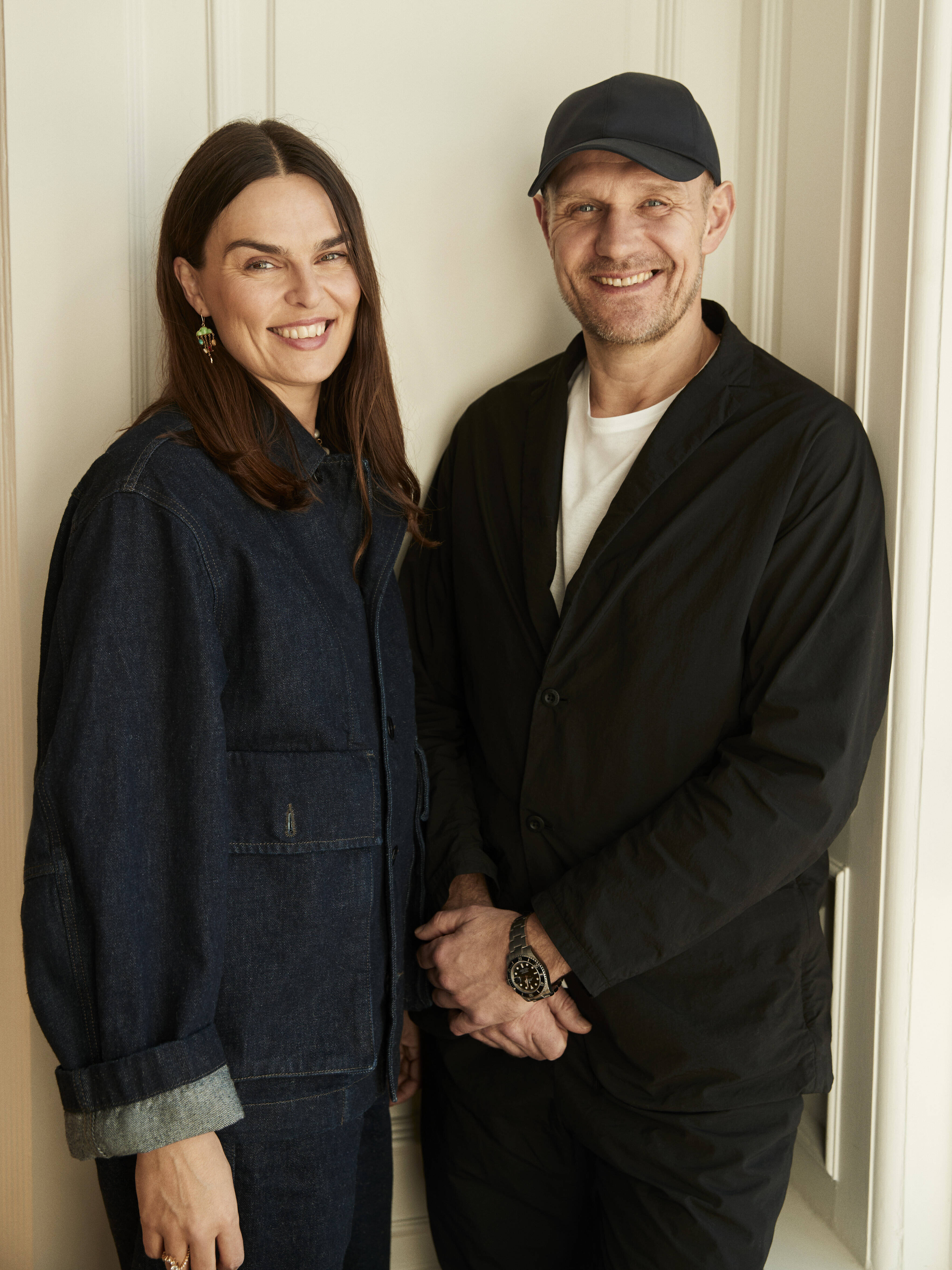
Mette and Rolf Hay. courtesy HAY
Despite HAY’s success, Mette doesn’t subscribe to any highbrow colour theory. Instead, she likens the choice of colourways to music. “A singer probably couldn’t describe how exactly they approach hitting a note,” she says. “The starting point is always a feeling.”
Whatever the process, Mette and Rolf are clearly virtuosos; the brand has offered everything from leaf green benches to mustard yellow chairs to multicoloured kettles. Within all this variation, they’ve never hit a bum note.
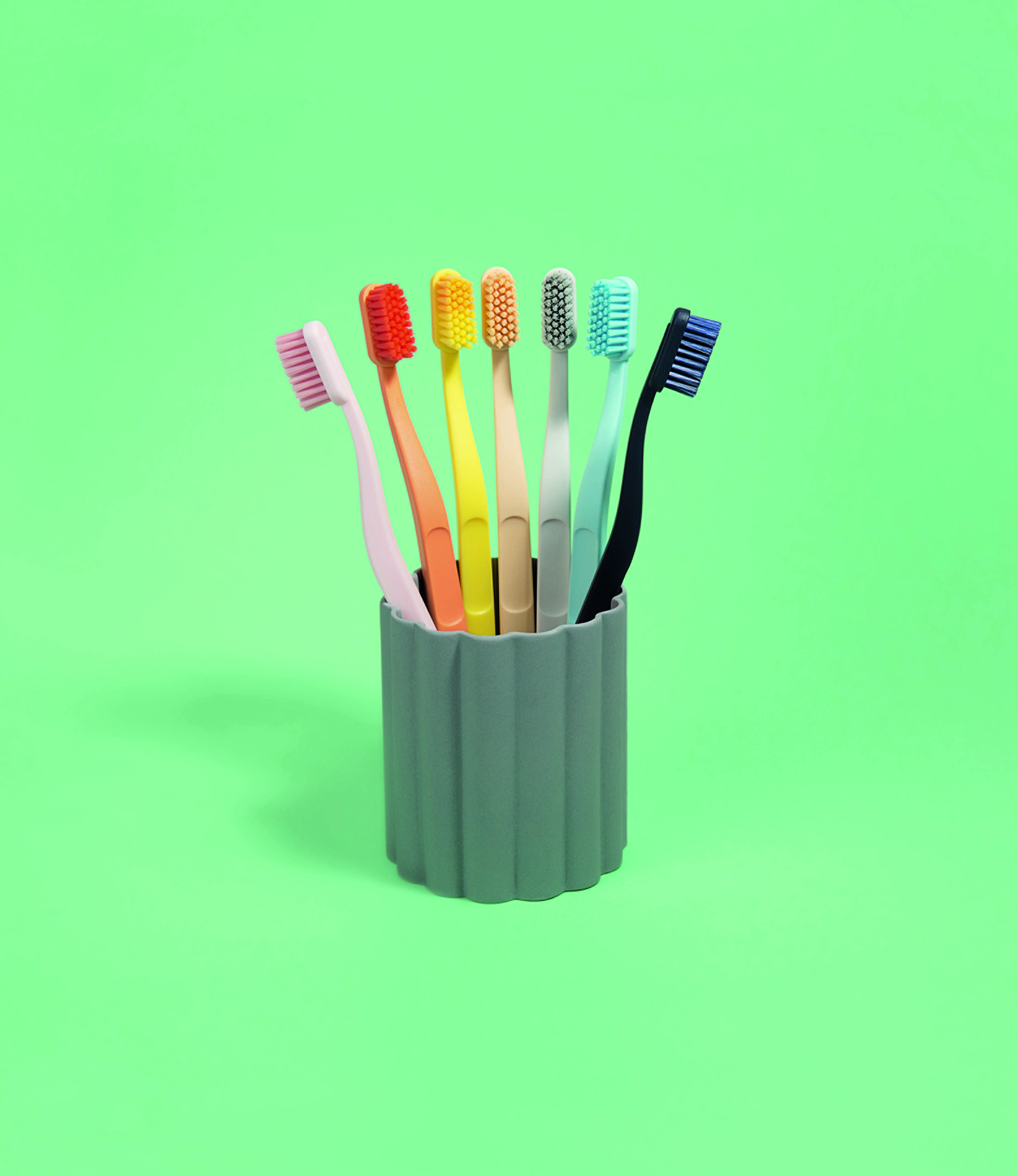
Tann Toothbrushes, Andreas Engesvik with Daniel Rybakken, 2016, from HAY
“Taking a broad view on the last two decades, it’s a marvel that the HAY catalogue doesn’t feel cacophonous,” writes Morris. “Instead, the broad colour application keeps its vast universe cohesive and characterful.”

HAY
To see more of that colourful cohesion, order a copy of HAY here.