Get more from pink – this year’s most disruptive colour
See this unruly shade through the lens of refined, Japanese culture, via Iro: The Essence of Colour in Japanese Design
When gazing into the future, it’s hard to see in colour. Towards the end of last year, Pantone, the colour guide company, proclaimed Very Peri, a blue hue with violet and red undertones, as the colour of the year for 2022. The rest of the world, however, had other ideas. Around the same time as Pantone was finalising its 2022 choices, Vogue picked out a bright, hot pink as the dominant colour within many Spring/Summer 2022 collections. Stars such as Kim Kardashian wore this fun, lively pigment; fashion houses, including Alexander McQueen, Versace and Dior, favoured it in their shows, and searches for the colour in shopping apps like Lyst rose precipitously.
How should we interpret this newfound preference for pink? Do we, in the West, really have the right tools to understand the pigment’s strength and significance? Or should we consult a very different culture when considering this worldwide trend? In her new book Iro: The Essence of Colour in Japanese Design, Rossella Menegazzo, Associate Professor of the History of East Asian Art at the University of Milan, sheds light on the way Japanese artisans have used different parts of the light spectrum over the centuries, from the ancient Jōmon period, right up to the present day. Pink might be having a moment in the West, but in Japan it’s always been rather popular.
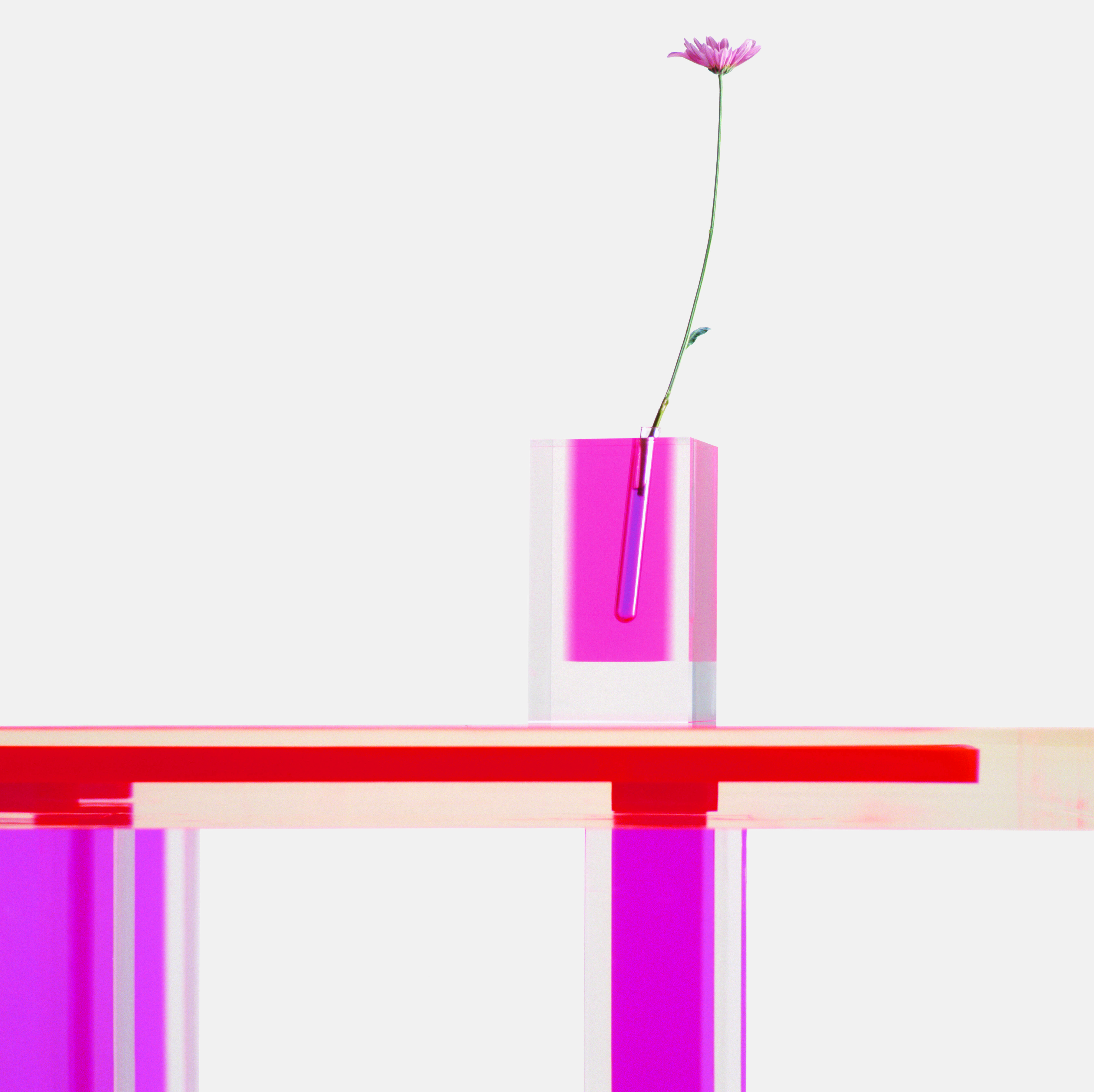
The book describes a number of different shades of the colour, including Ōtōiro or Cherry Blossom Peach. “Although known in English as cherry pink and in French as cerise, this colour’s Japanese name is a combination of the two kanji that denote the blushing fruits of the cherry and the peach,” writes Menegazzo. “This deep pink hue may have existed as early as the fifteenth century and is one of the most prized colours in Japanese culture, particularly in the sphere of textiles.” This doesn’t prevent it from being used in other products, such as this exquisite Shiro Kuramata vase (above), created back in 1989, during Japan’s boom years.

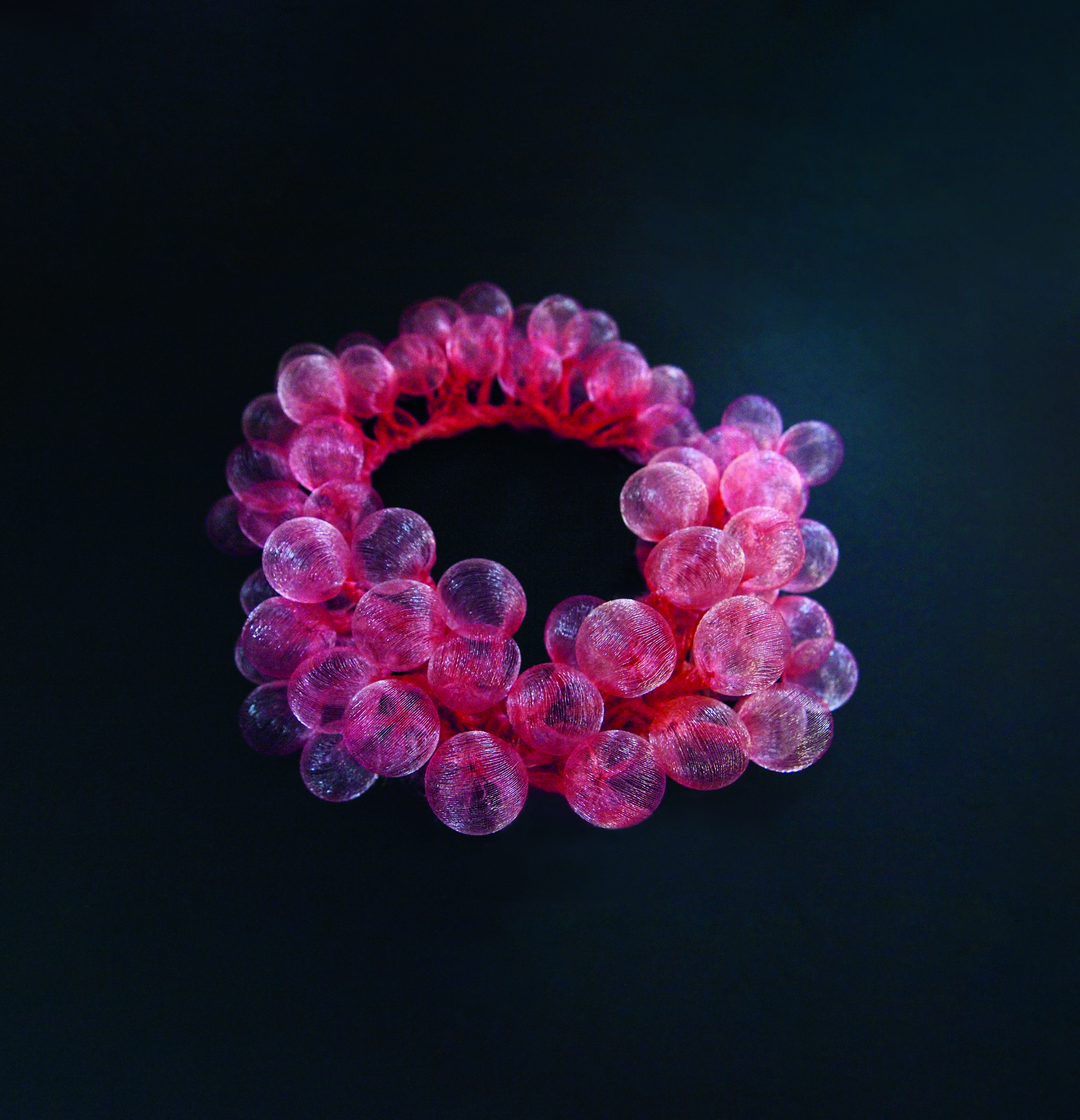
Pink Bubble Necklace, 2020, Mariko Kusumoto. Polyester
Moving just a notch or two along the colour wheel brings Menegazzo to Kōbaiiro or Plum Safflower Red, as exemplified in this polyester bubble necklace from 2020 (above). “The kanji (Chinese characters) that denote this colour refer to the red plum, in particular to the colour of the plum tree’s buds,” she writes. “Its early blossoms herald spring, making it one of the best-loved and most symbolic plants, to which many meanings have been attributed throughout history in both China and Japan. Kōbaiiro was among the most highly regarded hues used in the Kasane no irome, a ceremonial dress code that detailed how Heian imperial-court nobles should combine the layers of their robes to create colours that were appropriate for the season or occasion. This colour was achieved by layering a kōbaiiro outer robe over a suō (sappanwood red) under robe.”

Perhaps Kim and co can try some of that robe layering later this season. For more on these colours as well as a great deal besides, order a copy of Iro here.