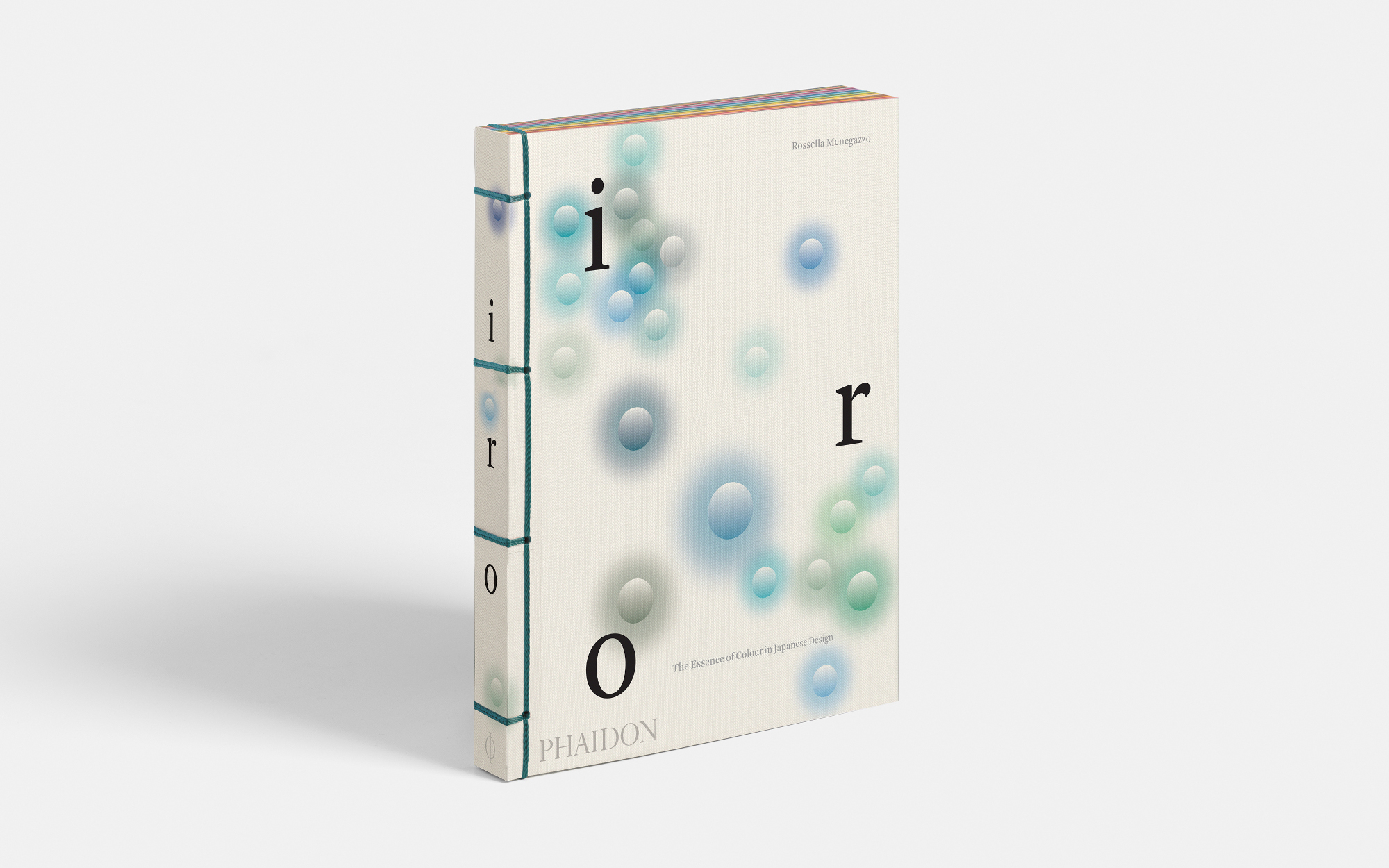
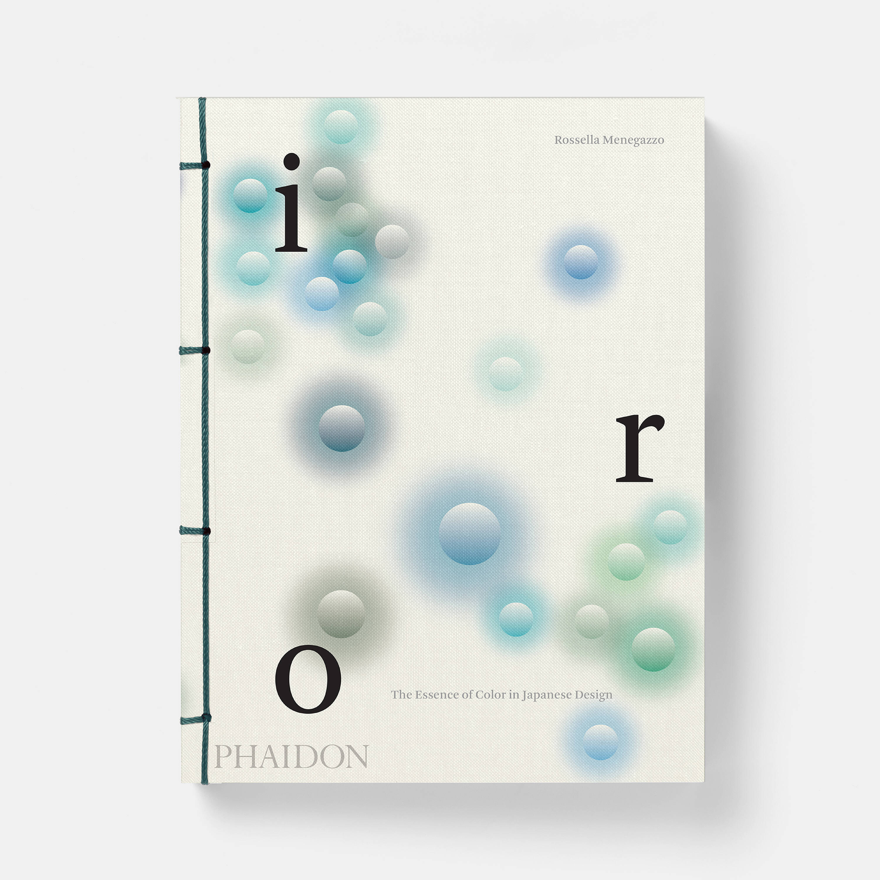
All you need to know about Iro: The Essence of Colour in Japanese Design
See pigments anew in the first and only book to present Japanese design through the colour spectrum
What’s Japanese for colour? The simple answer is ‘色’ or ‘iro’. The much longer answer is contained in our new book, Iro: The Essence of Colour in Japanese Design. You see, just as Japan takes a distinct approach to art, design, fashion and the culinary arts, so too does Japanese culture approach the colour spectrum in very different ways.
As Rossella Menegazzo, the Phaidon author and associate professor of the History of East Asian Art at the University of Milan, explains in this new title, colour has taken an integral role in the classification and demarcation of Japanese society and culture for hundreds of years, with courtly, aristocratic colours used to denote rank and hierarchy. Each era has brought with it different colour associations, and, with the advent of the modern age, these distinctive pigments have found their way into the manufactured world.
Pages from Iro: The Essence of Colour in Japanese Design
For a long time this distinct and highly nuanced system has remained opaque to many outsiders. This season, Iro brings it to everyone, via a carefully selected choice of 200 colours, individually drawn from, and sequenced according to, a reference catalogue called the DIC Traditional Japanese Colour Guide.
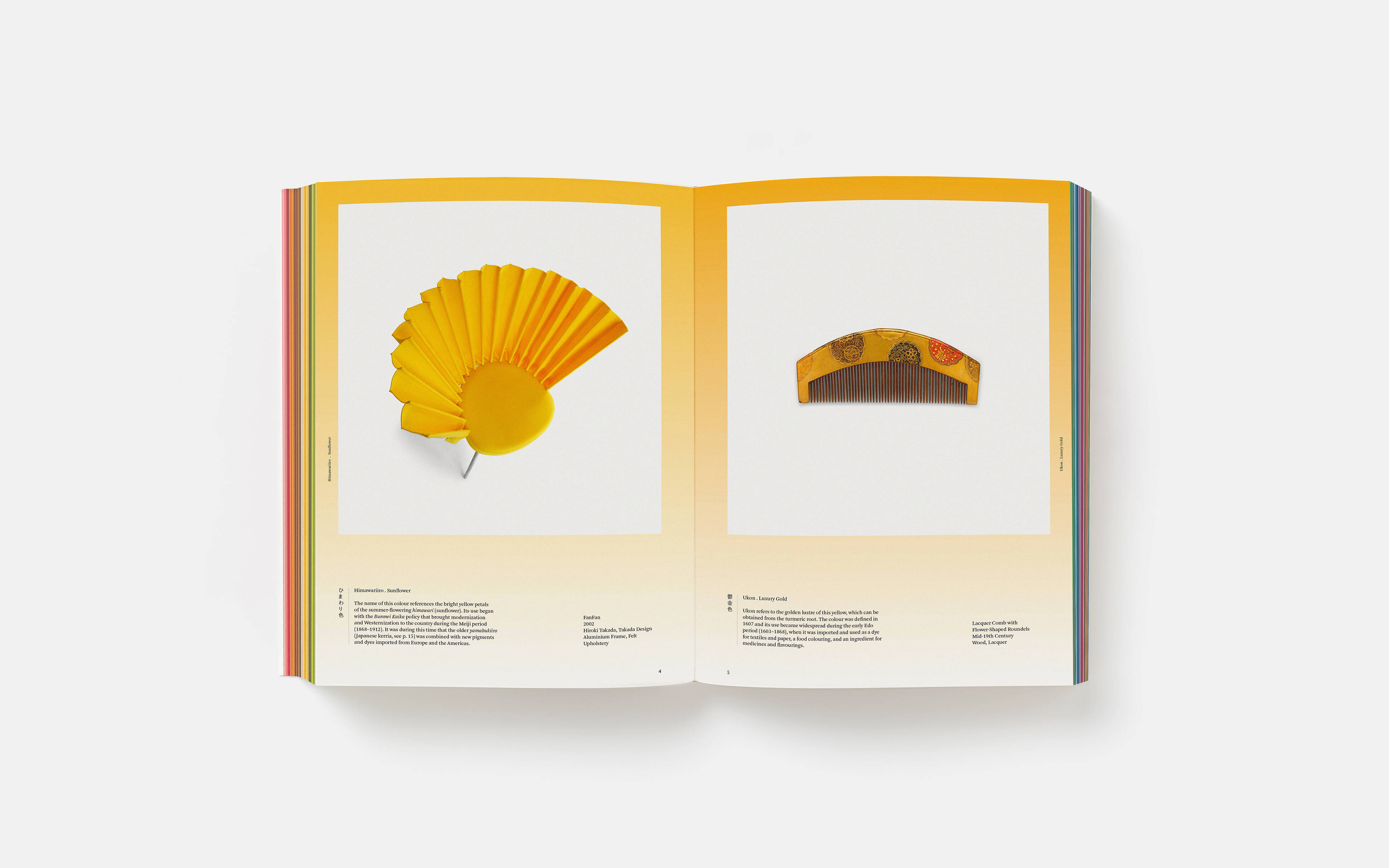
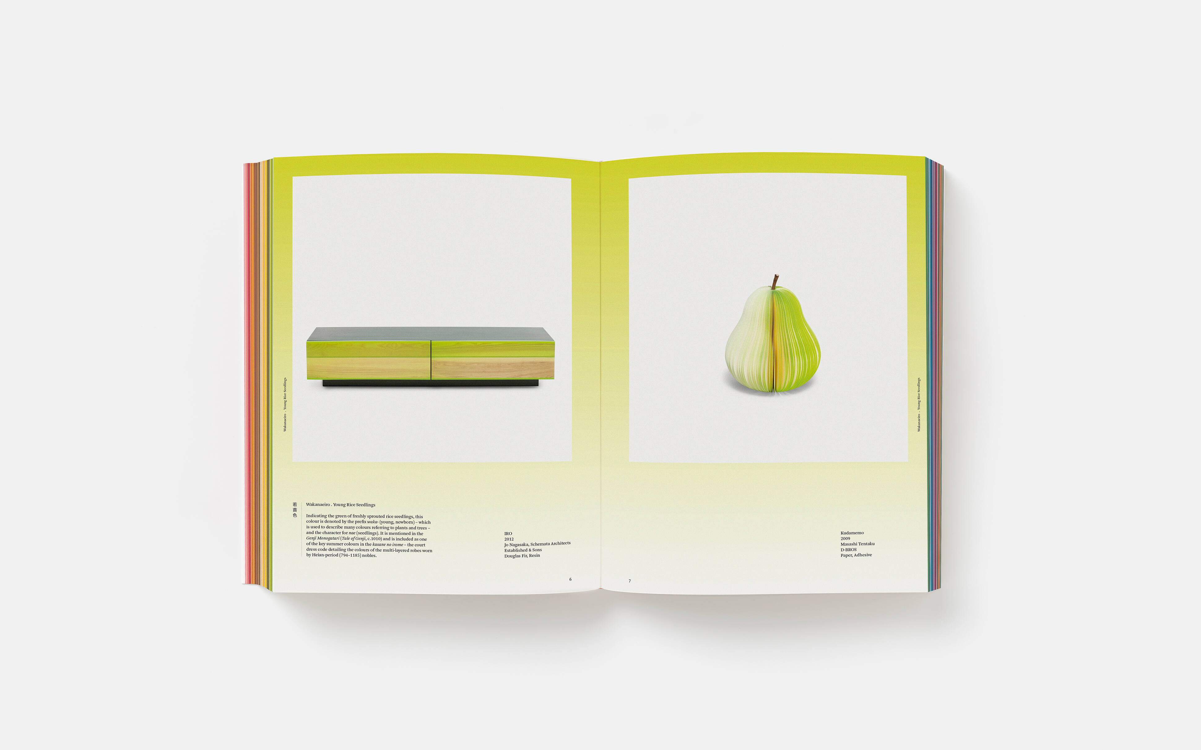
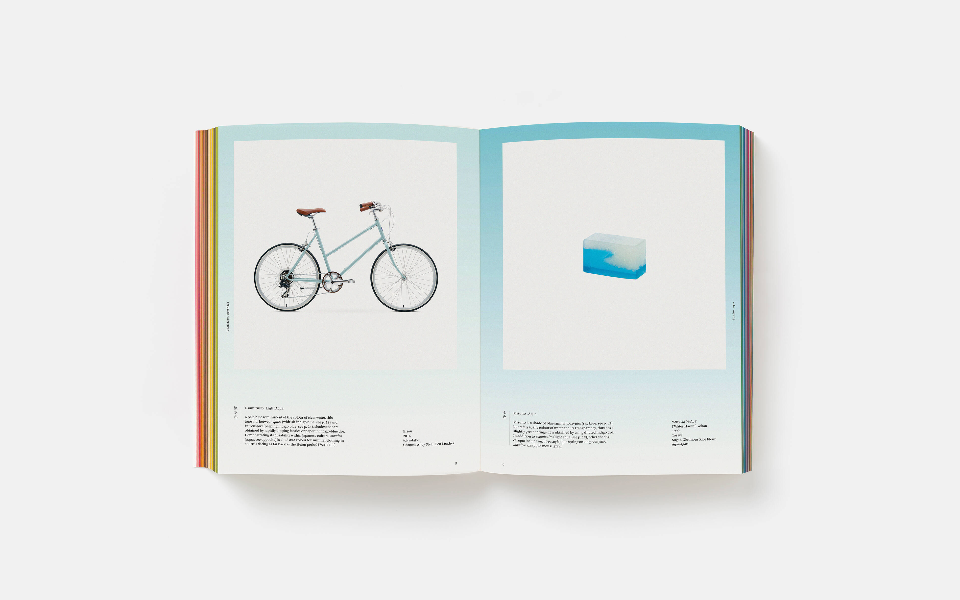
Every colour is represented by a single object, from a bicycle to a bag, a chair to a comb, and each is accompanied by a succinct description, detailing the pigment’s origin, use and significance.
There are ancient traditional items, and mass-produced goods. A great deal of the selected examples are drawn from the works of noted Japanese designers such as Naoto Fukasawa, Issey Miyake, Shiro Kuramata, nendo and Reiko Sud.
Pages from Iro: The Essence of Colour in Japanese Design
Lovers of contemporary Japanese culture will find much to admire in this survey, as it unlocks the contemporary colourways many of us have admired, but few of us have perhaps truly understood. Admirers of Japan’s ancient culture will also adore the way Iro places, for example, 16th-century kimonos next to contemporary chairs, or a quotidian kitchen utensil beside a rare porcelain vessel. The book’s texts are equally engaging, describing how everything from the colour of spring riceshoots, through to the fur on a mouse’s back, have informed and influenced this country’s approach to the colour spectrum.
The pink of cherry blossom gives way to the reds found in temples and pagodas which, in turn, is followed by aiiro or indigo, the most prevalent blue dye in Japan, which was once derived from the extract of fresh leaves and fixed with lye.
Pages from Iro: The Essence of Colour in Japanese Design
Following on from Phaidon’s hugely successful survey of Japanese design, Wa (which Menegazzo co-authored), Iro pays tribute to the culture it details via its printing; this handsome 288 page flexibound book is printed on craft paper and bound in the traditional Japanese style. To find out more and order your copy of Iro, go here.
Iro: The Essence of Colour in Japanese Design