Refresh your feel for green – the interiors colour of the moment
Dezeen, Living Etc. and Architectural Digest have singled out this part of the colour spectrum for 2022's interiors. Add a little depth andEast Asian sophistication to your take on it, with our new book, Iro
Sometimes Mother Nature knows best. When it comes to interior design trends, green – whether its sage, mint, or pea green – is currently in the ascendant. Architectural Digest singled out the nine best green paint colour designers turn to again and again; in the New York Times, interior designer Zoë Feldman recommended salad green for a room refresh this summer; Living Etc ran through the colours that go with sage green – an ‘on-trend shade’; and Dezeen just picked out ten green living rooms that prove the colour's versatility. Weight of opinion is certainly behind the pigment. Rather than pile on with these green commendations, we’ve decided to offer a little depth of insight via Iro: The Essence of Colour in Japanese Design.
In this book Rossella Menegazzo, Associate Professor of the History of East Asian Art at the University of Milan, singles out the remarkable, and sometimes unusual shades favoured in Japanese applied arts and design. From the mouse-grey clothing favoured during the Edo period, to the hot pigments used in design during the country’s boom years of the late 20th century.
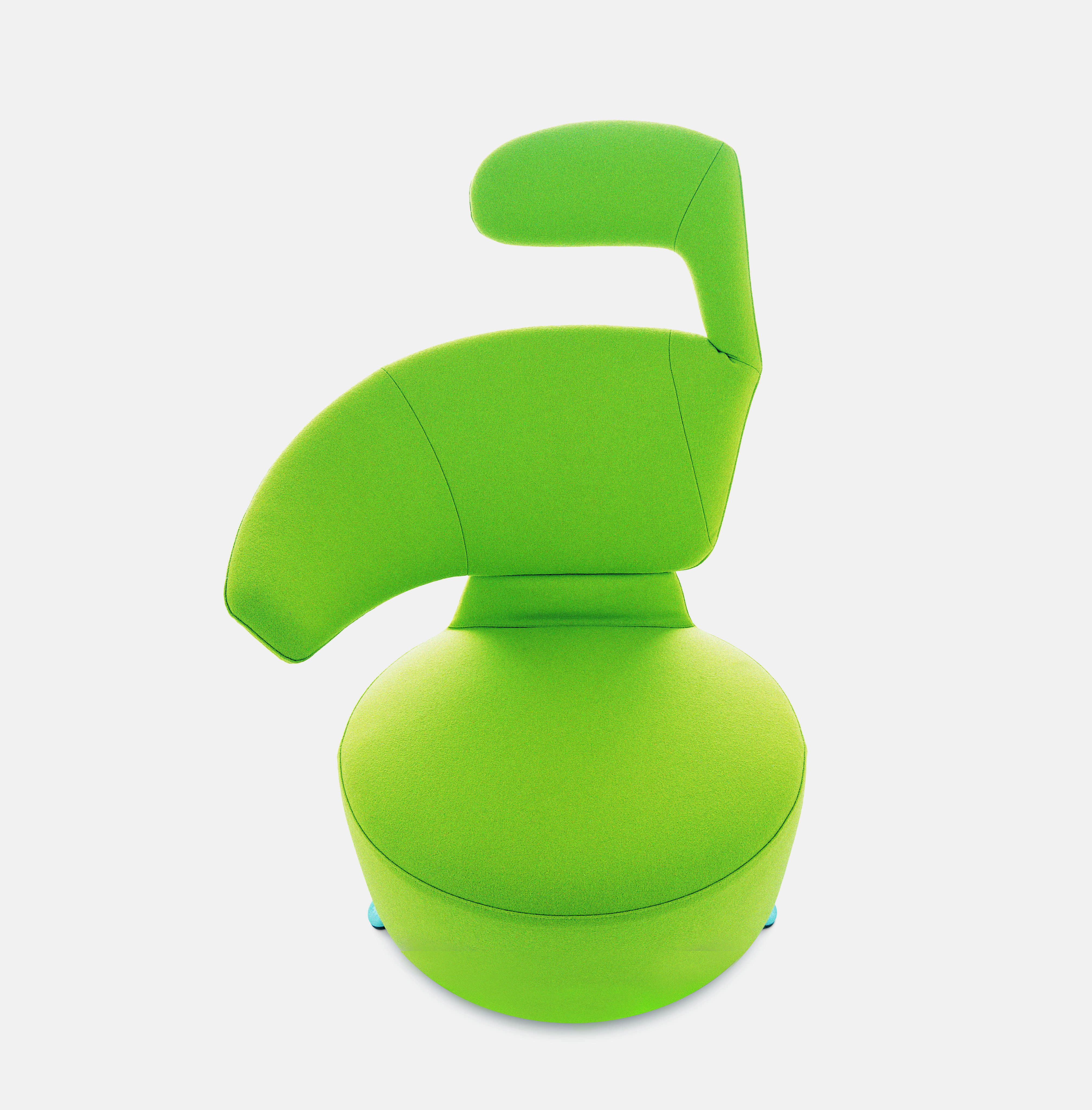
In each instance, Menegazzo offers an explanation of each colour’s name, its origins, and in some instances, the processes by which it is made. Consider Moegi or Spring Onion Sprout, the colour of this K06 Aki Biki Canta armchair (above) by the Osaka-born designer Toshiyuki Kita. “This is one of the bright young shades of green,” writes the author. “The earliest reference to this shade is made in the Genji Monogatari (Tale of Genji, c.1008), where it is mentioned in relation to vegetable-based textile dyes and how the colour can be achieved through the layering of robes. Since the 1990s, the term moe has become a slang word used in anime and manga subculture, referring to the almost devotional feeling of attachment to a character.”
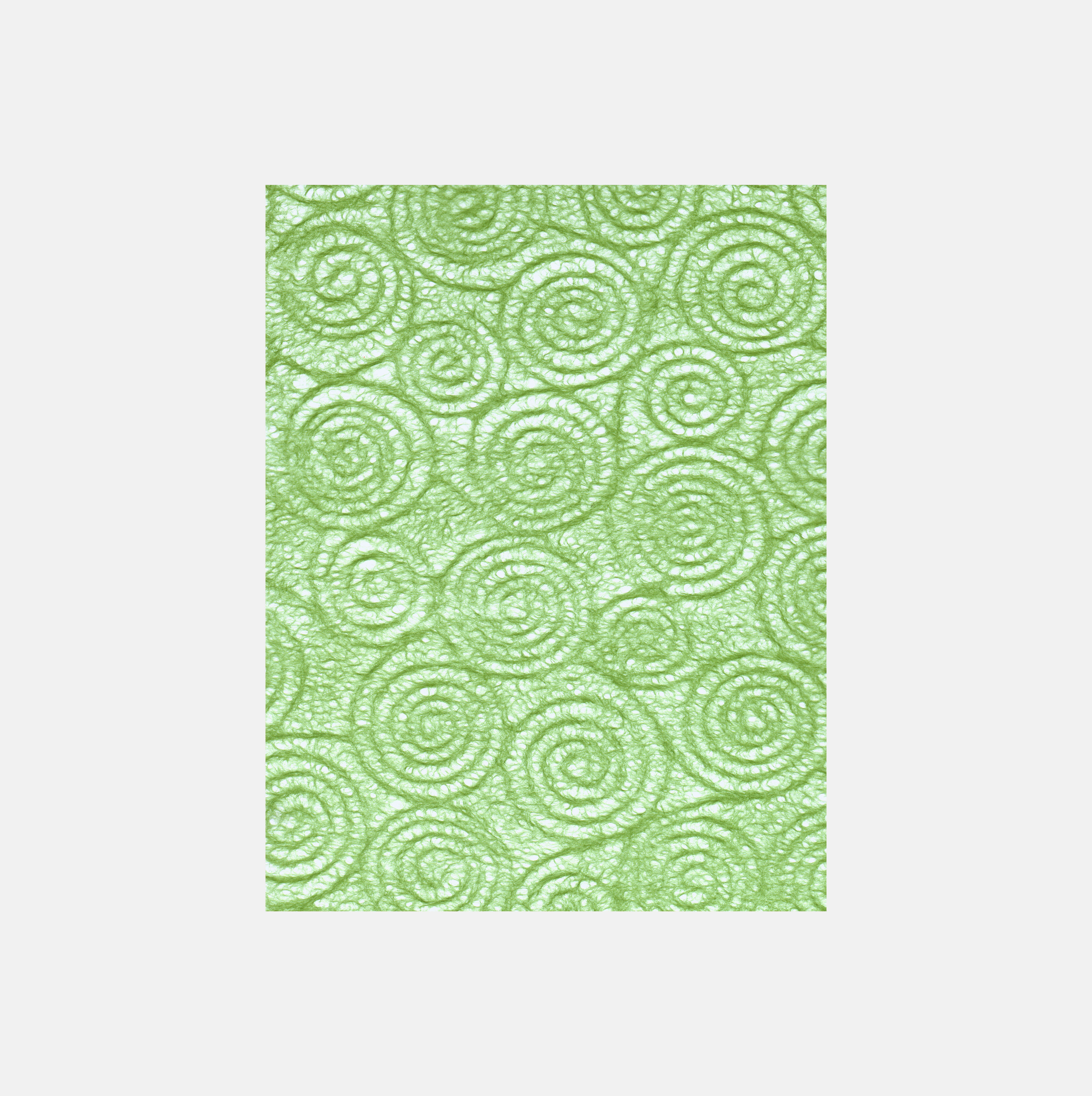
Uzumaki Oitake Tissue Paper, 2003, Morisa. Oitakeiro (Old Bamboo)
For a more mature take on this part of the light spectrum, try Oitakeiro or Old Bamboo. “The greyish, faded-green hue of oitakeiro (old bamboo), dried and weathered by sun and wind, contrasts with the bright green of wakatake (young bamboo),” Menegazzo writes. “These colours appear to have been defined together during the Edo period (1603–1868), reinforcing the perception that in Japanese culture bamboo is a highly regarded and symbolic plant, renowned for its strength and pliability.” This sheet of Uzumaki Oitake tissue paper (above) might not be the toughest of materials, but it does still embody those bamboo qualities via its colour.
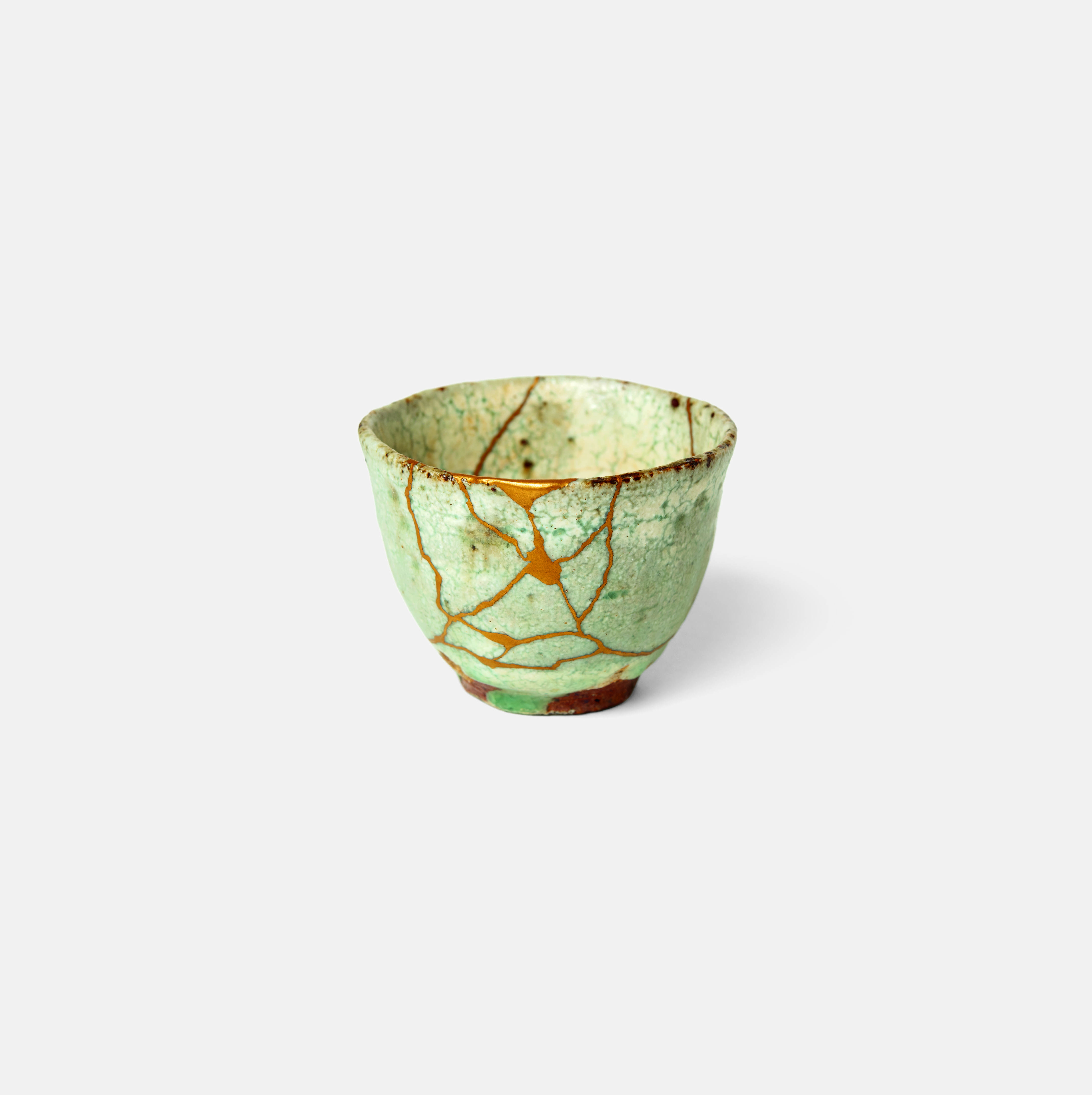
Kintsugi Cup, 2019, Mio Heki, Atelier Hifumi. Macchairo (Matcha Green Tea)
Prefer a more familiar, fortifying colour? Then turn to Macchairo or Matcha Green Tea. “This is the colour of the powdered matcha green tea that is used in tea ceremonies and is now familiar throughout the world in the form of desserts, ice creams and drinks,” the author explains. “Its pale yellowish-green shade is distinct from the common brown hue of other types of cha (tea).” It’s a colour that isn’t only good for drinking, but also for drinking vessels, as this picture of a Kintsugi-repaired cup, by the Japanese lacquer artist Mio Hek, shows.

Iro
To see many more beautiful and unusual colours that remain big in Japan (and all over the world), order a copy of Iro here.