Curator and Editor Michele Robecchi Picks his Favourite Affordable Works on Artspace
The man behind our Contemporary Artist Series picks out the works he likes most right now from the art-selling site
Michele Robecchi is a writer and curator based in London, where he is Commissioning Editor at Phaidon. Recent publications he has worked on include monographs on the work of Mark Bradford, Elmgreen & Dragset, Lili Reynaud-Dewar, Sharon Hayes, Jannis Kounellis, Yayoi Kusama, Jean-Michel Othoniel, Daan Roosegaarde, Adrian Villar Rojas, Jonas Wood, and the forthcoming survey book, Korean Art from 1953.
He contributes regularly to art journals and magazines, and has organized exhibitions in Berlin, Geneva, London, Milan, Paris and Zurich. For the last five years he has served on the selection committee for the Swiss Pavilion at the Venice Biennale.
He’s currently working on Contemporary Artist Series books with Adam Pendleton and Bernar Venet and on a revised and expanded edition of Lorna Simpson’s 2002 Phaidon monograph. Here he picks his favorite works on Artspace right now. And here's a tip from us: if Michele likes it, you should probably buy it.
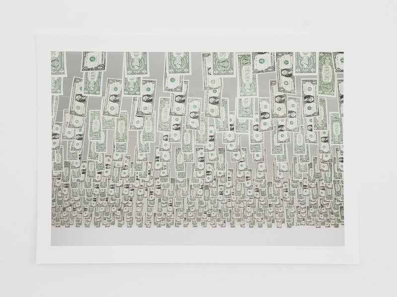
Gianni Motti - Moneybox, 2013 When invited to do an exhibition in 2011 Gianni Motti converted the budget into hard cash and put it on display, raising interesting questions over the effective value of the money once it becomes art. The choice to use US dollars was both conceptual and practical - their bi-chromatic quality and the fact that they come in the same size contributed to make the installation more uniform. The operation also successfully unified the two separate venues in which the show took place - La Synagogue de Delme (where the dollars were on the floor and visible from a balcony) and La Ferme du Buisson (where they were hanging from the ceiling). It’s a very clever piece.
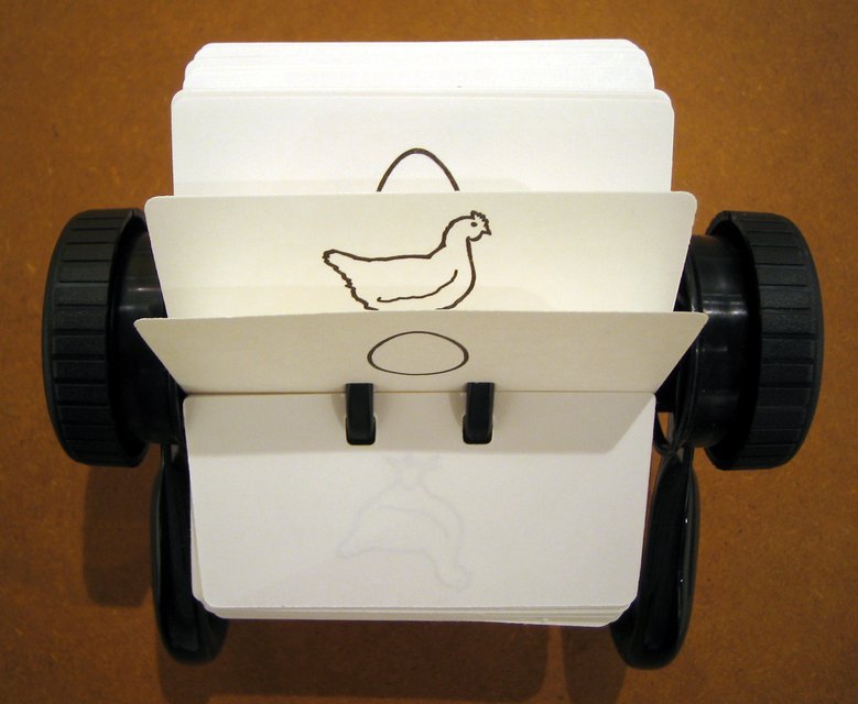
Ceal Floyer - Egg/Chicken, 2005 Ceal Floyer’s work is like a Zen aphorism – you can read it in five seconds but end up thinking about it for five months. It’s outstanding how much she can say with such an economy of means. The other thing that strikes me is how such a neutral approach can result in works that are so much about personal struggle. There is the elegance of Minimalism, the irony of Dadaism and the intensity of Expressionism but all devoid of the heroism that sometimes make them unbearable. This is art about the soul. It’s impossible not to identify with it.
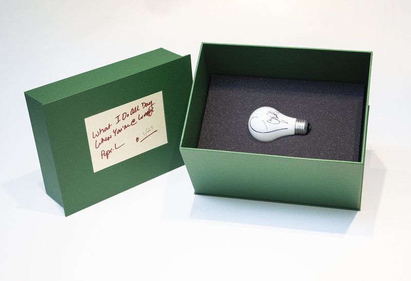
Pope .L - What I Do All Day When You're @ Work, 2019 A Japanese artist once explained to me that the empty room he kept in his premises was his studio, and the one with all the brushes, tubes and canvases, was the place where ‘he worked’. It’s a distinction Pope .L perfectly illustrated in this piece – a brilliant visualization of an abstract concept. Even in his more serious moments, Pope .L never failed to display a talent for humour-coating the most paradoxical and uncomfortable aspects of contemporary society. He is also a great performer and educator.
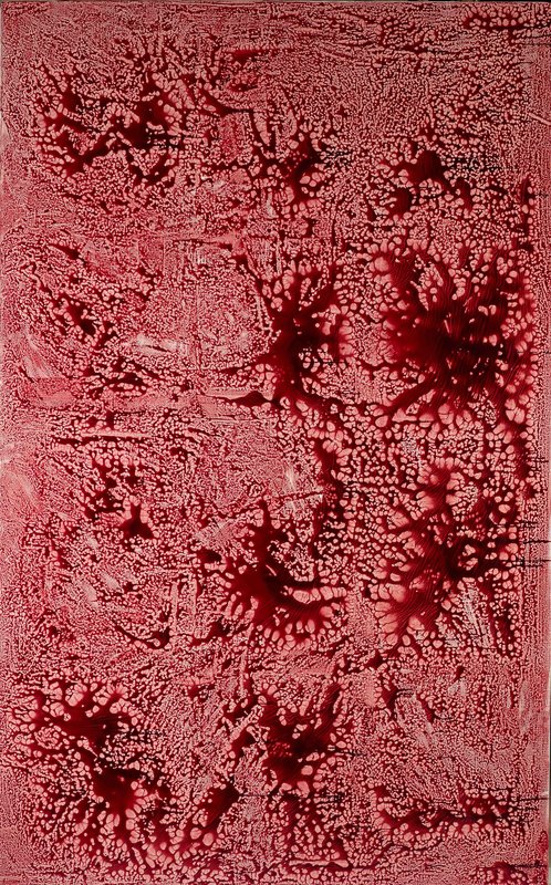
Adel Abdessemed - Forbidden Colours, 2018 Formally, this is a nudge to Jackson Pollock’s dripping technique and Abstract Expressionism. What stands out is the disturbing yet strangely familiar colour. Contrary to popular belief, Abdessemed didn’t use actual blood to make this series – it was artificially re-created by one of those companies supplying props for the film industry. Abdessemed’s work is invariably multi-layered. It can be thought provoking but even in its most direct moments there is an affectionate tributary reference to art history that never fails to add a touch of poetry.
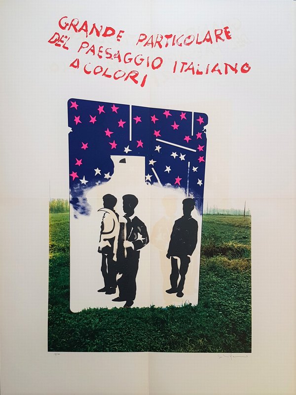
Mario Schifano - Blown up detail of the Italian landscape in color, 1968 Schifano was one of the founding fathers of European Pop Art. This piece was made in 1970 and is a counteraction to his 1963 Grande Particolare del Paesaggio Italiano in bianco e nero (which can be roughly translated as Great Details of Italian Landscape). They came at the beginning and the end of a torrid season in Italian society and in a way anticipate the political tension that would define the following decade. They also chronicle the transition from black and white to colour in mainstream media. Sadly Schifano’s ebullient personality and intense lifestyle proved deleterious to his work but I’m positive his oeuvre will be eventually rediscovered and reappraised as it deserves to be.
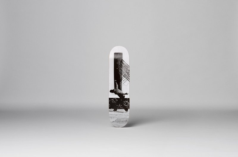
Robin Rhode - Almanach, 2016 Robin Rhode is a pretty accomplished skater – he often uses a board to move around his studio in Berlin. Those familiar with his work know well that he’s not a tourist in the world of hip-hop and sidewalk sport culture. His art comes from the street and it is interesting here to see him walking on the same path in the opposite direction. It is almost as things come full circle. And the classy black and white provides a nice contrast with the traditionally multi-coloured graffiti art skaters adopt to decorate their equipment.
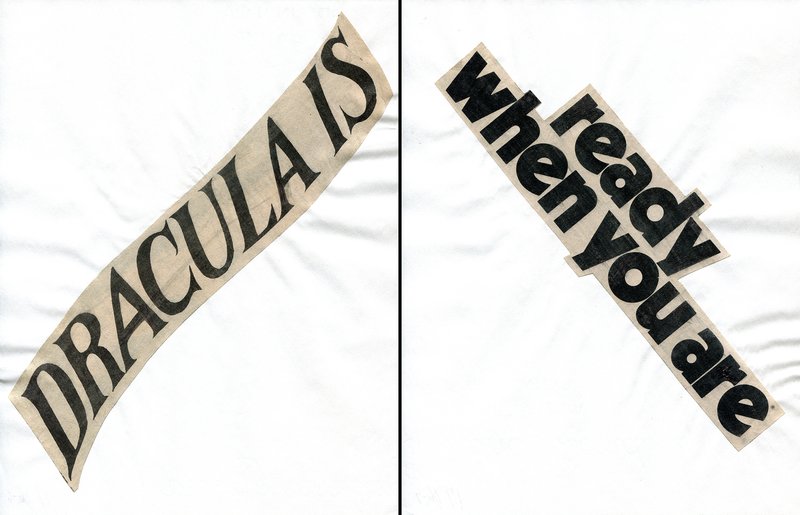
Lorraine O'Grady - Cutting out CONYT, 2017 This is part of Lorraine O’Grady’s newspaper poems serie in which she would cut-out The New York Times and create pungent reflections on gender and racial politics. O’Grady predominantly expressed herself through diptychs which I always found interesting. And she was also an amazing performer. Her Mile Bourgeoise Noire act is what she is mostly known for, but there were other great pieces, like the one where she would try to put a frame around people down the street and make them art or her tribute to Nefertiti and her sister Devonia at JAM in New York. Those who never saw her performing really missed something.
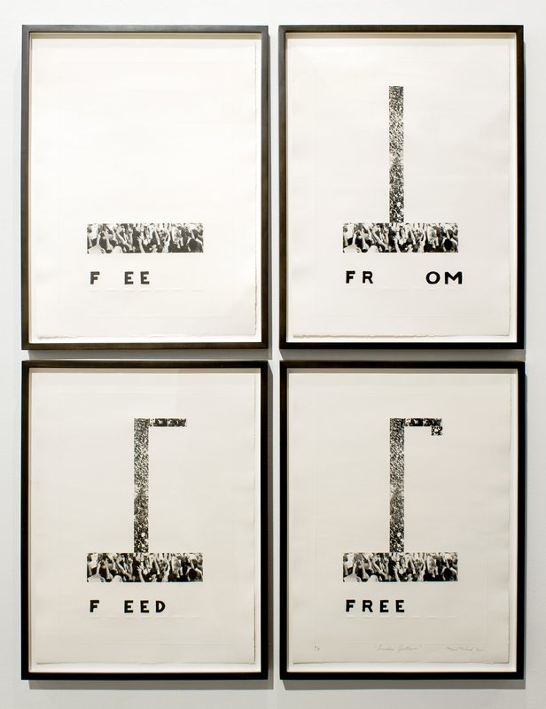
Nari Ward - Freedom Gallows, 2011 I consider the publication of Ward’s exhibition catalogue ‘We The People’ in conjunction with the New Museum in New York one of Phaidon’s proudest moments. Regrettably I wasn’t involved with the project (or not involved as much as I would have liked!) Ward’s work is incredibly powerful – his knack for making the most ordinary objects extraordinary and for giving a voice to the unheard is unparalleled. There is also a gentle ambiguity in his work that makes it even more compelling. He doesn’t ask the viewer to be transcendental to understand where he’s coming from. As he rightly said on one occasion: ‘you fight for your own space, not to join that space’.
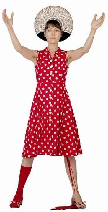
Pipilotti Rist - The Help, 2004 I actually own this piece. Pipilotti Rist gave it to me after we worked together on a performance that she conceived and I executed at an event organized by the Nicola Trussardi Foundation during the Venice Biennale in 2013. The first time I encountered Rist’s work was in Venice in 1997. Its effect on me is a long story I cannot tell in a few lines. To go back to the same place so many years later, this time as a collaborator of the artist who made so much art I love, was a huge privilege. Everything she has done has been massively inspirational and I’m always on the lookout for what’s next.
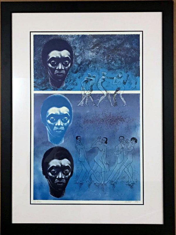
Elizabeth Catlett - Blues, 1983 Elizabeth Catlett is a name that doesn’t comes up very often. It’s a shame as the work is beautiful and she led a remarkable life. Apparently Grant Wood, who was her teacher at the University of Iowa, deserves a lot of credit for encouraging her to focus on subjects close to her experience. She also spent a great deal of time in close contact with Mexican muralists, which partially accounts for her chosen aesthetics and her political approach. Catlett didn’t believe in art as a mobilizing force but she knew it could be educational and persuasive.
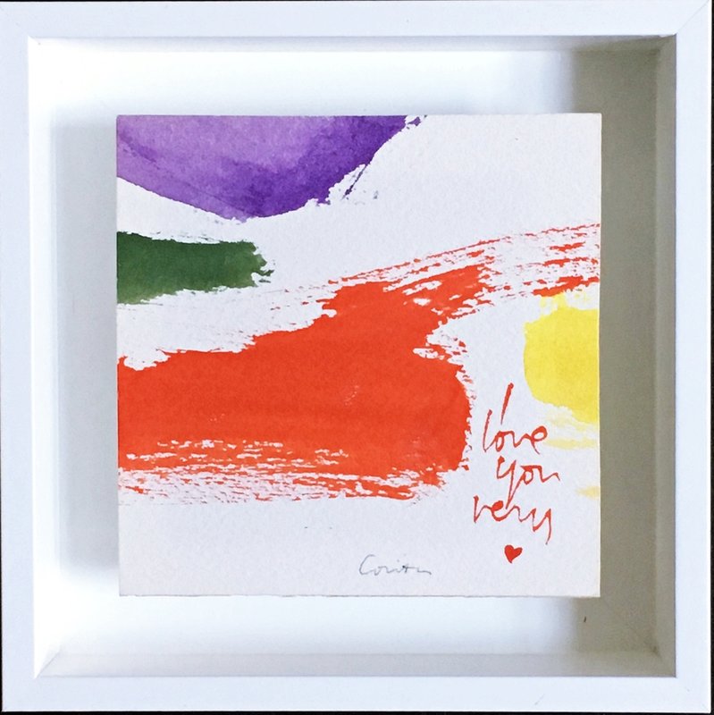
Corita Kent (Sister Mary Corita Kent) - I Love You, 1975 I have to credit Chris Johanson for introducing me to the work of Sister Corita Kent – an artist that was way ahead of her time. Pop art is occasionally considered apolitical but Kent made work that was at once visually exquisite and chromatically strong while tackling serious issues such as social injustice and discrimination. Her retrospective exhibition at the Harvard Art Museums in 2015 was phenomenal just like the accompanying catalogue – a recommended reading. As Kent’s market mostly consists of prints, it’s a pleasant surprise to discover that there is an original watercolour available.
To take a closer look and perhaps even buy some of these works, head over to Artspace; and to see more of Michele's work, take a look at our Contemporary Artist Series books.