What was it with Mark Rothko and Purple?
When he came to make one final spiritual series there was only one colour to pick. . .
Purple is a colour closely associated with the Catholicism, symbolising both high rank and human suffering within the church. It’s hard to think of, say, Robert Mapplethorpe’s use of the colour without being reminded of his Catholic upbringing.
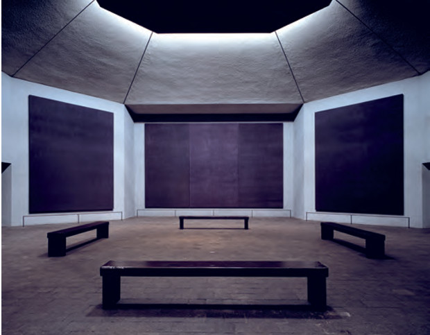
However, other non-believers have favoured this pigment in an ecclesiastical setting, thanks in part to its deep, spiritual resonances. The 20th century abstract expressionist Mark Rothko was not a church-goer, yet when he was commissioned to create one late, great cycle of spiritual pictures, he reached for the colour purple. Here’s how Stella Paul describes his Rothko Chapel in Chromaphilia: The Story of Colour in Art.
“An immersive environment in which colour inspires meditation, the Rothko Chapel engulfs viewers in the sombre palette of the artist’s last years – pared down, spectrally restrained, subdued,” writes Paul. “The paintings are so dark as to be almost black, but with the sustained contemplation that a visit to the chapel demands, a range of deep plums, maroons and closely valued purples emerge as undercurrents below or veils on top of muted fields of colour.”
Rothko’s abstract paintings were all about colour. Yet colour could never be reduced to a simple scheme or set of rules. “I am interested in expressing the basic human emotions – tragedy, ecstasy, doom and so on – and the fact that lots of people break down and cry when confronted with my pictures shows that I communicate with those basic human emotions’, quotes Rothko as saying. “If you… are moved only by their colour relationships, then you miss the point.”
The arts patrons John and Dominique de Menil invited Rothko to create this chapel in 1964, and allowed him complete control over the viewing environment. The artist did not live to see the paintings’ installation, since he committed suicide in 1970. Nevertheless, the chapel remains a universal testament to the painter’s spiritual depth and command.
“Rothko was inventive and experimental. Looking back at sources including [late Medieval Italian painter] Cennini, as well as using new synthetic materials, he experimented with radical techniques for making and applying paint,” writes Paul. “Rothko cautioned against misinterpreting his work as merely decorative because of its opulent colour. When he turned to the darker tonality of the chapel paintings, which some attribute to a darkened mood, he denied the interpretation, refusing to describe colour in a simplistic or symbolic vein. Nevertheless, colour was his means of making art with a serious message about the human condition. As he said early in his career, ‘There is no such thing as a good painting about nothing.’"
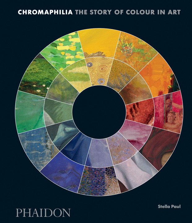
Read our other colour stories on Phaidon.com: Jean DuBuffet and Brown, Anish Kapoor and Red, Gerhard Richter and Grey, Picasso and Blue, Ad Reinhardt and Black. And for a hugely enjoyable read and to gain a great understanding of colour within art from the classical world up until the present day order a copy of Chromaphilia here.