What is it with Gerhard Richter and Grey?
Read why the German master thinks the colour epitomises indifference, fence-sitting - and despair
For the Sunday painter, grey doesn’t take up a lot of the palette; blue skies and yellow sunsets are more popular pigment choices. Yet for accomplished artists this intermediate mixture of black and white can, as our new book Chromaphilia: The Story of Colour explains, capture a kind of well-judged neutrality.
Nowhere is this more apparent than in the German painter Gerhard Richter’s works. “In the 1960s, Richter created paintings using only grey,” explains art historian Stella Paul in Chromaphilia: The Story of Colour. “The imagery is drawn from ready-made sources he compiled in a vast personal archive called Atlas and includes material from banal to ghastly, such as newspaper and magazine clippings, film stills, and snapshots of family members, animals or landscapes."
By pairing grey with this jumble of subjects Richter could flatten out and neutralize even the most sensational material.
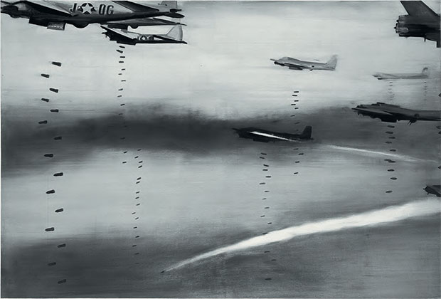
His 1963 painting Bomber derives from a photograph of a Second World War Allied air raid – something that Richter would have experienced as a youth in war-torn Germany. “Colour and form, though, carry the expression away from personal experience to a deadpan impassivity," writes Stella Paul. "It is a highly charged subject, distasteful and closed to discussion in postwar Germany. Thus Richter pushes the boundaries but keeps everything at a remove. Even though the imagery is very detailed, the work is stripped down to a veil of grey."
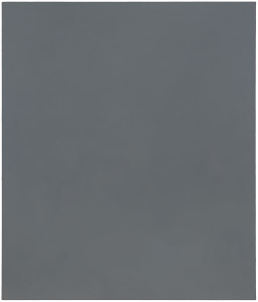
Richter pushed this investigation of grey even further, with a series of non-figurative, monochromatic grey paintings, which, Paul says, “remove imagery completely and carry further Richter’s focus on the unique power of grey." Richter himself called grey “the ideal colour for indifference, fence-sitting, keeping quiet, despair." Or according to Stella Paul, "for states of being and situations that affect one, and for which one would like to find a visual expression.”
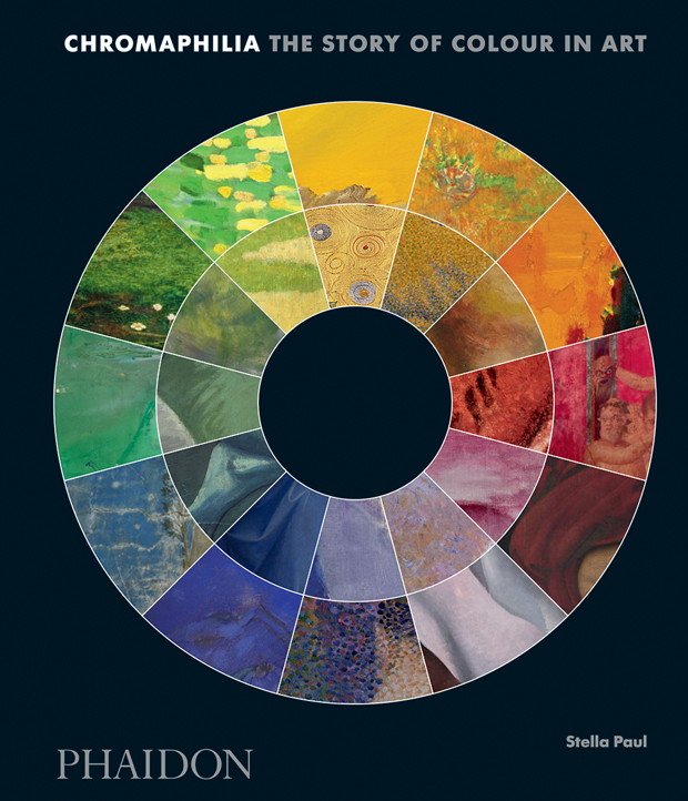
For more on Ricther’s greys, Picasso’s blues, Warhol’s reds, Klimt’s golds and plenty more besides order a copy of Chromophilia: The Story of Colour in Art, here. The book uses 240 artworks as case studies to tell the story of ten individual colours or colour groups. It explores the history and meaning of each colour in art, highlighting fascinating tales of discovery and artistic passion, and offering easily accessible explanations of the science and theory behind specific colours.
To accompany each of our colour stories inspired by Chromophilia we're pulling together a small Phaidon selection of works by colour that are affordable on Artspace.
Today's works are all grey and all are just over or way under £1000 / $1,300. Many of them are by well-known names, among them Allen Jones, Cerith Wyn Evans, Stephen Shore, Idris Khan, Raymond Pettibon, Marina Ambramovic, Paul McCarthy, Robert Mapplethorpe, Sophie Calle, Mike Kelley, Chris Ofilli, Paul Strand, Dorothea Lange and Lewis Baltz.
So that's all grey, all under £1000/$1,300 and all here. (Other colours and price points are, of course, available). Buy Chromophilia here and look out for the next colour story in our new series and check out the art on Artspace.