Did Lufthansa just hit turbulence with its logo redesign?
Some say the airline made the wrong choice in toning down Otl Aicher’s characterful yellow and blue colourway
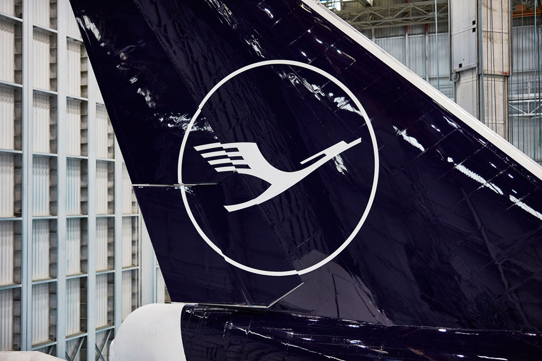
The German flag carrier, Lufthansa, not only has the world’s oldest airline logo: a crane designed a century ago by Otto Firle. Up until recently, its livery linked the airline to another hallowed European institution: the Bauhaus.
“One of the Bauhaus’s enduring legacies was the desire to make art and design an integral part of everyday life,” explains our book Graphic: 500 Designs that Matter, “a principle that greatly appealed to a generation of designers confronted with the destruction of a war-ravaged country.”
German designer Otl Aicher certainly admired that principle. In 1953 he founded the Ulm School of Design with Bauhaus alumnus Max Bill, and went on to put his thinking into practice for Lufthansa in 1969, creating a simplified, aesthetic version of its corporate identity. Aicher and his team tried to ditch the crane insignia all together, though the Lufthansa board demurred.

“Instead the new logo was enclosed within a circle and rendered more exact through a grid system.” Aicher also selected a recently minted typeface, now known as Helvetica.
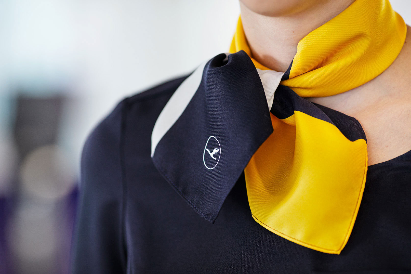
The treatment was pretty Spartan, though Aicher’s softened this with his colourways, adding a splash of yellow to the airline’s existing blue pigmentation, providing a good counterpoint to this minimalist design.
However, the airline clearly believes this jolly tone is no longer required, and has removed the yellow from its tailfins in a recent rebrand.
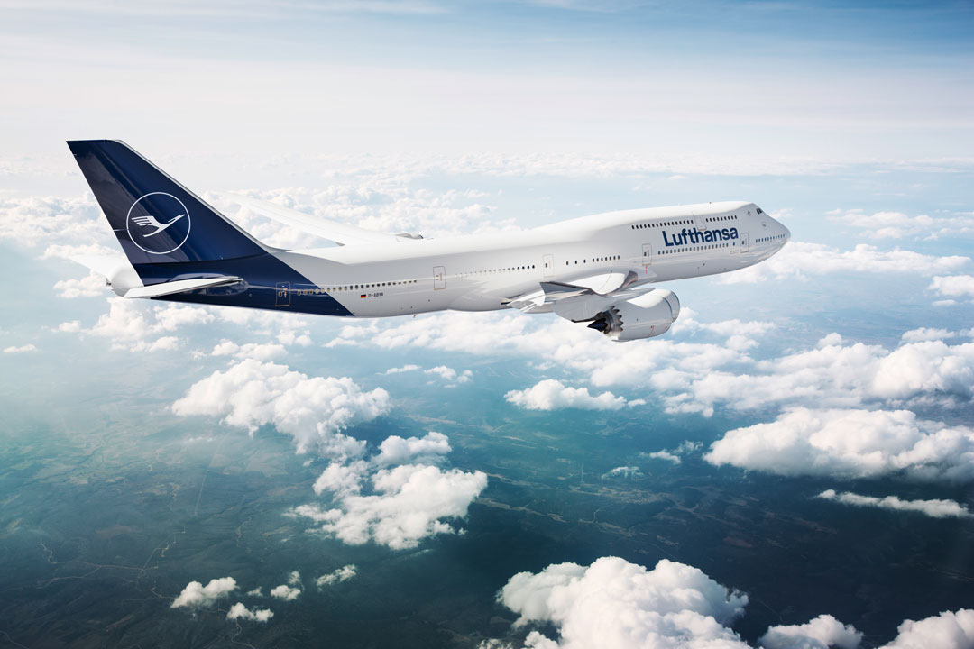
“The new Lufthansa appearance gives the individual elements a new, modern quality to sharpen their impact,” explains the airline. While Aicher’s yellow is retained in the boarding passes, check-in counters, uniforms and corporate signage, its loss from the tailfins and elsewhere has been partially justified in order “to meet requirements of the digital age,” the airline says.
Is that fair? There is something very striking yet undeniably dependable in Aicher’s use of yellow, ironically just the kind of design idiosyncrasy most new brands crave and call upon in an era when corporate concerns for global acceptability flatten most of the character and charm out of our visual landscape.
For more on Otl’s original design and much, much more order a copy of Graphic: 500 Designs that Matter.