Frost* stretch an 'o' for AIDS awareness
The Sydney design firm tease out the typography for their latest condom-use campaign
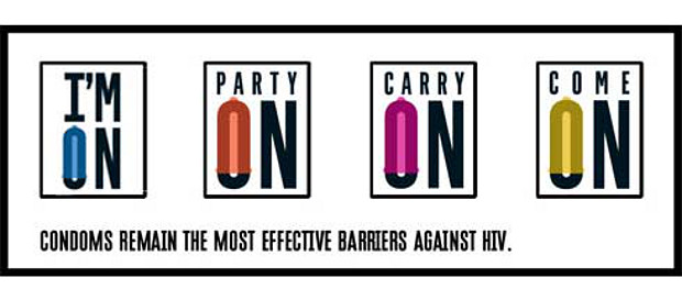
With a bit of typographic effort, the letter ‘o’ can be made to look phallic. We doubt this was actually detailed in the brief, but this vowel lies at the heart of Frost*’s campaign to encourage the use of condoms.
The Sydney graphics firm was commissioned by Australia's AIDS Council of New South Wales (ACON)'s Ending HIV initiative to design typographic banners and metro-light posters. The campaign, called Stay Safe, is being promoted in the centre of Sydney.
Frost*'s relationship with ACON is a long-standing one; the graphic firm created the identity for ACON's Ending HIV campaign, as well as its two previous ones, Test More and Treat Early.
Its Stay Safe visual style is in the same uppercase monochrome type, except for the opaque condom fitting snuggly over that elongated ‘o’ of tags such as ‘Oh Yeah!’ and ‘Carry On’.
Nevertheless, it's a simple, restrained campaign for an emotive subject. “Frost* convinced us that our message was so strong that we didn't need any cosmetic effect or sexy images - just a few words,” says ACON’s Yves Calmette. We think it was the right choice.
The Stay Safe graphics also appear on temporary tattoos, t-shirts, tote bags and a range of condoms. For more on the campaign, go here. For greater insight into typographical play, take a look at our masterful Archive of Graphic Design. For more on brilliant branding, consider our Marks of Excellence. Also, for a guide to great advertising solutions, pick up a copy of Problem Solved.