‘This is the first incarnation of XXX. That makes it intimate,’ Harland Miller says of his new edition
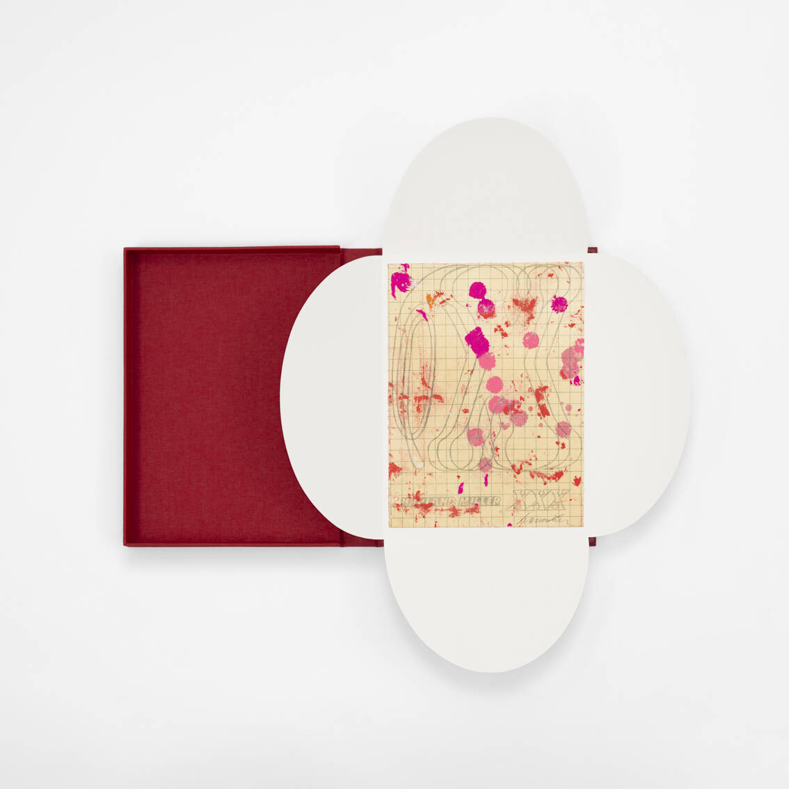
New etching builds on Miller’s original working drawing for the acclaimed painting.
Before Harland Miller joined Chelsea College of Art in London he’d studied graphic design in York. There he learned, among other things, about the psychology of colour in relation to printed materials. Certain colours, he was taught, brought with them a particular psychological impact.
Miller had some fun with these learnings, alighting on what he thought were ‘punk’ colour combinations that went against the teachings, already building up what Hettie Judah in Miller’s new book XXX calls “his own subversive repertoire”.
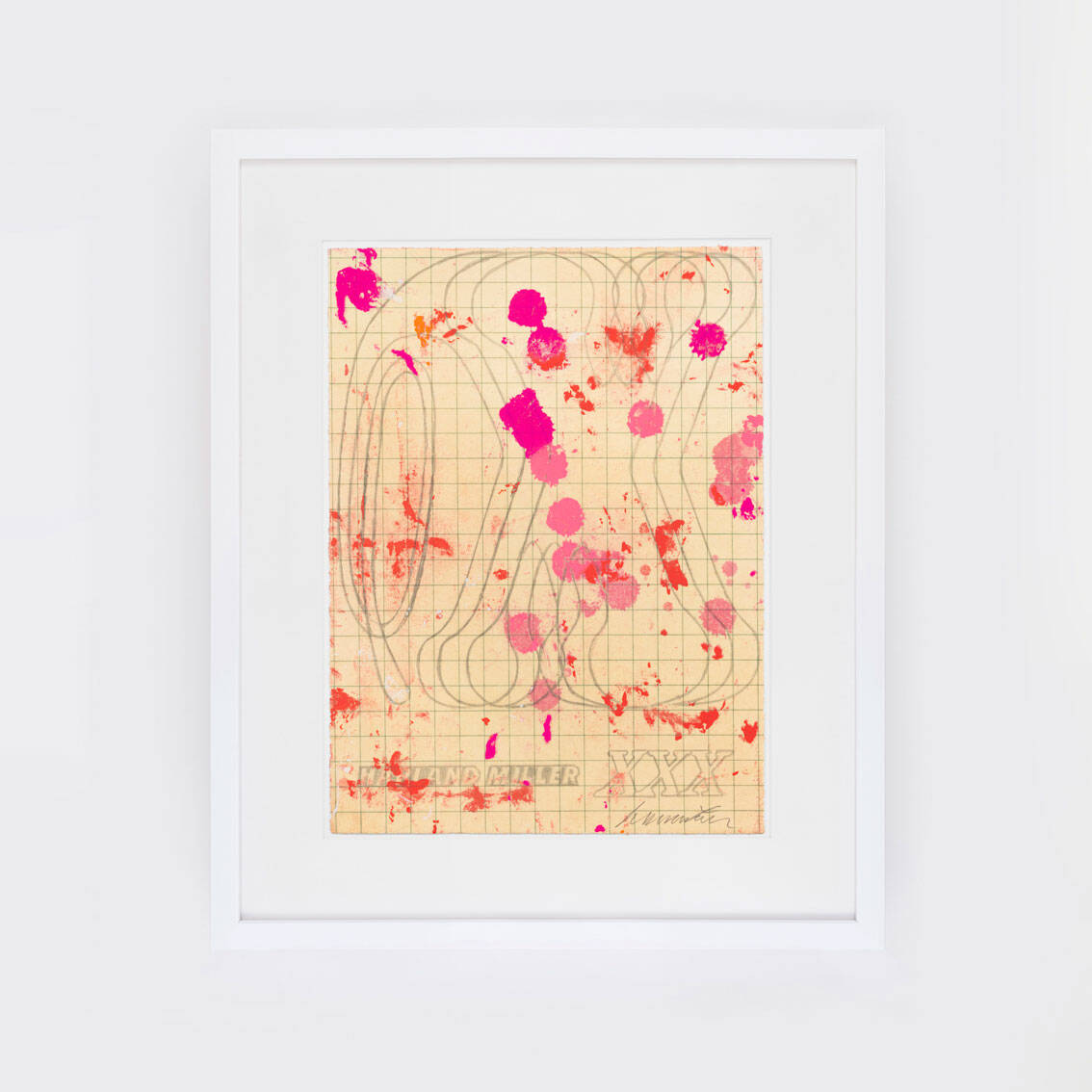
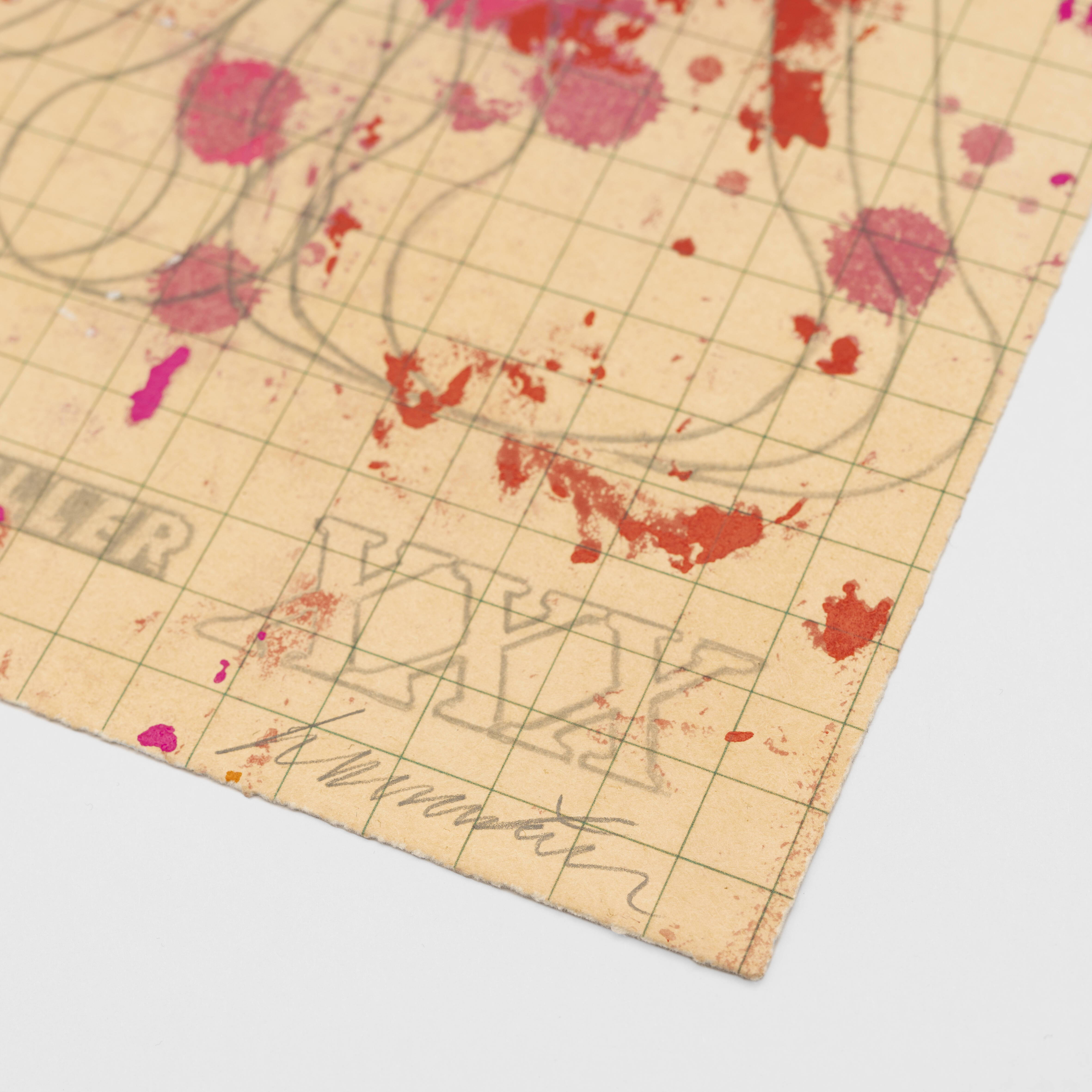
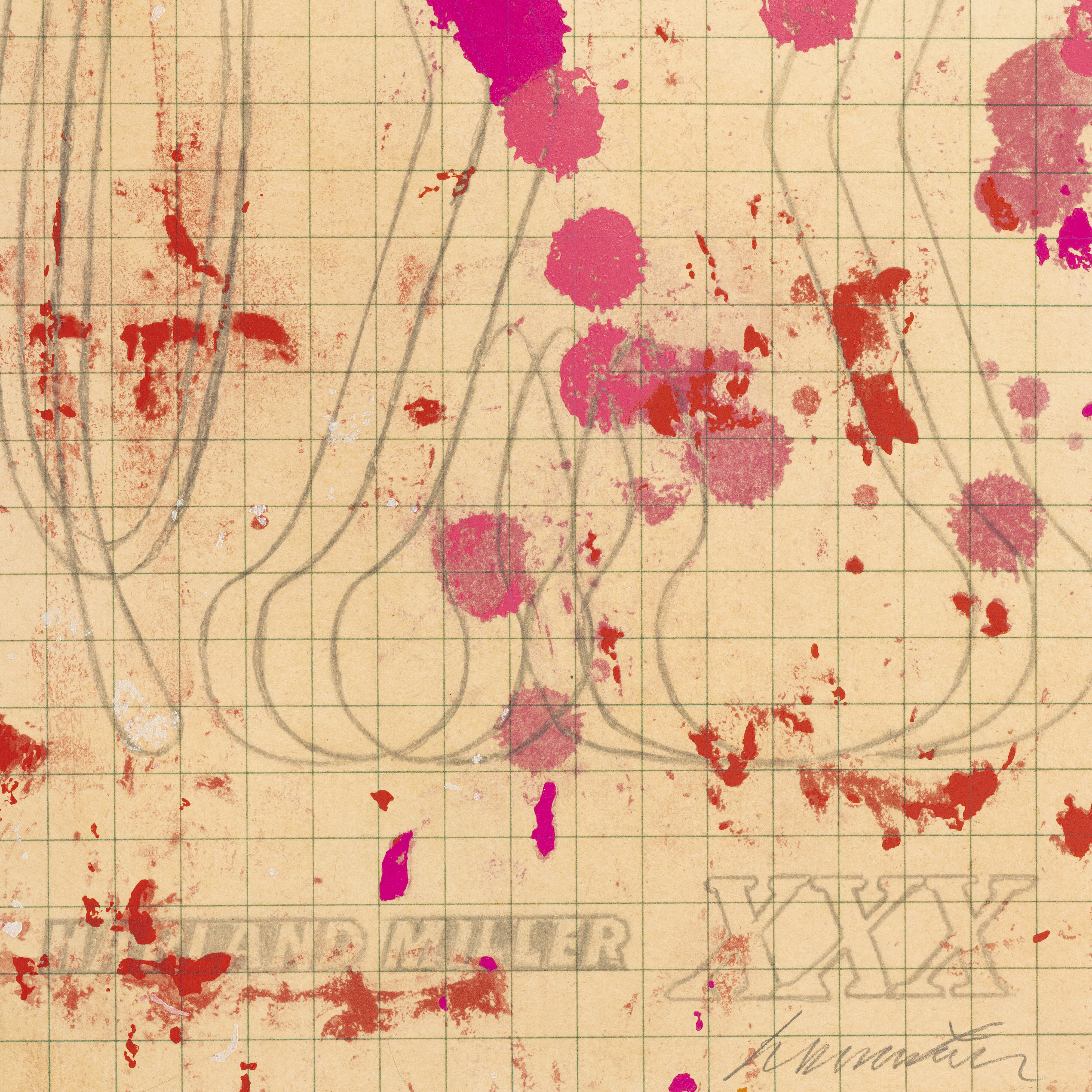
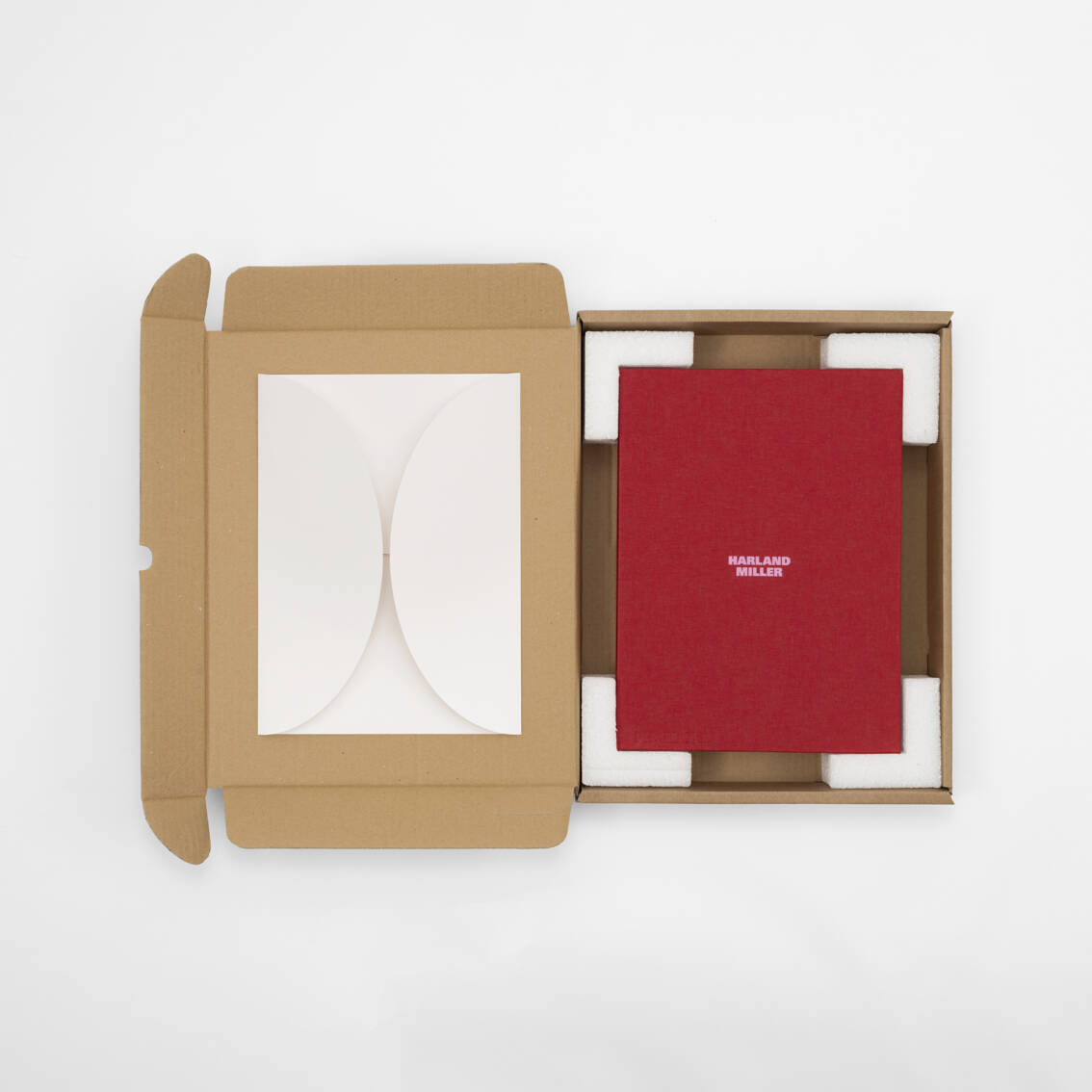
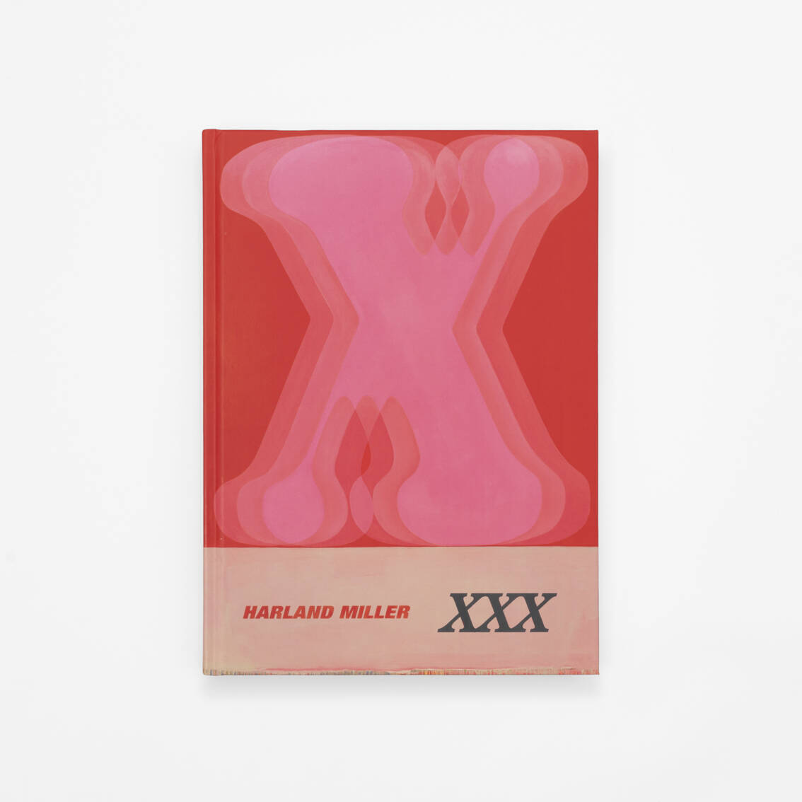
That combination of colour, text and subversion is evident in his new edition for Phaidon, XXX, 2025. The limited edition includes a signed and numbered print and the new monograph - the first to focus entirely on Miller’s Letter Paintings - presented in a custom-produced clamshell portfolio box. The edition is an etching with letterpress printing, measuring 11.8 inches x 8.75 inches (29.97 x 22.23 cm) produced by Manifold Editions. It’s signed by the artist on the front, numbered on the verso and comes in an edition of 50, priced £1,500 / $1,800.
XXX, 2025 showcases Miller’s iconic use of bold colour, rendered through playful splashes of pink and red that evoke a sense of spontaneity. The new print references an original sketch for one of Miller’s large-scale Letter Paintings, also titled XXX.
“Showing the original working drawing for the painting was kind of revealing, and something nobody had ever really done before,” he tells Phaidon.com. “This is the first incarnation of XXX and I guess that makes it intimate, a sensation or feeling which speaks to an aspect of what’s being suggested by XXX.”
Despite Miller’s quip that "I’m no fan of using ten words when twenty will do," his letter paintings actually work to simplify language, focussing on bisyllabic or monosyllabic words. Drawing from his background in literature and love of writing, they nod to the visual language of vintage book covers, layered with phrases that are often poignant or tongue-in-cheek, while exploring themes of identity, nostalgia, and language.
Miller's work is included in significant public collections such as the Tate Modern, the Montreal Museum of Fine Arts, and the York Art Gallery. On the eve of the release of the edition we caught up with the artist and asked him a few questions about it, and the Letter Paintings that led to it.
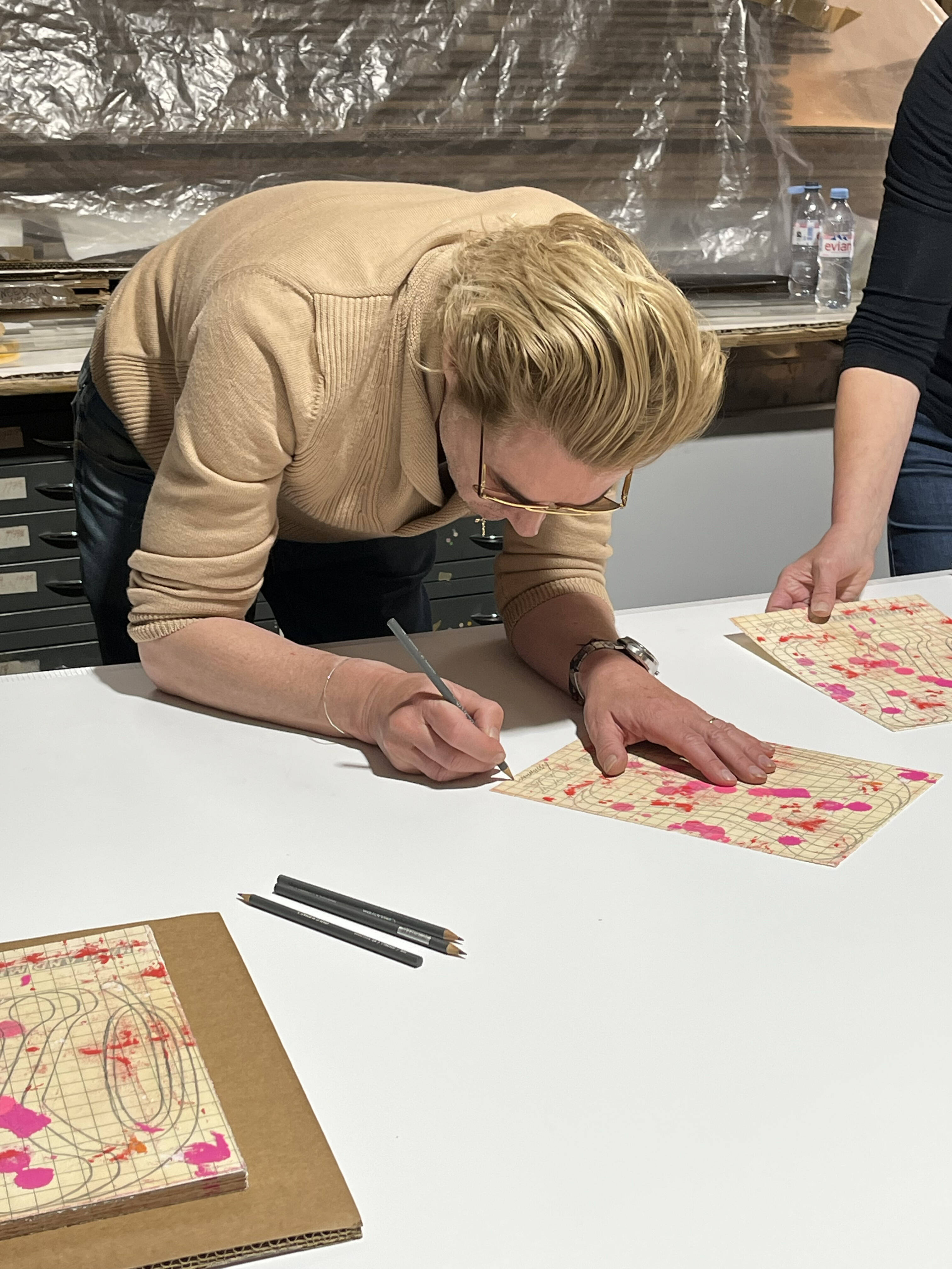
Harland Miller signing the new edition XXX, 2025 - photograph courtesy of the artist
Tell us about the new XXX edition. There’s so much that goes into the making of a print. When a print maker begins to make a print, they do just that - they begin. If they are making an etching they begin directly onto the etching plate.
When I begin to make a print I’m generally making a print of a painting, a painting which we think will make a great print. Within that simplistic sounding decision making process, there are a bunch of other considerations: such as the challenge it presents from a printmaking perspective, and if it can even be done.
All those technical considerations, as well as the positive feedback we got about the original work with so many unexpected interpretations - which in turn suggests multiplicity - we feel will be appreciated as an edition.
HARLAND MILLER - XXX, 2025 - photography Deniz Guzel
What approach did you take in translating the edition from the original artwork? We thought that going all the way back to the beginning of this process and showing the original working drawing for the painting would be revealing, and something nobody had ever really done before. So, this is the first incarnation of XXX and I guess that makes it intimate, a sensation or feeling which speaks to an aspect of what’s being suggested by XXX.
How did you originally land on red for the letters - was it love, danger, or something else? I think that was just kind of immediate. Not to dive into psychotherapy, but I’ve always liked the Jungian word association game. It’s a game of two players, although ‘participants’ may be a better word. One participant begins by saying a word out loud. It doesn’t really matter what the word is, or it may be a leading word.
There are no rules - which I like! But let’s say in this case the word was ‘hell’, and you have to answer without thinking, and within 3 seconds too. So, there are rules I guess, but I think it would be strange - borderline pretentious, even - to say ‘blue’ (although you do get blue flames, I guess). But that would be a secondary thought, and possibly outside of the 3 seconds rule. I don’t think I ever thought of hell outside that hot colour register and I feel the same way about triple X.
HARLAND MILLER - XXX, 2025 - photography Deniz Guzel
Is there a letter of the alphabet that you secretly dislike and would never paint? No, but I like the question, and I’d love to say I had an irrational fear of the letter ‘Q’ for example. That would probably be an interesting answer, one for Jung, I imagine. ‘Q’ is actually one of my favourite letters - although it does stand for question: and I don’t love questions, apart from these questions of course.
What does it feel like when you find the perfect phrase or letter for a painting, can you describe what goes through you at that point? It depends. If it just comes to you, seemingly out of nowhere, as the phrase goes, then that’s quite a euphoric stroke, a eureka feeling.
If it’s taken some time to get the right formulation of words, then that’s more of a feeling of satisfaction or relief, or a combo of the two. Relisfaction. There’s a new word for you. I’m not sure if its extant. The Oxford dictionary used to run an open competition to introduce a new word into the English language, I think it’s a great idea.
HARLAND MILLER - XXX, 2025 - photography Deniz Guzel
Is there a connection between the typographical and the emotional content of your paintings? Yes, especially in the new series of works where some words are put together out of made-up fonts, made up by me, to work with the overall composition and feeling of the painting. Where there isn’t a font that’s working precisely with the emotion I’m trying to convey, I’ll create one to make that connection.
How do your previous experiences as a writer and a painter influence each other in these works? Did you have to give yourself permission to paint letters, rather than write them? Speaking as a writer - which I’m not really - more of an artist who writes when I get a chance, I feel the answer to your question could in fact be a book in itself. It wouldn’t be a best seller for sure, more like listening in on a person talking to themselves.
I say that because both writing and painting - at least the way I go about them - are solitary occupations. I think you end up soliloquising subconsciously, not because you’re mad, but for the opposite reason, to stop you from going mad. However, by being open to let’s call them ‘The Voices’, both paintings and writings often speak to you of how they themselves should better communicate.
 HARLAND MILLER - XXX, 2025 - photography Deniz Guzel
Do you ever imagine your letter paintings talking in a specific voice? If so, is it your own or does each have a ‘character’? That question connects to the previous answer actually. When you’re in your studio talking to yourself, and you look at the work, it will talk back to you in many different ways, not always the same way.
It’s a matter of how the work strikes you at that moment and that’s always different as the work comes along. Sometimes when the work is finally finished, you might stand back and unconsciously articulate the title out loud with a sense of outlandish triumph, or swagger, like an overblown character in a movie. In a way, when you do this, you’re distancing yourself from the work that you have had this really intense relationship with for the past weeks, years, or however long it took you to make it.
It’s a way of saying that relationship has come to an end and it’s time for you - meaning the painting - to go out into the world. I realise this does sound a little mad. This wouldn’t be the case with every work. That wouldn’t work with the more introspective works like say NUMB. You would hear that inside yourself more. Numbumumm, it sort of resonates inside you.
Where do you stand on punctuation marks? I love them, especially the question mark. I always loved the Riddler, the animated villain in the Batman series. Leaving alone the concept of responding to a mad world with madness, his suit, with all the equidistant question marks, and its colour combination, was fantastic.
And it was conceived in shades of green and purple, colours which are supposed to be quite soporific. I suffer from insomnia and those two colours were prescribed to me by a sleep specialist - my bedroom is totally purple and green, but without the question marks.
When painting, do you ever think ‘this is too much or not enough’ maybe? That’s all I think. I constantly oscillate from one to the other. When I settle in the middle I know it’s finished.
 HARLAND MILLER - XXX, 2025 - photography Deniz Guzel
If XXX were hung in someone’s bedroom versus their office, would that change how you feel about it? Ah, we’re back in the bedroom. Well yes, I’m sure it would, and for fairly obvious reasons, as long as it wasn’t my bedroom, as this would definitely keep me awake, if only because it would clash with the purple and green.
How much of the text in your work is autobiographical or emotionally personal? In my paintings, as in most of my writing, the text is pretty autobiographical in so far as it comes from personal experience. A good example of that is DEATH: What’s In It For Me?
I didn’t die but my sister died, about 20 years ago now. Death was a big theme among the young British artists at the time. I only became aware of it when I moved back to the UK, about halfway through this scene, around 1996.
I was meeting some of these artists for the first time, and it was just after my sister had passed away, and it seemed like death was being approached in a whole host of ways - in just about every way actually - apart from actual personal loss.
When I spoke about it, it was as though that was inconsequential, and people would rather I didn’t bring it up. It would be spoken about in ways common to all art, such as where it was being shown, who’d bought it, and even for how much.
Of course that’s all really bully, but trying by now to play down my grief, I was left wondering: OK great, but what’s in it for me? I’d become a habitual self-noticer of the conversations I was having with myself, and out of that conversation came the title DEATH: What’s In It For Me? With the question mark.
Tragically, the guy who bought it actually died not that long after and so I guess he’s found out by now what’s in it for him. At least I hope he has, and I hope it’s good.
What new things have you recently discovered that you’re into right now? That was the question I was hoping you wouldn’t ask me. Take a look a closer look at XXX, 2025 .