Designers on Design: Andy Altmann
Why Not Associates' principal reveals his favourite piece of graphic design
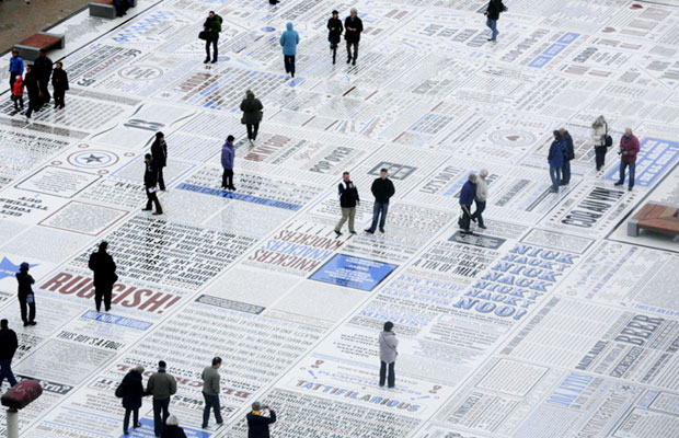
For nearly 25 years, the British graphic design company Why Not Associates has been turning out passionate, innovative and, perhaps most importantly, commercially successful designs for a wealth of clients, both large and small. Not an agency to eschew experimentation, it's created 300m-long typographic pavements, 20m-high climbing towers in Blackpool, and an hilarious comedy carpet containing over 160,000 granite letters embedded into concrete. Here, the London-based company's founder, Andy Altmann, reveals his favourite piece of graphic design, and succinctly explains why.
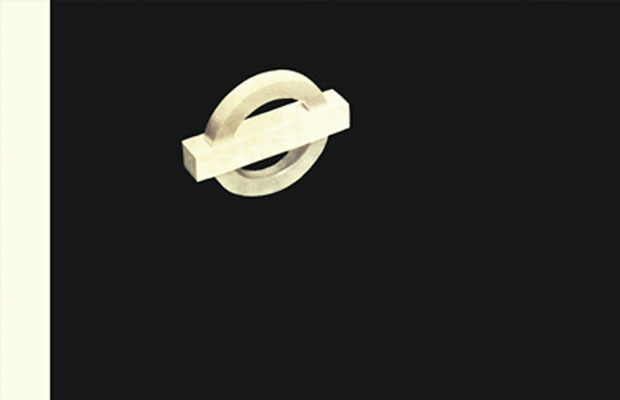
" I think it's Man Ray's 1938 poster, Keeps London Going, for the London Underground. It was years ago when I first saw it and, no pun intended, it stopped me dead in my tracks.
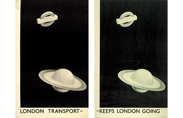
" It's just so simple, and it's executed so elegantly. It's also quite odd that it has a white border left and bottom. Only an artist would do that, never a graphic designer. And the type is just so simple too. Great, simple ideas always stand the test of time. I was a big fan of Surrealism as a teenager, and this is a great piece of surrealist thinking applied to a commercial project. Genius! I wish I owned a copy – an original would be worth a lot of money today."
Read more about Man Ray's iconic poster in The Phaidon Archive of Graphic Design.