How Turner Duckworth created the Amazon 'smile' logo
Our new book I Love It What Is It lays bare the fascinating stories behind the brilliant branding done by the design company
It’s pretty much impossible to go a day without coming across the work of the branding and design company Turner Duckworth. The UK founded US-based company is the brains behind many of the unmistakable visuals of many of the world's most recognizable brands.
They’ve created the visual identities for anyone and everyone from Metallica to McDonalds, Campbells soup to Coca-Cola. That famous smile on the Amazon box you got the other day? Yep, that was done by them. We’ll tell you how it came about later in this story.
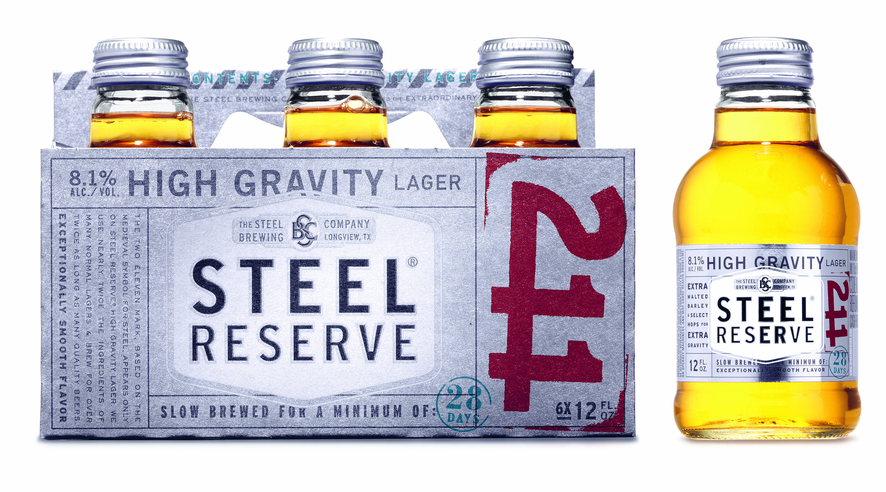
 Trust & Faith, essay by Minott Wessinger, Chief Executive Officer, McKenzie River Corporation. Steel Reserve, High Gravity Lager. Picture credit: © Turner Duckworth
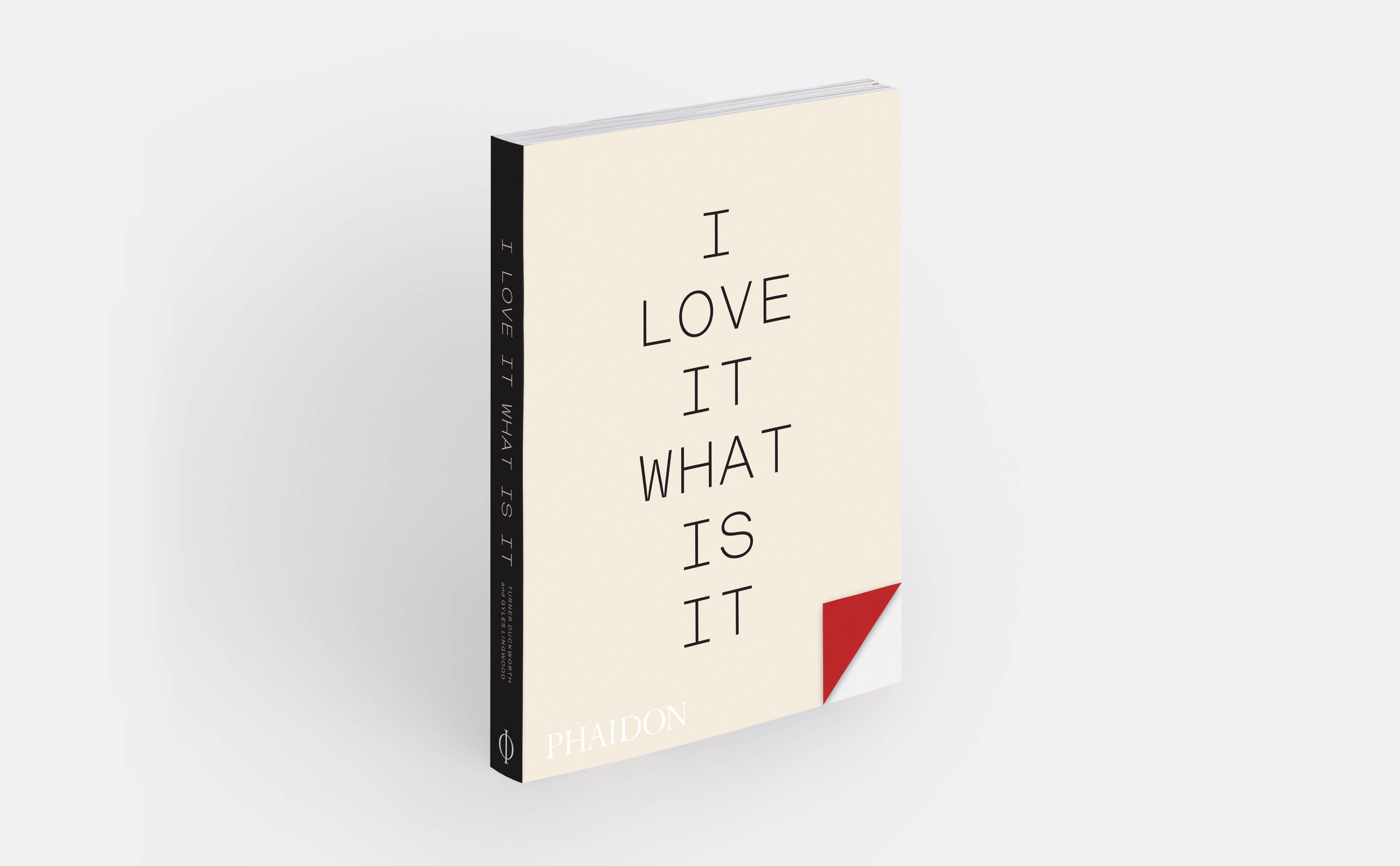
Published on the occasion of Turner Duckworth’s 30th anniversary, our new book, I Love It What Is It, features a selection of the firm’s familiar, witty and captivating work alongside texts from twenty contributors that explore themes of courage, passion, conviction, and heart-over-head decision-making when creating identities for some of the best-known brands in the world.
Meticulously put together by Gyles Lingwood, a professor at the University of Lincoln, I Love It What Is It? presents texts from leaders in the worlds of design and branding, including the former design director of Coca-Cola; the executive vice president and global chief marketing officer of McDonald’s; internationally celebrated designer and friend of Phaidon, Stefan Sagmeister; and more.
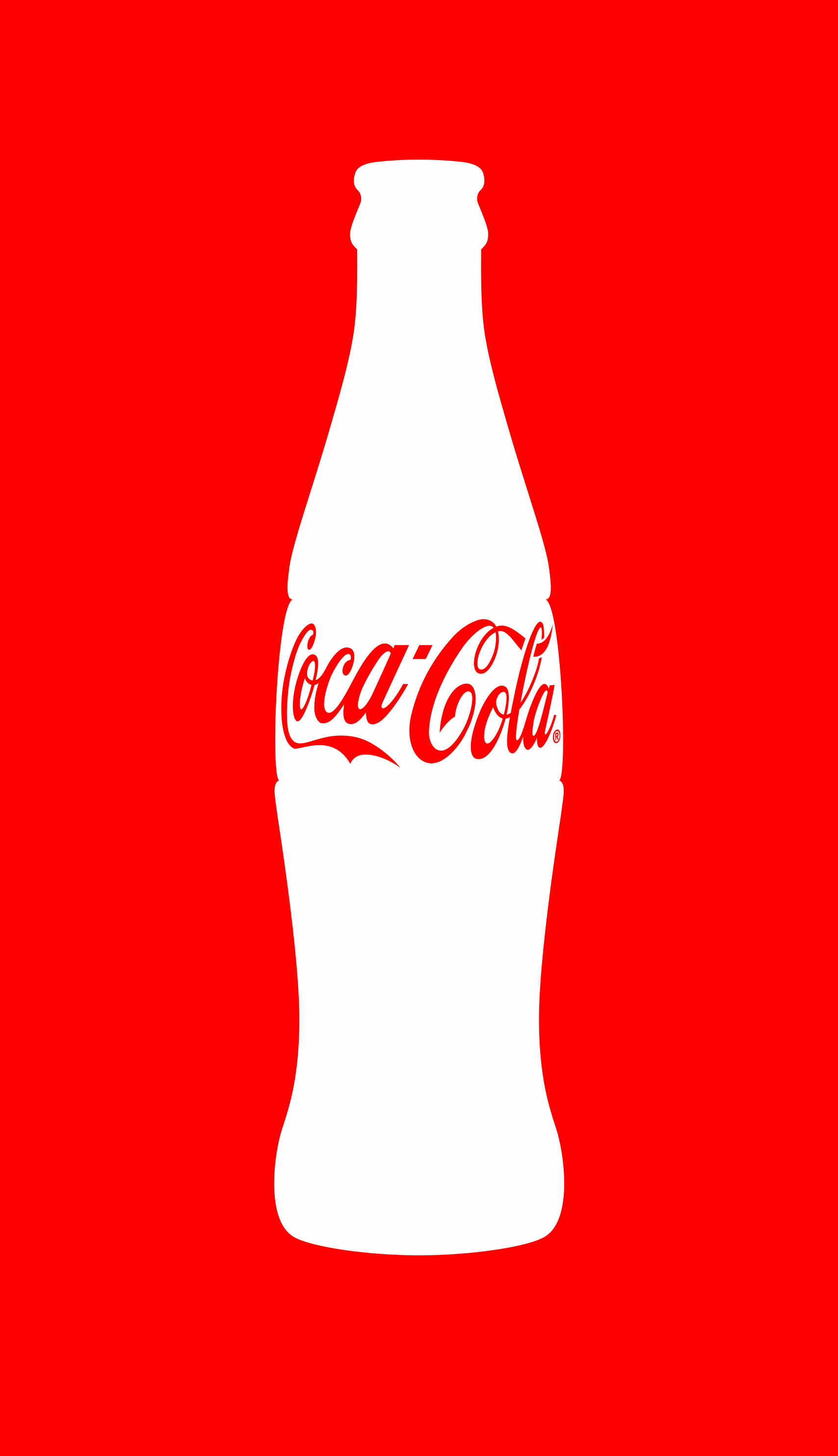
 Soft Power, essay by Moira Cullen, Former Design Director, Coca-Cola North America. Picture Credit: ©2008 The Coca-Cola Company, All Rights Reserved
Here’s how it went when the company pitched the now iconic smile logo to Amazon boss Jeff Bezos. Read on and you might learn something new about a logo you’ve seen countless times. Turner Duckworth CEO Joanne Chan tells the story.
“Amazon was a bookseller who had just started to sell CDs and DVDs. At the time, they had started to build their pioneering distribution centre strategy for faster shipping, and they were months away from announcing their partnership with Toys ‘R’ Us. David Turner (co-founder) and I travelled to Amazon headquarters to be briefed directly by Jeff Bezos, who at the time was not famous and not the least bit intimidating.”
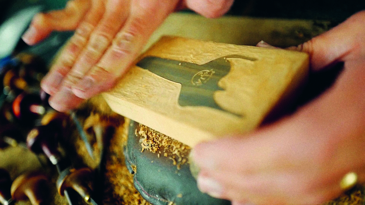
 Soft Power, essay by Moira Cullen, Former Design Director, Coca-Cola North America. Picture credit: © 2024 Turner Duckworth
“The brief was written on one sheet of paper with no images to inspire the designers, no background to define the competitive landscape, no data to explain customer segmentation and refreshingly, no Venn diagram of overlapping circles.”
“The challenge was straightforward and twofold: first, the company was hyper-focused on customer service. Whatever didn’t benefit the consumer was considered non-essential. When we asked for proof of this, we were told that a suggestion by the marketing department to print two-colour stationery was rejected because the incremental cost had no benefit to the end consumer.”
 Marketing that People Love, essay by Jessica Spence, President of North America, Beam Suntory. Picture credit: ©2024 Andrew Davidson, c/o Mendola Artists. With permission from Beam Suntory, All Rights Reserved
“Second, the vision was to eventually sell ‘everything and anything’. We asked what Amazon might sell in the future, and Bezos answered, ‘furniture’. At the time, going from small objects, such as books and CDs, to large objects, such as furniture, seemed like a stretch, but now we all know how his vision has manifested.”
“A clear and concise brief is the Holy Grail for designers. But it also needs to be true, with no smoke and mirrors. Amazon’s brief was simple and 100 per cent truthful, backed up by how they ran their business.”
 Flowers Bloom in the Sunshine, essay by Mark Tutssel, Former Executive Chairman and Global Chief Creative Officer of Leo Burnett Worldwide. Flower photo by Paula Codoñer. Picture credit: courtesy the artist Paula Codoñer, ©2021, ©2020 & ©2022. All Rights Reserved
“We returned to present three design concepts, and Bezos chose what ended up being the final design in the first meeting. The simplicity of the design was exactly on-brief: the smile for customer service, connecting the A to the Z within the word ‘Amazon’.”
“This Easter egg of ‘everything from A to Z’ was never touted openly by Amazon. It remains a discovery element in the logo, much like the arrow in the FedEx logo. Creative ideas hidden in plain sight deliver a moment of delight for those sharp enough to notice. That, in turn, elicits a positive emotional response in the consumer and sticks in their minds and hopefully their hearts.”

Want more great stories behind big brands? I Love It What Is It is a must-have insiders’ guide that offers hints, tips, and an optimistic point of view on cultivating ideas and taking risks that may not have been considered through logic alone.