It’s the Gutenberg Bible’s birthday
Born from wine presses 561 years ago, Gutenberg's first major publication changed the world forever - here's how
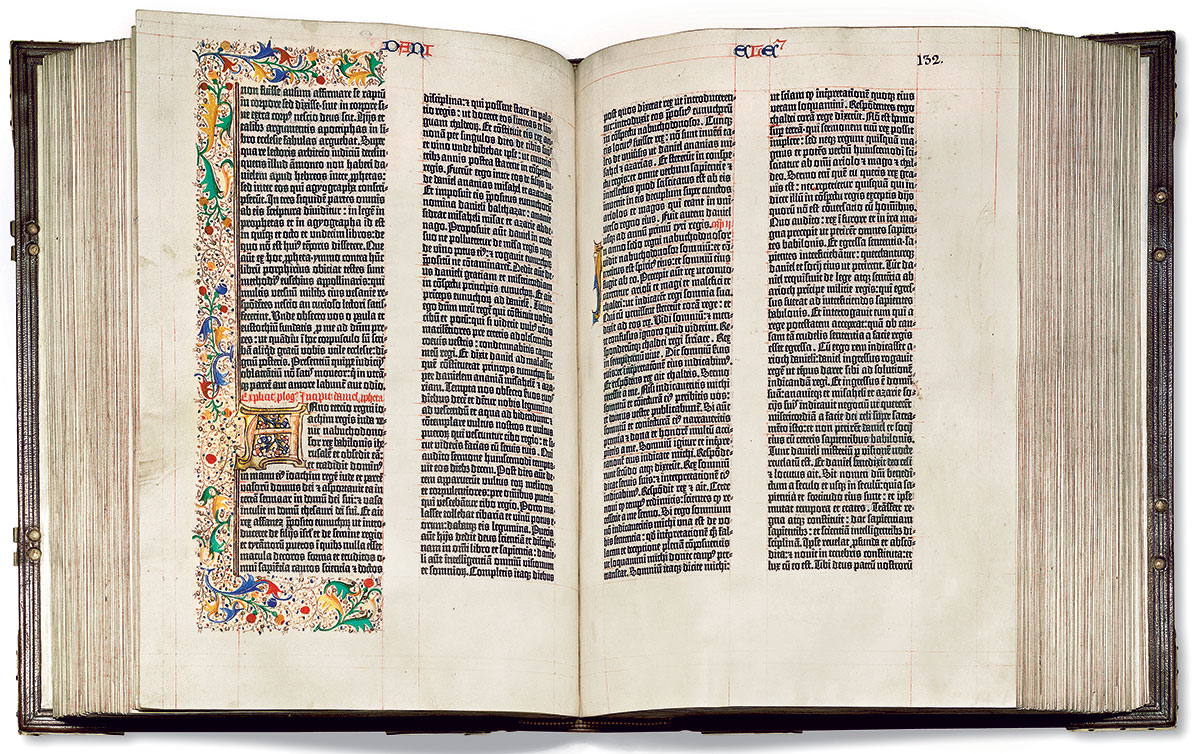
It’s hard to put a date on the Gutenberg Bible, the first major book printed in Europe using moveable metal type, created by the German print pioneer Johannes Gutenberg in the mid 15th century. However, many choose today’s date as the Gutenberg Bible’s birthday, as a completed copy was definitely in existence by 24 August 1456, according to dates inscribed on to surviving examples of this first edition to best all first editions.
Here’s how our book Graphic: 500 Designs that Matter places this seminal work of printing and graphic design in context.
“The Gutenberg Bible is celebrated as much for its beauty as for its historical importance. In appearance the books look like the finest handwritten manuscripts, although their words were composed from metal letters, first inked then pressed onto the page by machine. Headings and sections in different colours were added by hand, making every copy of the Bible an individual work of art. Copies for important monasteries were printed on vellum and elaborately illuminated.”
And while it retained the appearance of a handmade illuminated manuscript, this new process of mechanical reproduction cut a bookmaker’s labour costs considerably.
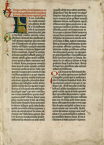
“Gutenberg’s press allowed a printer to produce in a single day what had previously taken a scribe an entire year. His basic process remained unchanged for more than three hundred fifty years: first, a letter would be carved on a steel stick called a punch; second, the punch was hammered on to a soft, “blank” piece of copper or brass, which became the matrix or casing, and in turn was placed into a mold for casting. The mold was adjustable on two sides, allowing the letters to have varying widths. Molten metal was then poured into the mold, and the individual letters, when removed, were assembled using a compositor’s stick.
To ensure that his Bible resembled calligraphy, Gutenberg created an alphabet of 290 alternate characters; this allowed him to choose different letter widths as a way of justifying columns without having to adjust their spacing. He also developed a new kind of ink that would adhere to the metal and transfer effectively to vellum or paper. This process was accomplished using a screw press, possibly adapted from wine presses.”
“Gutenberg’s innovations enabled books to be duplicated quickly and inexpensively, producing a rapid surge in literacy as printing technology proliferated throughout Europe. Even though new technologies have now long superseded those used by Gutenberg, his Bible remains a “gold standard” for beauty in book design and production.”
For more on Graphic design, from the Medieval Europe through to the present day order a copy of Graphic here.