A Phaidon guide to Mario Testino’s art collection
The photo legend is selling his collection at Sotheby’s - here’s all you need to need to know about the artists in it
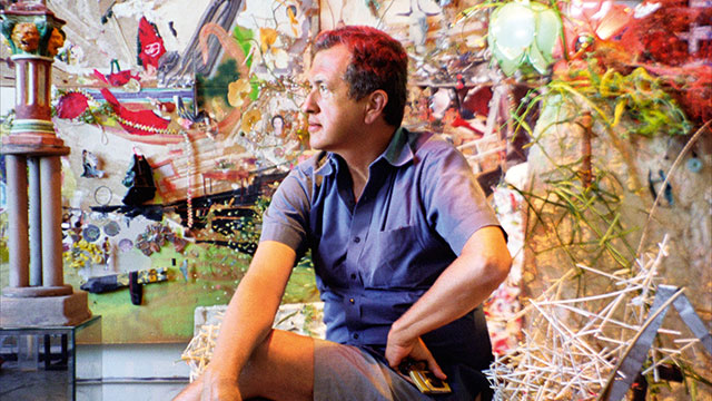
We all know Mario Testino has a good eye for a photograph. His images of Lady Diana, Gisele Bundchen and Kate Moss are world famous. However, the Peruvian photographer also as a keen aesthetic sense when it comes to collecting art, as a forthcoming sale at Sotheby’s shows. Shake It Up: Works from the Mario Testino Collection will be held at the London auction house on 13 September, with proceeds going towards the photographer’s charity Museo MATE in Lima, which promotes and supports local and global culture in Peru. Here’s what buyers and gallerygoers can expect to see when the collection goes on show on 8 September.
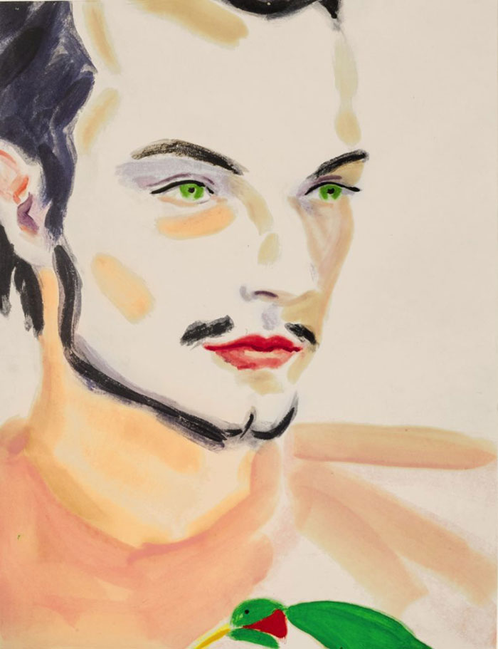
“A product of her time, Peyton is also very much a product of her place – New York – and specifically the Lower East Side where she lived and kept a studio for more than a decade,” writes Lisa Philips in our Elizabeth Peyton book. This Peyton work is a portrait of the renowned downtown club promoter, DJ and fellow artist Spencer Sweeney. Find out more about Peyton and her set in our our Contemporary Artist Series book on her. And take a listen to the music that inspires her, here.
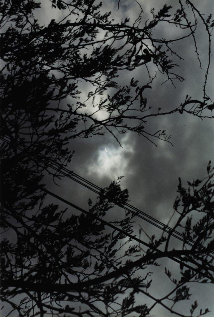
Wolfgang Tillmans, like Testino, rose to fame as a magazine photographer. However, Tillmans’ interest in star gazing predates his professional career; Tillmans enjoyed astronomy as a boy, and, as our Tillmans monograph explains, the photographer still manages to work a deeply humane aspect into his celestial works.
“In the images of starry night skies (Sternenhimmel, 1995), the pictures of the solar eclipse (Eclipse, 1998) and those of Concorde taking off for distant continents (Concorde, 1997) one always senses not only that there is someone on the ground watching,” writes Jan Verwoert in our Tillmans book, “but that it is a person who has perhaps travelled some way or waited some time to get this image; a person, who holds specific feelings of fascination and longing in relation to these sublime sights. Thus in Tillmans’ images the sublime is always defined in relation to an experience of human scale.”
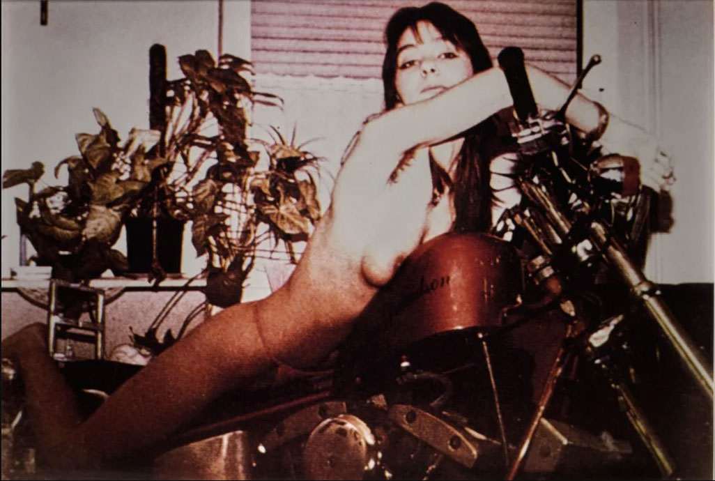
Richard Prince’s Girlfriends series can be understood as a counterpart to his better-known Cowboys works. With Cowboys, the artist cropped and rephotographed the horse riding men in the Marlboro advertisements, freeing them from the logos and allowing them to loom larger within the American consciousness. With his girlfriends series, he reworked the readers’ photos sent into such motorcycle magazines as Easyriders and Iron Horse.
“The pictures appear comical at first,” writes Luc Sante in our Richard Prince book,” a longer look reveals their fundamental pathos. As writer Melissa Holbrook Pierson writes of them in her book The Perfect Vehicle, ‘the women are colluding with their own debasement, and this is seen somewhere deep in their eyes, though their lips smile and their backs arch in feigned ecstasy. Mainly the look uncomfortable and tentative, as if they wished they could do something, anything, to please the men behind the Instamatics.”
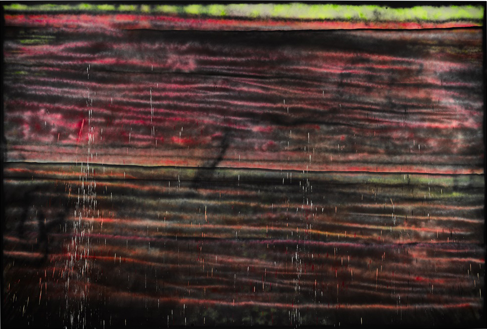
The US artist Sterling Ruby is perhaps best known for his sculptural works. Nevertheless these spray-painted works on canvas fit into Ruby’s scrappy, dystopian worldview.
“Ruby’s ‘SP’ (spray paint) paintings, are icons of the social and psychological landscape we all inhabit, however we choose to politically align our sensibilities,” writes Franklin Sirmans in our Ruby book. “The general tone of the early ‘SP’s is dark, black and reminiscent of the most basic – like late 1960s and early 1970s New York styles, when graffiti were identified as an urban, anti-institutional creative form. The emphasis is on the line and here lines crisscross over each other cancelling each other out so that no matter the green or the pinkish yellow trying to come through from the foreground, blackness rules.
“Rather than covering the entire surface of an object, the paintings are tight in composition and come in a range of sizes, from nothing-so-small that it couldn’t hold a museum wall to larger than life. They are beautiful, in both traditional and contemporary senses, informed by formal qualities of composition, colour and form. They are also in a chromatic register that is absolutely of the present. The colours – amplified acid brights in cautionary orange, fluorescent yellow and green – could be keyed to the most recent palettes for Nike and Adidas soccer shoes.
To find out more about Sterling Ruby get this book; for more on Richard Prince get this one; for more on Wolfgang Tillmans get this book; for more on Elizabeth Peyton buy this title; and for more on Mario himself get our Phaidon retrospective Any Objections?